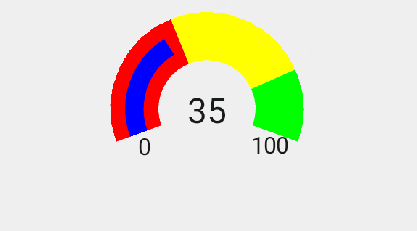
Although, Xamarin controls match the native controls on all three platforms by default and are designed to work with both: light and dark themes available on all platforms. But, there are several properties available that let you customize the gauge elements to make it visually attractive. The following code example demonstrates how to set different styling properties to customize a C1RadialGauge.
The image given below shows a C1RadialGauge control with customized appearance.
The following code example demonstrates how to customize the gauge in Java. The example uses the sample created in the RadialGauge Quick Start section.
| C# |
Copy Code |
|---|---|
//Customize Text Appearance radialGauge.ShowText = GaugeShowText.All; //Set Pointer and customize its appearance radialGauge.Pointer.BorderColor = Color.Blue.ToArgb(); radialGauge.Face.BorderWidth = 0.5f; radialGauge.Pointer.BorderWidth = 0.3f; | |