This topic provides a walkthrough of how the DropDown control can be used to create a custom date picker. For this, you begin by creating a new portable or shared application, initializing a DropDown control in XAML view, and then supplying content to its Header view using the setHeader property, and to the DropDown view using the setDropDown property. In this example, you create a date picker by using a MaskedEntry control in the header and a Calendar control in the drop-down.
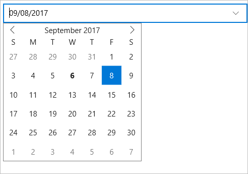
The image below shows how a custom date picker created using the DropDown control appears.
Complete the following steps to create a custom date picker using the DropDown control.
| XAML |
Copy Code
|
|---|---|
xmlns:c1="clr-namespace:C1.Xamarin.Forms.Input;assembly=C1.Xamarin.Forms.Input" xmlns:calendar="clr-namespace:C1.Xamarin.Forms.Calendar;assembly=C1.Xamarin.Forms.Calendar" |
|
| XAML |
Copy Code
|
|---|---|
<StackLayout> <Grid VerticalOptions="FillAndExpand" > <c1:C1DropDown x:Name="dropdown" HorizontalOptions="FillAndExpand" VerticalOptions="Start" > <c1:C1DropDown.Header> <c1:C1MaskedEntry x:Name="mask" Mask="00/00/0000" /> </c1:C1DropDown.Header> <c1:C1DropDown.DropDown> <calendar:C1Calendar x:Name="calendar" HorizontalOptions="FillAndExpand" DayOfWeekFormat="d" BackgroundColor="Transparent" WidthRequest="270" HeightRequest="270"> </calendar:C1Calendar> </c1:C1DropDown.DropDown> </c1:C1DropDown> </Grid> </StackLayout> |
|
| XAML |
Copy Code
|
|---|---|
public partial class MainPage : ContentPage
{
    public MainPage()
    {
        InitializeComponent();
        this.calendar.SelectionChanged += CalendarSelectionChanged;
    }

    private void CalendarSelectionChanged(object sender, CalendarSelectionChangedEventArgs e)
    {
        C1Calendar calendar = (C1Calendar)sender;
        this.mask.Value = ((DateTime)calendar.SelectedDate).ToString("MM/dd/yyyy");
        this.dropdown.IsDropDownOpen = false;
    }

    }
|
|