The ComboBox control comes with various properties to customize its appearance. The C1ComboBox class provides a set of properties listed below to achieve customization in the control's overall look and feel.
The image given below shows a customized combo box control.
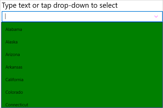
The given code illustrates how to set the above properties and render a customized combo box control. This code example uses the sample created in the Quick Start.
| C# |
Copy Code
|
|---|---|
cbxEdit.ButtonColor = Xamarin.Forms.Color.Magenta; cbxEdit.DropDownBackgroundColor = Xamarin.Forms.Color.Green; cbxEdit.DropDownBorderColor = Xamarin.Forms.Color.Navy; cbxEdit.DropDownMode = C1.Xamarin.Forms.Input.DropDownMode.ForceBelow; |
|
| XAML |
Copy Code
|
|---|---|
<c1:C1ComboBox x:Name="cbxEdit" HorizontalOptions="FillAndExpand" DisplayMemberPath="Name" ButtonColor="Magenta" DropDownBackgroundColor="Green" DropDownBorderColor="Navy" DropDownMode="ForceBelow"/> |
|