You can add a title to the FlexPie control by setting its Header property. Besides a title, you may also set a footer by setting the Footer property.
There are also some additional properties to customize header and footer text in a FlexPie.
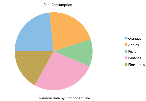
The image below shows how the FlexPie appears after these properties have been set.
The following code example demonstrates how to set these properties in C#. This example uses the sample created in the Quick Start section.
| C# |
Copy Code
|
|---|---|
//Set header and footer chart.Header = "Fruit Consumption"; chart.HeaderAlignment = LayoutAlignment.Center; chart.Footer = "Random data by ComponentOne"; chart.FooterAlignment = LayoutAlignment.Center; |
|
The following code example demonstrates how to set these properties in XAML. This example uses the sample created in the Quick Start section.
| XAML |
Copy Code
|
|---|---|
<c1:FlexPie x:Name="chart" ItemsSource="{Binding Data}" BindingName="Name" Binding="Value" Header="Fruit Consumption" HeaderAlignment="Center" Footer="Random data by ComponentOne" FooterAlignment="Center" /> |
|