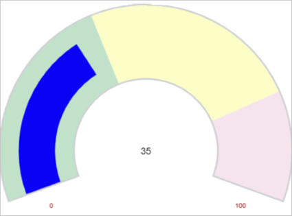
Xamarin Edition controls match the native controls on all three platforms by default and are designed to work with both: light and dark themes available on all platforms. But, there are several properties available that let you customize the gauge elements to make it visually attractive. The following code example demonstrates how to set different styling properties to customize a RadialGauge.
The following image shows how the RadialGauge appears after its appearance is customized.
| C# |
Copy Code
|
|---|---|
//Customize Gauge gauge.ShowText = GaugeShowText.All; gauge.Thickness = 0.5; gauge.FaceBorderColor = Color.FromHex("#cfd1d4"); gauge.FaceBorderWidth = 5; gauge.MinTextColor = Color.Brown; gauge.MaxTextColor = Color.Brown; gauge.MinFontSize = 10; gauge.MaxFontSize = 10; //Customize Range Appearance low.Color = Color.FromHex("#C1E1C9"); med.Color = Color.FromHex("#fdfdc8"); high.Color = Color.FromHex("#f6e4ed"); //Customize Pointer Appearance gauge.Pointer.Thickness = 0.5; |
|
| XAML |
Copy Code
|
|---|---|
<c1:C1RadialGauge Min="0" Max="100" Value="35" StartAngle = "-20" SweepAngle = "220" AutoScale = "true" FaceBorderColor="#cfd1d4" FaceBorderWidth="5" MinTextColor="Brown" MaxTextColor="Brown" > <c1:C1RadialGauge.Ranges> <c1:GaugeRange Min="0" Max="40" Color="#C1E1C9"/> <c1:GaugeRange Min="40" Max="80" Color="#fdfdc8"/> <c1:GaugeRange Min="80" Max="100" Color="#f6e4ed"/> </c1:C1RadialGauge.Ranges> <c1:C1RadialGauge.Pointer> <c1:GaugeRange Thickness="0.5"></c1:GaugeRange> </c1:C1RadialGauge.Pointer> </c1:C1RadialGauge> |
|