Xamarin controls for native iOS are designed to work with both: light and dark themes available on all platforms. However, there are several other properties that allow you to customize the appearance of the FlexChart control. You can change the background color of the chart, set the color of the series, add colored borders of specified thickness to charts as well as series and do much more to enhance the appearance of the control.
The image below shows a customized FlexChart control.
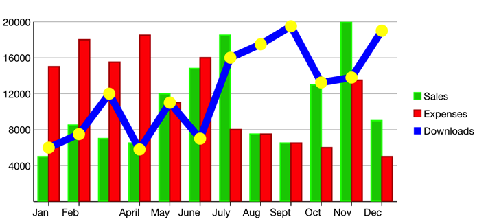
The following code example demonstrates how to customize the FlexChart and its series. The example uses the sample created in the Quick Start section, with multiple series added to the chart. For more information on how to add multiple series, see Mixed Charts.
| C# |
Copy Code
|
|---|---|
chart.Series.Add(new ChartSeries() { SeriesName = "Sales", Binding = "Sales,Sales", Style = new ChartStyle { Fill = new UIColor(0, 0.8 f, 0, 1), Stroke = UIColor.Green, StrokeThickness = 2 } }); chart.Series.Add(new ChartSeries() { SeriesName = "Expenses", Binding = "Expenses,Expenses", Style = new ChartStyle { Fill = UIColor.Red, Stroke = new UIColor(0.702 f, 0, 0, 1), StrokeThickness = 2 } }); chart.Series.Add(new ChartSeries() { SeriesName = "Downloads", Binding = "Downloads,Downloads", ChartType = C1.iOS.Chart.ChartType.LineSymbols, Style = new ChartStyle { Fill = new UIColor(1, 0.416 f, 1, 1), Stroke = UIColor.Blue, StrokeThickness = 10 }, SymbolStyle = new ChartStyle { Fill = UIColor.Yellow, Stroke = UIColor.Yellow, StrokeThickness = 5 } }); |
|