Xamarin for iOS controls contain several properties to customize the appearance of the FlexPie control. They are designed to work with both: light and dark themes. You can also change the background color, the color and width of borders and the thickness of margins of FlexPie by simply setting the desired value in the following properties:
The image below shows a customized FlexPie control.
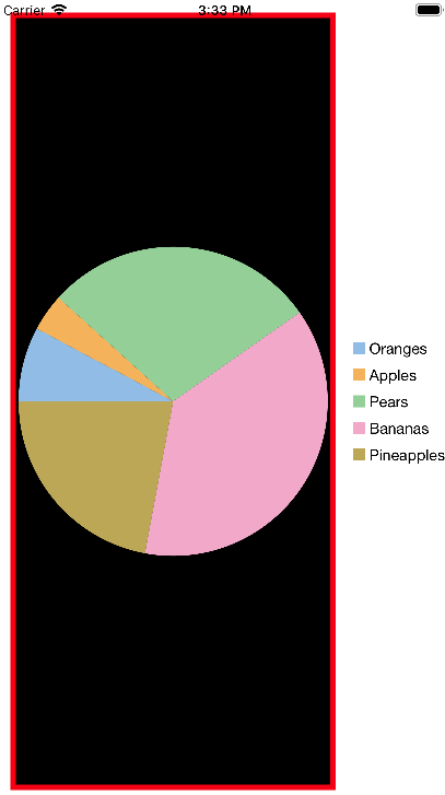
The following code example demonstrates how to set these properties. This example use the sample created in the Quick Start section.
| CS |
Copy Code
|
|---|---|
pieChart.PlotStyle.Fill = UIColor.Black; pieChart.PlotStyle.Stroke = UIColor.Red; pieChart.PlotStyle.StrokeThickness = 5; |
|