
Powerful Input Controls for WinForms
Parse and Format User Input with WinForms Editors
A full set of 15 WinForms input controls for any data entry scenario.
- Capture text with masking, error detection, and validation
- Format and parse numbers, dates, colors, and fonts
- Select multiple items from a checklist or enter items like a tag editor
- Edit a numeric range visually using a slider
- Design a custom drop-down UI with ease
Why Choose Input Controls for WinForms?
Input Controls for Any Type of Data Entry
The WinForms Input library includes 15 controls that provide editors with a wide variety of customizable data types. You can also design a custom drop-down specific for your application.
Get the Latest Styles and Themes for Windows
All of the WinForms Input controls match the latest Windows 11 interface. The WinForms Edition includes dozens of themes and Microsoft Office Visual Styles.
Create Bound Input Forms with Ease
The WinForms Input controls support data-binding to all .NET data sources. When bound, the editors can display dynamic data.
WinForms Input Controls

WinForms ColorPicker
The C1ColorPicker control provides multiple ways to select colors from a drop-down list. Select a color from a list or create a custom color by setting the RGB values.
WinForms ComboBox
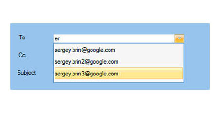
The C1ComboBox control provides developers with a portable, lightweight combo box that combines the versatility of an editable textbox and the power of an auto-searchable drop-down box. It supports partial search support.

WinForms DateTimePicker
The C1DateEdit control is a flexible date input control that displays a calendar in a drop-down, enabling faster date/time input and selection.

WinForms DataPager, Database Navigator
The C1DbNavigator control provides buttons for convenient data source navigation. It enables record navigation and common data actions like update, add new, delete, apply, cancel, and refresh.

WinForms Custom Dropdown
The C1DropDownControl allows you to create any drop-down editor you need. Drop-down editors are created visually as forms in your project.

WinForms FontPicker
The C1FontPicker control provides font selection. It includes special masking, parsing, validation, and formatting features.

WinForms MaskedTextBox
C1MaskedTextBox is an advanced textbox control which automatically validates the input entered by users. Restrict input for numbers or strings with support for passwords, capitalization, and regular expressions (regex).

WinForms Multi-Select & Tag Editor
The C1MultiSelect control displays a drop-down checklist, allowing users to select multiple items. The C1TagEditor control provides the same functionality without the drop-down.

WinForms Numeric TextBox
The C1NumericEdit control provides formatted numeric input. It also can display a drop-down calculator (.NET Framework only), allowing the user to perform calculations without leaving the control.

WinForms RangeSlider
The C1RangeSlider control extends the basic slider control and provides two thumb elements instead of one, allowing users to select numeric ranges instead of single values.

WinForms Buttons
With the C1SplitButton control, a user can select from a drop-down of the nested menu of items. The C1Button control is a standard button control that supports engaging visual styles.

WinForms TextBox
The C1TextBox control is an all-purpose, data-bound input control used for entering and editing text-based information. It includes special masking (.NET Framework only), parsing, validation, and formatting features useful for all common data types.
WinForms Input Key Features
UI Styles for Windows 11
The ComponentOne Input TextBox control supports the Windows 11 system styles like color, rounded corners, and underlines, similar to standard .NET input controls.


Floating Placeholders
The floating placeholder is inspired from the Material themes and displays the labels inside the input controls. These labels move to top once the control has a value assigned. This feature can be enabled by setting the Placeholder and FloatingPlaceholderEnabled properties of the respective input controls.
Data Validation
Specify validation rules without having to handle coded events using the input controls' pre and post-validation property settings. Pre-validation allows you to check raw input text, while post-validation enables you to verify that the value falls within specific criteria. Validate values against an exact list of allowed or excluded values, use wild-card string patterns and regular expressions, or simply fire a validation event and handle this yourself.


Input Error Detection
Detect errors while parsing or validating input values with ease. WinForms Input controls have an ErrorInfo property, allowing you to customize the error handling. For example, alert users with a beep, prevent them from putting focus to another control, display an error message, or reset the value. Detect errors using C1TextBox, C1ComboBox, C1FontPicker, C1ColorPicker, C1MultiSelect, C1DateEdit, and C1NumericEdit.
Optional Modal Buttons
C1DateEdit, C1NumericEdit, C1ColorPicker, and C1DropDownControl feature an additional optional modal button. This feature is useful for launching a special dialog box or any other custom action.


Culture & Regional Settings
Input for WinForms controls allow you to customize the culture at the control level. Configure many additional regional settings, such as calendar information for DateTime input, and special characters such as the decimal point. Specify the culture settings for any text input control, including C1TextBox, C1ComboBox, C1FontPicker, C1ColorPicker, C1MultiSelect, C1DateEdit, and C1NumericEdit.


