
12 WPF Input Controls
Parse and format user input with a full set of WPF input controls for any data entry scenario.
- Format and parse numbers, dates, colors, and masked text
- Select multiple items from a checklist or enter items like a tag editor
- Edit a numeric range visually using a slider
- Design a custom drop-down UI with ease
Why Choose Input Controls for WPF?
Find the Exact Editor You Need
ComponentOne includes a dozen WPF input controls and editors for a variety of data types and scenarios that are missing in the Visual Studio toolbox.
Easily Customizable
Each WPF input component supports maximum flexibility for customization. Use simple properties, item templates and reusable inner components to create custom editors.
Get Styled Input Controls
Out of the box, our input controls support Microsoft's Implicit Style Manager to design themes. You can also select from our 20+ provided themes.
Basic WPF Input Controls

WPF ComboBox
The C1ComboBox control is a full-featured WPF Combobox control that combines an editable text box with an auto-searchable drop-down list. It supports item templates and item virtualization, so it loads quickly - even when populated with hundreds of items.

WPF Custom Dropdown
With the C1DropDown control, you have complete control over creating specialized drop-down editors. Attach your logic to the spin buttons and your own drop-down form/editor to the drop-down button.

WPF FilePicker
The C1FilePicker control shows a file picker dialog box that allows users to select files for selection or upload. Select one or multiple files. You can limit the browsable file types based on a file extension or category using the Filter property.

WPF MaskedTextBox
The C1MaskedTextBox control allows you to validate and format strings using a mask. You can choose to show prompt characters and literals.

WPF NumericBox
The C1NumericBox control restricts input to a specific numeric range and increment amount. It supports standard .NET formats including fixed-point (F), number (N), general (G), currency (C), exponential (E), hexadecimal (X), and percent (P).

WPF RangeSlider
The C1RangeSlider control extends the basic slider control and provides two thumbs, making it possible for users to select a range. Users can drag each thumb individually or drag the center to modify both at the same time.
More WPF Input Controls

WPF ColorPicker
Using the C1ColorPicker control, you can select colors from professionally-designed palettes or edit your custom colors with support for RGB, HSL, and color values with alpha transparency.
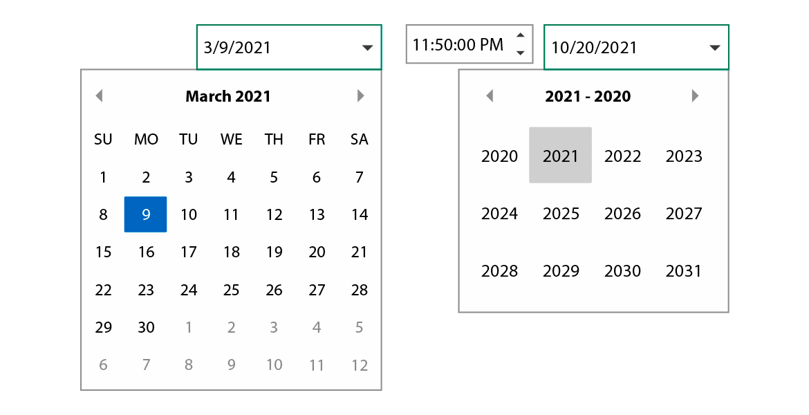
WPF DateTime Editors
Display, edit, and validate date and time information using three specialized components for editing DateTime values: C1DateTimePicker, C1DatePicker, and C1TimeEditor.

WPF Multi-Select Checklist & Tag Editor
The C1MultiSelect supports selecting multiple items from a drop-down checklist. It supports autocomplete, and you use the control as a tag editor.

WPF InputPanel
Our innovative C1InputPanel is a single control that makes it easy to create and manage complete data-entry forms. Generate input forms without having to worry about layout and positioning of each item.

WPF Rating Control
Enable users to share their reviews with the C1Rating control. Customize the control to show stars, thumbs, bars, and more custom shapes.

WPF RichTextBox
Edit and format rich text containing multiple fonts, decorations, sizes, colors, and other basic HTML and RTF features such as pictures and tables using C1RichTextBox.


