Version 1
Version 1
Customizing a Tree Column
DataViewsJS allows you to customize the hierarchical tree column presenter. You can customize the tree column presenter to add images, drop-down arrows for open or collapse nodes, and so on. You can even add formulas in the footer.
Use the following steps to customize the tree columns.
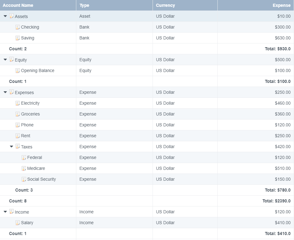
Sample Code
- Add the column definition. Set the hierarchyFooter property to apply the tree view to the column. You can optionally add formulas in the column definition.
var cols = [
  {
    id: 'accountName',
    caption: 'Account Name',
    dataField: 'accountName',
    minWidth: 120,
    presenter: accountPresenter,
    hierarchyFooter: '<span style="font-weight:bold">Count: \{{=it.eval("=COUNT([id])")}}</span>',
  },
  {
    id: 'type',
    caption: 'Type',
    dataField: 'type',
  },
  {
    id: 'commodity',
    caption: 'Currency',
    dataField: 'commodity',
  },
  {
    id: 'total',
    caption: 'Expense',
    dataField: 'total',
    format: '$0.00',
    hierarchyFooter: '<span style="font-weight:bold">Total: \{{=it.eval("=SUM([total])", "$0.0")}}</span>',
  },
  {
    id: 'id',
    caption: 'Id',
    dataField: 'id',
    visible: false,
  },
  {
    id: 'parentID',
    caption: 'ParentID',
    dataField: 'parentID',
    visible: false,
  },
];
- Set the showRowHeader and hierarchy properties while initializing the grid.
var dataView = new GC.DataViews.DataView(
  document.getElementById('grid1'),
  data,
  columns,
  new GC.DataViews.GridLayout({
    allowSorting: true,
    showRowHeader: false,
    hierarchy: {
      keyField: 'id',
      parentField: 'parentID',
      collapsed: false,
      footer: {
        visible: true,
      },
    },
  })
);
See also
Feedback
Submit and view feedback for