Line charts are the most basic charts that are created by connecting the data points with straight lines. These charts are used to visualize a trend in data by comparing values against periodic intervals such as time, temperature etc. Some examples that can be well depicted using line charts are closing prices of a stock in a given time frame and monthly average sale of a product.
DsExcel supports the following types of line charts.
| Chart Type | Chart Snapshot | Use Case |
|---|---|---|
| Line |
Line chart |
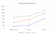
Line chart is used to depict the data values plotted over time to display the trends. It shows continuous data over time on an evenly scaled Axis. |
| Line3D |
Line3D chart |
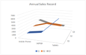
Line3D chart is used to display the chart demonstration in 3D, which is a modification of 2D Line chart. |
| LineMarkers |
LineMarkers chart |
LineMarkers chart is used to display data values shown with markers. It is ideal to use this chart when there are many categories or approximate values. |
| LineMarkersStacked |
LineMarkersStacked chart |
LineMarkersStacked is used to display data values with markers, typically showing the trend of contribution of each value over time or evenly spaced categories. |
| LineMarkersStacked100 |
LineMarkersStacked100 chart |
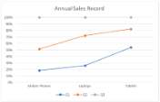
LineMarkersStacked100 chart is used to display individual data values with markers, typically showing the trend of the percentage each value that has been contributed over time or evenly spaced categories. It is ideal to use this chart when there are many categories or approximate values. |
| LineStacked |
LineStacked chart |
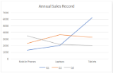
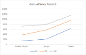
LineStacked chart is used to display stacked line to depict the trend of contribution of each data value or ordered category over different time intervals. |
| LineStacked100 |
LineStacked100 chart |
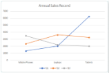
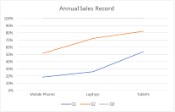
LineStacked100 chart is used to display displays trends in terms of the percentage that each data value or ordered category has contributed (to the whole) over different time intervals. |
Refer to the following example code to add LineStacked100 chart:
| C# |
Copy Code |
|---|---|
public void LineCharts() { // Initialize workbook Workbook workbook = new Workbook(); // Fetch default worksheet IWorksheet worksheet = workbook.Worksheets[0]; // Prepare data for chart worksheet.Range["A1:D4"].Value = new object[,] { {null, "Q1", "Q2", "Q3"}, {"Mobile Phones", 1330, 2345, 3493}, {"Laptops", 2032, 3632, 2197}, {"Tablets", 6233, 3270, 2030} }; worksheet.Range["A:D"].Columns.AutoFit(); // Add Line Chart IShape lineChartshape = worksheet.Shapes.AddChart(ChartType.LineStacked100, 250, 20, 360, 230); // Adding series to SeriesCollection lineChartshape.Chart.SeriesCollection.Add(worksheet.Range["A1:D4"], RowCol.Columns, true, true); // Configure Chart Title lineChartshape.Chart.ChartTitle.TextFrame.TextRange.Paragraphs.Add("Annual Sales Record"); // Saving workbook to Xlsx workbook.Save(@"21-LineChart.xlsx", SaveFileFormat.Xlsx); } | |