DsExcel Templates provide the ability to build PDF forms with various form fields using Excel as the designer. The form fields can be defined using the proper syntax while creating template layouts. After the template is processed, the result can be exported to a PDF document that includes the pre-defined form fields.
The "form" property can be used to define a PDF form field. The value of this property is in JSON format and a JSON string can be used to describe all settings of the form field. For example:
The following standard PDF form fields are supported:
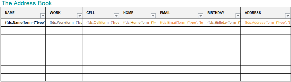
Consider an example for generating a bound PDF form by using DsExcel Templates. In this case, an address book is generated in PDF by defining textbox fields in template cells. The textbox fields are defined in a way that they relate to common details of an address book, like:
Name : {{ds.Name(form={"type": "textbox", "name": "name","font":{"color": "#000000", "bold": true}})}}
Email: {{ds.Email(form={"type": "textbox", "name": "Email","font":{"color": "#EC881D"}})}}
These textbox fields are bound fields, whose data is populated from the data source and is displayed in the PDF form after template processing. You can also download the Excel template layout from here.
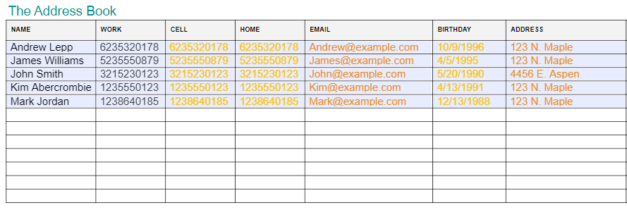
After DsExcel processes the template and exports it to a PDF document, the PDF form will look like below:
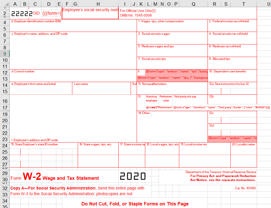
Consider an example for generating an unbound PDF form by using DsExcel Templates. In this case, a wage and tax statement is generated in PDF by defining textbox and checkbox fields in template cells, like:
Textbox field:
{{(form={"type": "textbox", "name": "tips","backgroundcolor": "#ffabab"})}}
Checkbox fields:
{{(form={"type": "checkbox", "name": "Retirement","border": {"color": "#ff0000"}})}}
{{(form={"type": "checkbox", "name": "Statutory","border": {"color": "#ff0000"}})}}
These fields are unbound fields, and their data should be filled directly in the PDF form after template processing. You can also download the Excel template layout from here.
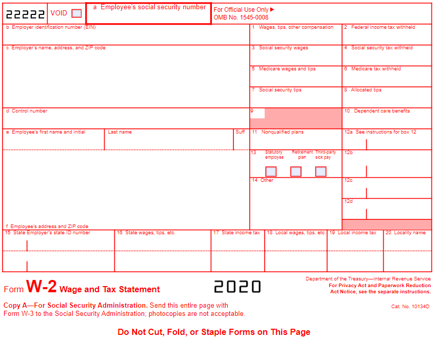
After DsExcel processes the template and exports it to a PDF document, the PDF form will look like below:
Various settings can be applied on form fields to enhance and customize their appearance. These are explained as below:
| Name | Value Type | Example | Description | |
|---|---|---|---|---|
| type |
Enum string Standard Form Fields
|
{"type": "listbox"} |
Indicates the type of form field. (Mandatory field) | |
| alternateName | String | {"alternateName": "The alt name"} | Displays text which is helpful for a user while filling in the form field. Tooltips appear when the pointer hovers briefly over the form field. | |
| backgroundcolor | String | {"backgroundcolor": "#ffff00"} {"backgroundcolor": "rgb(255, 178, 0)"} {"backgroundcolor": "rgba(188, 100, 0, 255)"} |
Indicates background color of the form field. | |
| border | width | Yes | {"border":{"width": 120}} | Indicates width, color and style settings of the border for the form field. |
| color | String | {"border":{"color": "#ffff00"} {"border": {"color": "rgb(255, 178, 0)"}} {"border": {"color": "rgba(188, 100, 0, 255)"}} | ||
| style | Enum string:
|
{"border": {"style": "dashed"}} | ||
| font | size | Yes | {"font": {"size": 18}} | Indicates various font settings which can be used in the form field. |
| color | String | {"font": {"color": "#ffff00"}} {"font": {"color": "rgb(255, 178, 0)"}} {"font": {"color": "rgba(188, 100, 0, 255)"}} | ||
| name | String | {"font": {"name": "sans-serif"}} | ||
| bold | Boolean | {"font": {"bold>": true}} | ||
| italic | Boolean | {"font": {"italic": true}} | ||
| locked | Boolean | {"locked": true} | Indicates whether the user can change the properties of field or not. | |
| name | String | {"name": "The field name"} | Indicates the unique name of field. | |
| readOnly | Boolean | {"readOnly": true} | Indicates whether the user can change the value of field or not | |
| required | Boolean |
{"required": true} | Indicates whether the field must have a value. | |
| printed | Boolean | {"printed":false} | Indicates whether to print the field when page is printed. | |
| hidden | Boolean | {"hidden":true} | Indicates whether to display the field or not. | |
| mouseUp | JsonObject | {"mouseUp":{"script":"fBox1 = this.getField(\"checkbox\") ;\r\nfBox1.display = display.hidden", "submit":"http://localhost:80//myscript#FDF" ,"reset":{"fieldNames": ["checkbox", "textbox"]}}} |
Indicates the actions to be performed in sequence when the mouse button is released in the active area of the field. | |
| mouseDown | JsonObject | {"mouseDown":{"script":"fBox1 = this.getField(\"checkbox\") ;\r\nfBox1.display = display.hidden", "submit":"http://localhost:80//myscript#FDF" ,"reset":{"fieldNames": ["checkbox","textbox"]}}} |
Indicates the actions to be performed in sequence when the mouse button is pressed in the active area of the field. | |
| mouseEnter | JsonObject | {"mouseEnter":{"script":"fBox1 = this.getField(\"checkbox\") ;\r\nfBox1.display = display.hidden", "submit":"http://localhost:80//myscript#FDF" ,"reset":{"fieldNames": ["checkbox","textbox"]}}} |
Indicates the actions to be performed in sequence when the mouse button enters the field's active area. | |
| mouseExit | JsonObject | {"mouseExit":{"script":"fBox1 = this.getField(\"checkbox\") ;\r\nfBox1.display = display.hidden", "submit":"http://localhost:80//myscript#FDF" ,"reset":{"fieldNames": ["checkbox","textbox"]}}} |
Indicates the actions to be performed in sequence when the mouse button exitsthe field's active area. | |
| onFocus | JsonObject | {"onFocus":{"script":"fBox1 = this.getField(\"checkbox\") ;\r\nfBox1.display = display.hidden", "submit":"http://localhost:80//myscript#FDF" ,"reset":{"fieldNames": ["checkbox","textbox"]}}} |
Indicates the actions to be performed in sequence when the annotation receives the input focus. | |
| onBlur | JsonObject | {"onBlur":{"script":"fBox1 = this.getField(\"checkbox\") ;\r\nfBox1.display = display.hidden", "submit":"http://localhost:80//myscript#FDF" ,"reset":{"fieldNames": ["checkbox","textbox"]}}} |
Indicates the actions to be performed in sequence when the annotation loses the input focus. | |
| format | String | {"format":"event.value = (event.value * 100) + \" % \";"} | Indicates a JavaScript action to be performed before the field is formatted to display its current value. This action can modify the field’s value before formatting. | |
| validate | String | {"validate":"if (event.value < 0 || event.value > 100) {\r\n" +"app.beep(0);\r\n" +"app.alert(\"Invalid value for field \" +event.target.name);\r\n" + "event.rc = false;\r\n" +"}"} |
Indicates a JavaScript action to be performed when the field’s value is changed. This action can check the new value for validity. | |
| calculate | String | {"calculate":"var oil = this.getField(\"Oil\");\r\n"+ "var filter = this.getField(\"Filter\") ;\r\n"+"event.value (oil.value + filter.value) * 1.0825;"} |
Indicates a JavaScript action to be performed to recalculate the value of this field when that of another field changes. | |
| keystroke | String | {"keystroke":"if (!event.willCommit) {\r\n"+"var f =this.getField (\"myPictures\");\r\n"+"var i =this.getIcon(event.change) ;\r\n"+"f.buttonSetIcon(i);\r\n"+"};"} |
Indicates a JavaScript action to be performedwhen the user types a keystroke into a text field or combo box or modifies the selection in a scrollable list box. This action can check the keystroke for validity and reject or modify it. | |
| autofocus | Boolean | {"type": "password" , "autofocus": true} | Indicates whether a date field should automatically get focus when the page loads. | |
| disabled | Boolean | {"type": "password" , "disabled": true} | Indicates whether a field is disabled or not. | |
| autocomplete | Enum String | {"type": "date" , "autocomplete": "bday"} |
Lets web developers specify if any user needs to provide assistance for automated filling of form field values, as well as guidance to the browser about what type of information is expected in the field. The behavior of this property depends on the browser implementation. | |
|
| |||
| Name | Value Type | Example | Description | |
|---|---|---|---|---|
| script |
String |
{"script":"fBox1 = this.getField(\"checkbox\");\r\nfBox1.display = display.hidden"} | Indicates an action which causes a script to be compiled and executed by the JavaScript interpreter. | |
| submit | String | {"submit":"http://localhost:80//myscript#FDF"} | Indicates an action to transmit the names and values of selected interactive form fields to a specified uniform resource locator (URL), presumably the address of a Web server that will process them and send back a response. | |
| reset | fieldNames | Yes | {"fieldNames": ["checkbox", "textbox"]} | Indicates the list of names of fields that should be processed (or excluded from processing)by this action. If empty then all fields will be processed. |
| exclude | Boolean | {"exclude":true} | Indicates whether to exclude the fields specified in fieldNames from processing (by default, this property is false and the specified fields are included). | |
| Name | Value Type | Example | Description |
|---|---|---|---|
| checkStyle |
Enum string:
|
{"checkStyle": "circle"} | Indicates the style of check mark. |
| value | Boolean | {"value": true} |
Indicates the value of Checkbox. (If the value is missing, DsExcel automatically tries to convert the cell's value to Boolean, and then, set it to the property after processing the template.) |
| defaultValue | Boolean | {"defaultValue": false} | Indicates the default value of Checkbox. |
| Name | Value Type | Example | Description |
|---|---|---|---|
| value |
String |
{"value": "Hunter"} | Indicates the value of Textbox. |
| defaultValue | String | {"defaultValue": "Input your name!"} | Indicates the default value of Textbox. |
| combo | Boolean | {"combo":true} | Indicates whether the new value is committed as soon as a selection is made with the pointing device. |
| password | Boolean | {"password":true} | Indicates whether the field is intended for entering a secure password that should not be visible on the screen. |
| spellcheck | Boolean | {"spellcheck":false} | Indicates whether the text entered in the field is spell-checked. |
| scrollable | Boolean | {"scrollable":false} | Indicates whether the field is scrollable to accommodate more text than it fits within its annotation rectangle. |
| maxlength | Integer | {"maxlength":10} | Indicates the maximum length of the field’s text, in characters. |
| multiline | Boolean | {"multiline":true} | Indicates whether the field can contain multiple lines of text. |
| justification |
Enum string:
|
{"justification": "center"} |
Indicates the justification to be used while displaying the field’s text. |
| Name | Value Type | Example | Description |
|---|---|---|---|
| value | String Array | {"value": ["US", "UK"]} | Indicates the value of Listbox. |
| defaultValue | String Array | {"defaultValue": ["US", "UK"]} | Indicates the default value of Listbox. |
| commitOnSelChange | Boolean | {"commitOnSelChange": true} | Indicates whether the new value is committed as soon as a selection is made with the pointing device. |
| selectedIndex |
Integer |
{"selectedIndex": 0} | Indicates the indexes of selected item. |
| sort | Boolean | {"sort": true} | Indicates whether the field’s option items should be sorted alphabetically. |
| spellCheck | Boolean | {"spellCheck": true} | Indicates whether the text entered in the field is spell-checked. |
| selectedIndexes | Integer Array | {"selectedIndexes": [0, 2, 5]} | Indicates the indexes of selected items. |
| multiSelect | Boolean | {"multiSelect": true} | Indicates whether more than one of the field’s option items may be selected simultaneously. |
| exportValue | String | {"exportValue": "TheResult"} | Indicates the export value of Listbox field. |
| Name | Value Type | Example | Description |
|---|---|---|---|
| value | String Array | {"value": ["US", "UK"]} | Indicates the value of Combobox. |
| defaultValue | String Array | {"defaultValue": ["US", "UK"]} | Indicates the default value of Combobox. |
| commitOnSelChange | Boolean | {"commitOnSelChange": true} | Indicates whether the new value is committed as soon as a selection is made with the pointing device. |
| selectedIndex |
Integer |
{"selectedIndex": 0} | Indicates the indexes of selected item. |
| sort | Boolean | {"sort": true} | Indicates whether the field’s option items should be sorted alphabetically. |
| spellCheck | Boolean | {"spellCheck": true} | Indicates whether the text entered in the field is spell-checked. |
| editable | Boolean | {"editable": true} | Indicates whether the Combobox includes an editable text box as well as a drop-down list. |
| Name | Value Type | Example | Description |
|---|---|---|---|
| checkStyle |
Enum string:
|
{"checkStyle": "circle"} | Indicates the style of check mark. |
| groupName |
String |
{"groupName": "Teams"} |
Indicates the name of radio button group. Radio buttons with the same group name are added in the same group. (If the value is missing, DsExcel automatically adds radio buttons expanded from the same template cell to the same group after processing the template) |
| radiosInUnison | Boolean | {"radiosInUnison": true} |
Indicates whether a group of radio buttons within a radio button field that use the same value for the on state will turn on and off in unison. If one is checked, they are all checked. If clear, the buttons are mutually exclusive (the same behavior as HTML radio buttons). |
| checkedChoice | String | {"checkedChoice": "Team5"} | Indicates the value of checked option. |
| defaultCheckedChoice | String | {"defaultCheckedChoice": "Team1"} | Indicates the value of checked option when the user first opens the form. |
| Name | Value Type | Example | Description | |
|---|---|---|---|---|
| highlighting |
Enum string:
|
{"highlighting": "outline"} | Indicates the annotation’s highlighting mode. | |
| caption |
String |
{"caption": "Push"} | Indicates the button's caption. | |
| image | Base64 String | {"image": "The base64 image data."} | Indicates the button’s image. | |
| captionImageRelation |
Enum string:
|
{"captionImageRelation": "captionBelowIcon"} | Indicates the positioning of button's caption relative to image. | |
| downCaption | String | {"downCaption": "Push Down"} | Indicates the button's caption when user presses the button. | |
| downImage | Base64 String | {"downImage": "The base64 image data."} | Indicates the button’s image when user presses the button. | |
| rolloverCaption | String | {"rolloverCaption": "Rollover"} | Indicates the button's caption when the user rolls the cursor into its active area without pressing the mouse button. | |
| rolloverImage | Base64 String | {"rolloverImage": "The base64 image data."} | Indicates the button’s image when the user rolls the cursor into its active area without pressing the mouse button. | |
| imageScale | mode | Yes | {"imageScale": {"mode": "bigger"}} | Indicates the scaling mode. |
| proportional | Boolean |
{"imageScale": {"proportional": true}} |
Indicates whether an image should be scaled proportionally. | |
| x | Float |
{"imageScale": {"proportional": true, "x": 0.6}} |
Indicates the position of an image.
| |
| y | Float | {"imageScale": {"proportional": true, "y": 0.8}} | ||
| ignoreBorder | Boolean | {"imageScale": {"ignoreBorder": true}} |
Indicates whether a button's appearance should be scaled to fit fully within the bounds of the annotation without taking into consideration the line width of the border. | |
| Name | Value Type | Example | Description |
|---|---|---|---|
| lockType |
Enum string:
|
{"lockType": "specifiedOnly"} | Indicates the type of locked fields. |
| fieldNames | String Array | {"fieldNames": ["signerName", "time"]} | Indicates the list of field names which should be included or excluded from processing depending on lockType property. |
| LockedFields | Boolean | {"LockedFields": true} | Indicates whether to lock the fields when SignatureFormField is signed or not. |