Create a dynamic dashboard with the dashboard layout control for ASP.NET MVC
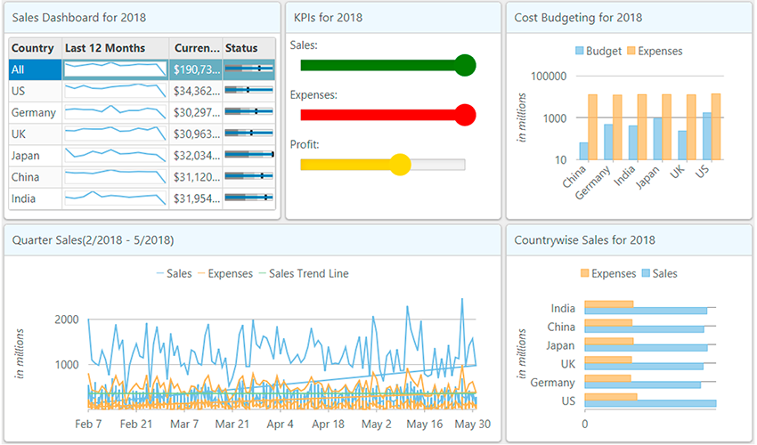
The Dashboard Layout is a layout control that lets you design dynamic screens and dashboards giving you a powerful layout system. Being able to choose layouts that fits screen requirements is the core feature of the control. Other built-in features include drag and drop, maximize and restore, and save and load layouts.

The control has four out-of-the-box layouts. They can be set using the respective Flow, AutoGrid, ManualGrid, and Split layout elements of c1-dashboard-layout.
Flow Layout

When the <c1-flow-layout> of <c1-dashboard-layout> control is used , it arranges child containers into either rows or columns, per the direction property. By default, the flow of items is wrapped at the control's edge, so when one column/row ends, another one automatically starts.
<c1-dashboard-layout id="dashboard">
    <c1-flow-layout direction="LeftToRight">
        <c1-flow-tile header-text="@("Cost Budgeting for " + Model.CostBudgetingStr)" width="303" height="303">
            <c1-flex-chart binding-x="Country" legend-position="Top" chart-type="Column" class="liContentChart">
                <c1-items-source source-collection="@Model.CostBudgetingData"></c1-items-source>
                <c1-flex-chart-axis c1-property="AxisY" title="in millions" format="g4,," log-base="10"></c1-flex-chart-axis>
                <c1-flex-chart-series name="Budget" binding="Budget"></c1-flex-chart-series>
                <c1-flex-chart-series name="Expenses" binding="Expenses" chart-type="Line"></c1-flex-chart-series>
                <c1-flex-chart-tooltip content="<b>{seriesName}</b><br/>{x} {y:c0}"></c1-flex-chart-tooltip>
                <c1-annotation-layer>
                </c1-annotation-layer>
            </c1-flex-chart>
        </c1-flow-tile>
        <c1-flow-tile header-text="@("Countrywise Sales for " + Model.CountrywiseSalesStr)" width="303" height="303">
            <c1-flex-chart binding-x="Country" chart-type="Bar" legend-position="Top" class="liContentChart">
                <c1-items-source source-collection="@Model.CountrywiseSalesData"></c1-items-source>
                <c1-flex-chart-axis c1-property="AxisX" format="g4,," title="in millions"></c1-flex-chart-axis>
                <c1-flex-chart-series name="Sales" binding="Sales"></c1-flex-chart-series>
                <c1-flex-chart-series name="Expenses" binding="Expenses"></c1-flex-chart-series>
                <c1-flex-chart-tooltip content="<b>{seriesName}</b><br/>{x} {y:c0}"></c1-flex-chart-tooltip>
                <c1-chart-animation animation-mode="All" easing="Swing" duration="400"></c1-chart-animation>
            </c1-flex-chart>
        </c1-flow-tile>
    </c1-flow-layout>
</c1-dashboard-layout>
The c1-flow-layout contains c1-flow-tile elements. The ac1-flow-tile can contain any arbitrary content, such as text, HTML elements, and MVC controls.
Auto Grid Layout

When you use the c1-auto-grid-layout of c1-dashboard-layout, it arranges the items in tabular form consisting of rows and columns in groups of c1-auto-grid-group. Each c1-auto-grid-group can contain one or more c1-auto-grid-tile, the c1-auto-grid-tile can contain HTML elements or MVC controls.
<c1-dashboard-layout id="dashboard">
    <c1-auto-grid-layout orientation="Vertical" max-rows-or-columns="3" cell-size="303">
        <c1-auto-grid-group>
            <c1-auto-grid-tile header-text="@("Cost Budgeting for " + Model.CostBudgetingStr)" row-span="1" column-span="1">
                <c1-flex-chart binding-x="Country" legend-position="Top" chart-type="Column" class="liContentChart">
                    <c1-items-source source-collection="@Model.CostBudgetingData"></c1-items-source>
                    <c1-flex-chart-axis c1-property="AxisY" title="in millions" format="g4,," log-base="10"></c1-flex-chart-axis>
                    <c1-flex-chart-series name="Budget" binding="Budget"></c1-flex-chart-series>
                    <c1-flex-chart-series name="Expenses" binding="Expenses" chart-type="Line"></c1-flex-chart-series>
                    <c1-flex-chart-tooltip content="<b>{seriesName}</b><br/>{x} {y:c0}"></c1-flex-chart-tooltip>
                    <c1-annotation-layer>
                    </c1-annotation-layer>
                </c1-flex-chart>
            </c1-auto-grid-tile>
            <c1-auto-grid-tile header-text="@("Countrywise Sales for " + Model.CountrywiseSalesStr)" row-span="1" column-span="1">
                <c1-flex-chart binding-x="Country" chart-type="Bar" legend-position="Top" class="liContentChart">
                    <c1-items-source source-collection="@Model.CountrywiseSalesData"></c1-items-source>
                    <c1-flex-chart-axis c1-property="AxisX" format="g4,," title="in millions"></c1-flex-chart-axis>
                    <c1-flex-chart-series name="Sales" binding="Sales"></c1-flex-chart-series>
                    <c1-flex-chart-series name="Expenses" binding="Expenses"></c1-flex-chart-series>
                    <c1-flex-chart-tooltip content="<b>{seriesName}</b><br/>{x} {y:c0}"></c1-flex-chart-tooltip>
                    <c1-chart-animation animation-mode="All" easing="Swing" duration="400"></c1-chart-animation>
                </c1-flex-chart>
            </c1-auto-grid-tile>
        </c1-auto-grid-group>
    </c1-auto-grid-layout>
</c1-dashboard-layout>
The orientation attribute of c1-auto-grid-layout specifies if the tiles are to be laid out vertically or horizontally. You can then specify the max-rows-or-columns attribute to limit this.
For example, if the orientation is vertical, then column count is limited to the specified number, and rows can be extended. A c1-auto-grid-tile can span multiple cells. To enable this, set the row-span and column-span attribute.
Manual Grid Layout
The c1-manual-grid-layout is similar to the Auto Grid layout; however, in manual grid layout, you can specify the row and column numbers where each c1-manual-grid-tile should be positioned.
If the row and column numbers of tiles are same then they will overlap. In the Auto Grid layout, this does not happen.
<c1-dashboard-layout id="dashboard">
    <c1-manual-grid-layout orientation="Vertical" max-rows-or-columns="3" cell-size="303">
        <c1-manual-grid-group>
            <c1-manual-grid-tile header-text="@("Cost Budgeting for " + Model.CostBudgetingStr)" row-span="1" column-span="1" row="1" column="3">
                <c1-flex-chart binding-x="Country" legend-position="Top" chart-type="Column" class="liContentChart">
                    <c1-items-source source-collection="@Model.CostBudgetingData"></c1-items-source>
                    <c1-flex-chart-axis c1-property="AxisY" title="in millions" format="g4,," log-base="10"></c1-flex-chart-axis>
                    <c1-flex-chart-series name="Budget" binding="Budget"></c1-flex-chart-series>
                    <c1-flex-chart-series name="Expenses" binding="Expenses" chart-type="Line"></c1-flex-chart-series>
                    <c1-flex-chart-tooltip content="<b>{seriesName}</b><br/>{x} {y:c0}"></c1-flex-chart-tooltip>
                    <c1-annotation-layer>
                    </c1-annotation-layer>
                </c1-flex-chart>
            </c1-manual-grid-tile>
            <c1-manual-grid-tile header-text="@("Countrywise Sales for " + Model.CountrywiseSalesStr)" row-span="1" column-span="1" row="2" column="1">
                <c1-flex-chart binding-x="Country" chart-type="Bar" legend-position="Top" class="liContentChart">
                    <c1-items-source source-collection="@Model.CountrywiseSalesData"></c1-items-source>
                    <c1-flex-chart-axis c1-property="AxisX" format="g4,," title="in millions"></c1-flex-chart-axis>
                    <c1-flex-chart-series name="Sales" binding="Sales"></c1-flex-chart-series>
                    <c1-flex-chart-series name="Expenses" binding="Expenses"></c1-flex-chart-series>
                    <c1-flex-chart-tooltip content="<b>{seriesName}</b><br/>{x} {y:c0}"></c1-flex-chart-tooltip>
                    <c1-chart-animation animation-mode="All" easing="Swing" duration="400"></c1-chart-animation>
                </c1-flex-chart>
            </c1-manual-grid-tile>
        </c1-manual-grid-group>
    </c1-manual-grid-layout>
</c1-dashboard-layout>
Split Layout

This type of layout is helpful when above layouts do not fulfill the requirements and a split layout is required. The c1-split-layout supports nesting. A c1-split-group can contain another c1-split-group with different Orientation than the parent.
Each such c1-split-group can contain a number of c1-split-tile. This can contain any HTML element or MVC control. This type of layout helps in adjusting the layout at runtime using the splits. Items in groups can be resized as one whole group or individually inside the group.
<c1-dashboard-layout id="dashboard">
    <c1-split-layout orientation="Horizontal">
        <c1-split-group orientation="Vertical">
            <c1-split-tile header-text="@("Cost Budgeting for " + Model.CostBudgetingStr)" size="*">
                <c1-flex-chart binding-x="Country" legend-position="Top" chart-type="Column" class="liContentChart">
                    <c1-items-source source-collection="@Model.CostBudgetingData"></c1-items-source>
                    <c1-flex-chart-axis c1-property="AxisY" title="in millions" format="g4,," log-base="10"></c1-flex-chart-axis>
                    <c1-flex-chart-series name="Budget" binding="Budget"></c1-flex-chart-series>
                    <c1-flex-chart-series name="Expenses" binding="Expenses" chart-type="Line"></c1-flex-chart-series>
                    <c1-flex-chart-tooltip content="<b>{seriesName}</b><br/>{x} {y:c0}"></c1-flex-chart-tooltip>
                    <c1-annotation-layer>
                    </c1-annotation-layer>
                </c1-flex-chart>
            </c1-split-tile>
            <c1-split-tile header-text="@("Countrywise Sales for " + Model.CountrywiseSalesStr)" size="*">
                <c1-flex-chart binding-x="Country" chart-type="Bar" legend-position="Top" class="liContentChart">
                    <c1-items-source source-collection="@Model.CountrywiseSalesData"></c1-items-source>
                    <c1-flex-chart-axis c1-property="AxisX" format="g4,," title="in millions"></c1-flex-chart-axis>
                    <c1-flex-chart-series name="Sales" binding="Sales"></c1-flex-chart-series>
                    <c1-flex-chart-series name="Expenses" binding="Expenses"></c1-flex-chart-series>
                    <c1-flex-chart-tooltip content="<b>{seriesName}</b><br/>{x} {y:c0}"></c1-flex-chart-tooltip>
                    <c1-chart-animation animation-mode="All" easing="Swing" duration="400"></c1-chart-animation>
                </c1-flex-chart>
            </c1-split-tile>
        </c1-split-group>
    </c1-split-layout>
</c1-dashboard-layout>
The Dashboard Layout control comes with following built-in features:
Drag and Drop

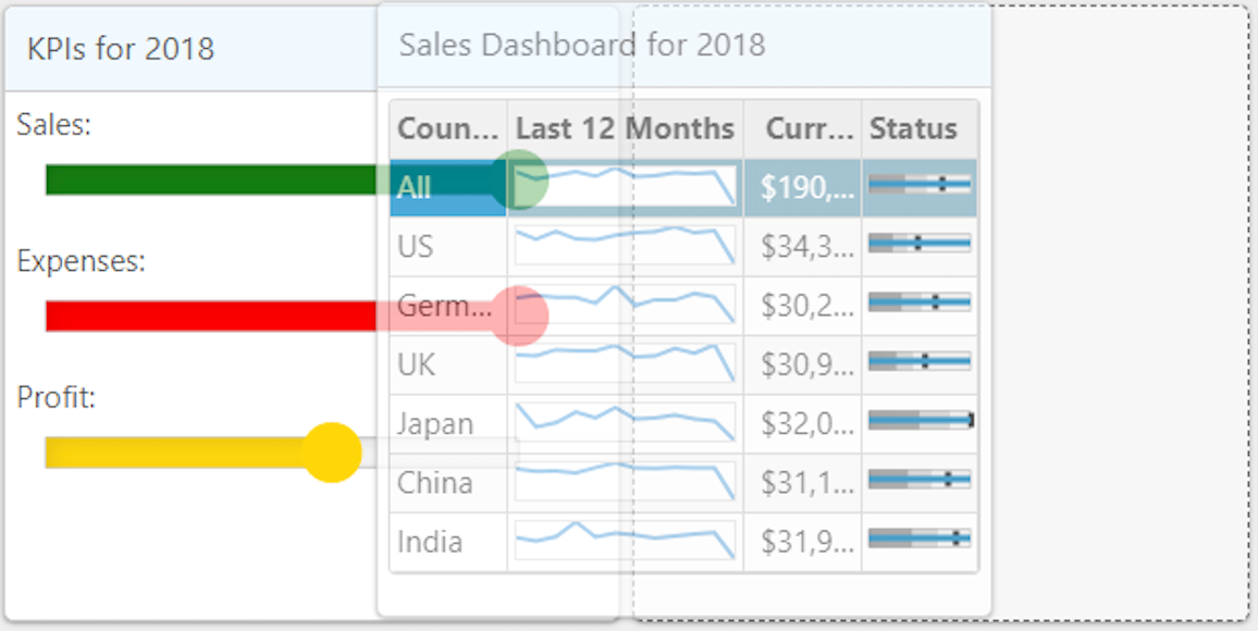
The control supports out-of-the-box drag and drop. On hovering over the child container, you can drag a child container from one position to another. Other child containers automatically adjust to this change as per the respective layout rules.
Maximize and Restore

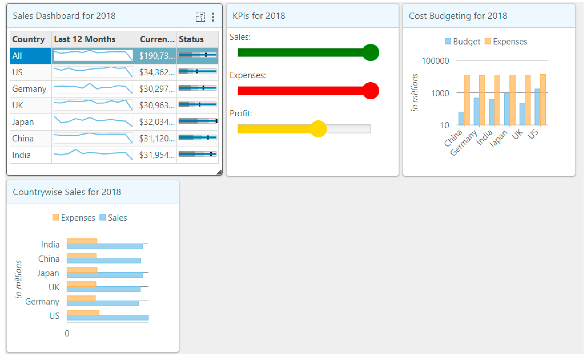
Child containers can be maximized and restored using the built-in icons. On maximizing the child container, it covers the parent surface like a model window, it can be restored using the corresponding restore icon. In the image, the restore icon can be seen in the top right corner.
Resizing

A child container can be resized using the mouse along the edges (as shown in the image). When you resize a control, an arrow is available along the edges during the resize. Other containers adjust as per the available space. For example, in Flow layout, when “Sales Dashboard for 2018” is further resized, “KPI for 2018” will move to a second row.
Save and Load Layout
Dashboard Layout provides a public API to save and load the layout to local storage in JSON format through the saveLayout and loadLayout methods. This feature is helpful if you need to save a particular layout and load, or to provide an option to users that may need to change layout and save it to load later.
Header and Tools

The control supports optional header and configurable toolbar for the child containers. This supports Captions for child containers. In addition, it has built-in support to Hide and ShowAll child containers. You can customize the toolbar by adding custom menus to the toolbar in the formatTile event.
Here is an example of using formatTile event to customize the toolbar and add a toolbarItem to export the chart:
    <script type="text/javascript">
        function formatTile(dashboardLayout, e) {
            var tile = e.tile,
                toolbar = e.toolbar;
            if(tile.headerText == ('Cost Budgeting for ' + '@Model.CostBudgetingStr')){
                var strExportIcon = '<img style="vertical-align:middle" src="@Href("~/Content/images/icon_export.png")" alt="Export" title="Export" />';
                toolbar.insertToolbarItem({
                    icon: strExportIcon,
                    title: 'Export',
                    command: function () {
                        var selector = e.tile.content,
                            chart = wijmo.Control.getControl(selector);
                        chart.saveImageToFile(selector.substr(1) + '.png');
                    }
                });
            }
        }
    </script>
Learn more about Dashboard Layout for ASP.NET MVC
