How to Quickly Create a React Datagrid in Your Web Application
Datagrids have been one of the most common visual software elements since the advent of UIs themselves. They appeal to the instinct that drives all of us to take in and understand as much data as possible, as quickly as possible. Datagrids are more useful than ever, not only for displaying data but also for editing it.
With automatic conveniences like sorting and autocomplete and advanced features like custom formulas, Microsoft Excel would be the natural choice for most users. Users choose Excel because it is familiar.
Although Excel has become the most common example of software using a datagrid, the paradigm has increased throughout the software field. As web apps continue to replace the traditional native applications we're used to, it only makes sense that datagrids would make their way to web app UIs.
Plenty of JavaScript datagrids exist in the market: open-source, third-party, and homegrown. Which to choose?
In another post, we discussed what makes datagrids so useful as UI elements and why FlexGrid is the best React datagrid. You can check out our React datagrid and see FlexGrid in action through our React datagrid overview sample. You can get your copy from NPM, from our CDN, or you can download it from our site.
All this sounds great, right? Let's put FlexGrid to work. In this React Datagrid example, we will build a customizable React datagrid in minutes. We'll use the following application to demonstrate how to use FlexGrid with React, Facebook's JavaScript framework: React Sample App
We used stackblitz to create the sample, so it is easy to maintain and share.
In this React datagrid tutorial we will cover the following:
- How to Create the React App
- How to Import the Required Modules
- Styling the App
- Adding a Data Source to Your Grid
- How to Visualize the Data in React
- How to Run the Application
Ready to Try FlexGrid? Download Wijmo Today!
How to Create the React App
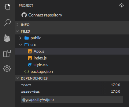
To create your copy of this React datagrid example app, follow these steps:
- Open stackblitz
- Click the "React/JavaScript" button at the top of the screen
- Add Wijmo to the project by typing "@grapecity/wijmo" into the dependencies list
How to Import the Required Modules
In the React version of the app, all the code and logic are contained in the index.js file.
The code starts by importing the required classes and styles from React and Wijmo:
import React from 'react';
import ReactDOM from 'react-dom';
import './style.css';

import { CollectionView } from '@grapecity/wijmo';
import { FlexGrid } from '@grapecity/wijmo.react.grid';
import { FlexGridFilter } from '@grapecity/wijmo.react.grid.filter';
import '@grapecity/wijmo.styles/wijmo.css';
import { sedanData } from './data.js';
Notice how, in addition to classes, the code imports some CSS. In this React datagrid tutorial, we chose Wijmo's material theme, one of several included with Wijmo.
Styling the App
To style the app, edit the styles.css file as follows:
body {
  font-family: Lato, Arial, Helvetica;
}
.wj-flexgrid {
  /* limit the grid's width and height */
  max-height: 300px;
  max-width: 32em;
}
Adding a Data Source to Your Grid
Our data source will be part of the App component's state, as usual, for React apps. Please see code for the data.js file.
The App component is defined as follows:
class App extends React.Component {
  constructor() {
    super();
    this.state = {
      data: new CollectionView([], {
        groupDescriptions: ['make'],
      }),
    };
    this.filterApplied = () => {
      let view = this.state.data;
      this.setState({
        data: view,
      });
    };
  }

  componentDidMount() {
    let view = this.state.data;
    view.sourceCollection = sedanData;
    this.setState({
      data: view,
    });
  }

  render() { ... }
The React datagrid example App state exposes the data through its "data" property, a CollectionView grouped by make. The data is loaded asynchronously after the component is mounted. When the data is received, it is assigned to the CollectionView's sourceCollection property and becomes available to the application.
The component also defines a filterApplied method used to update the state when the data is filtered. This component is necessary to update the total counts displayed in the app header.
Ready to Try FlexGrid? Download Wijmo Today!
How to Visualize the Data in React
The final step is implementing the App component's render method, which renders the whole UI, including the grid.
class App extends React.Component {
constructor() { ... }
componentDidMount() { ... }
render() {
return (
<div>
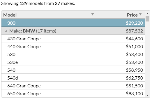
<h1>2023 Sedans (React)</h1>
<p>
Sort by model and price by clicking the column headers. Filter by
value or condition by clicking the filter icons in the column headers.
Collapse and expand makes to see all the models. Select one or more
models with the mouse or keyboard and copy your selection to the
clipboard.
</p>
<p>
Showing <b>{this.state.data.items.length}</b> models from{" "}
<b>{this.state.data.groups.length}</b> makes.
</p>
<FlexGrid
allowResizing={"None"}
showAlternatingRows={false}
isReadOnly={true}
selectionMode={"ListBox"}
headersVisibility={"Column"}
autoGenerateColumns={false}
columns={[
{ binding: "make", header: "Make", width: "*", visible: false },
{ binding: "model", header: "Model", width: "*" },
{
binding: "price",
header: "Price",
width: ".5*",
format: "c0",
aggregate: "Avg"
}
]}
itemsSource={this.state.data}
>
<FlexGridFilter filterApplied={this.filterApplied} />
</FlexGrid>
</div>
);
}
}
The app header contains a short app description and a summary of how many models and makes are displayed. The summary counts are updated automatically when the user filters the data. The header is followed by the "FlexGrid" element, which initializes the grid's properties, including the itemsSource, the columns to display, and their properties.
The column properties include the binding, header, format, and width for each column. Note that the aggregate property on the price column causes the React datagrid example to show the average price for each make in the group headers.
The "FlexGrid" element contains a "FlexGridFilter" element, which adds the column filter so that users may filter the grid data by model and price. The filterApplied event is used to update the state when the filter changes, so the page's top summary is updated.
How to Run the Application
That's it! The React version of the "2023 Sedans" app is ready.
Happy Coding! We hope you enjoyed this React datagrid tutorial. If you have questions or comments, be sure to enter them below, and if you'd like to learn more, check out our React DataGrid.
Ready to Try FlexGrid? Download Wijmo Today!
Related Blogs
Try Our JavaScript UI Components & Datagrid

Joel Parks