Data Visualization - Creating a .NET Election Prediction Report
With the upcoming United States Congressional elections in November, I thought it would be an interesting experience to create a report on the predicted outcomes of the election using an ActiveReports Page report. To do this, a few different controls were used. The one that had the greatest impact on the aesthetic value of this report was the Map control. I was able to easily present a color-coded map of the United States to indicate which states had Senate seats up for election. A pie chart and a bar chart were used to supplement the map and create a dashboard-style report of these numbers.
Data visualization: choosing the best chart
Both types of charts, the pie chart and bar chart, were used because they can best display the aggregate state totals of each predicted result in relation to one another. While the map control excels at showing each states’ individual predicted outcome, it does not show the valuable information that the pie chart and bar chart display.
You can use similar .NET report layouts such as this to display information on many other data topics, whether those are using a world map, United States map, or your own custom map. While the data driving the report is up to you to provide, ActiveReports gives you the power to quickly and easily create meaningful reports with rich data visualizations to display that data in whatever interpretation you wish to utilize. Keep reading below to follow along with how this report was created.

You can download the report and the data source.
Creating the election report
After creating a new Page report, adding the data source, and setting up the data set, set the report to the Landscape orientation, so that the page is wider than it is tall. Do this by clicking in the gray area of the designer, then, under properties, set the PaperOrientation to landscape.
Additionally, set the margins of the report to 0 inches (found within the Properties pane, labeled as 0 in). Doing so will allow us to enlarge the map and make it the focal point of this report. I chose to use a Page report for this report because I know exactly how much data I am working with, and wanted it to be a straight-forward, one-page report.
Drag and drop the Map control on to the design surface of the report. Select USA Map to bring up a map template of the United States.
Click inside the map so the zoom bar, four arrows, and PolygonLayer1 are all visible. The zoom bar allows you to zoom in on the map, which is especially useful if you only need to focus on certain geographical regions, such as the Northeast or Southwest corners of the continental States. The four arrows will move the map according to which arrow is clicked. PolygonLayer1 is our layer of shapes (the States) overlaying the longitude and latitude guidelines. Right-click PolygonLayer1 and select Layer Data.
Navigate to the Analytical data tab and set the dataset to our report’s dataset. Click the green plus sign, and match STATE_ABBR to =Fields!StateAbbrev.Value. Click OK, then right-click PolygonLayer1 and select Edit. In the General tab, set Label text to #STATE_ABBR so that each state is labeled with its respective abbreviation.
Using custom colors
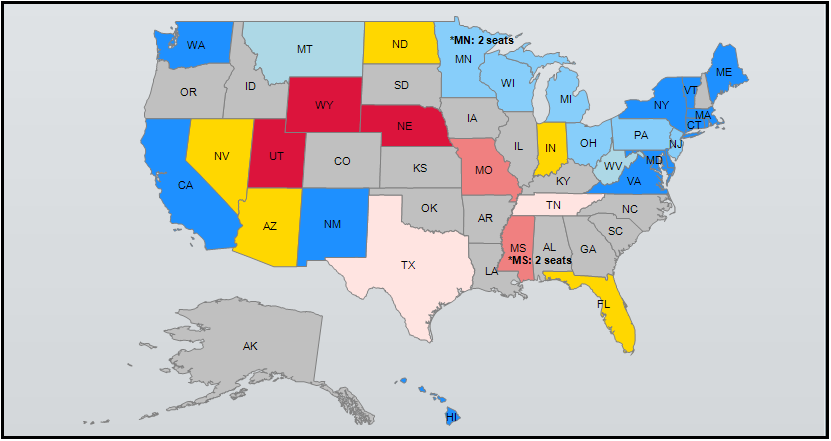
In the Color Rule tab, select the radio button option for Visualize data by using custom colors. In the Data field drop-down, click expression, and set the data field to be =Fields!ElectionType.Value. This will display custom colors over the states to correspond with each state’s predicted election outcome.
Next, add in our custom colors. The colors I used were: LightBlue (leans Democrat), MistyRose (leans Republican), LightSkyBlue (likely Democrat), LightCoral (likely Republican), Silver (no election), DodgerBlue (safe Democrat), Crimson (safe Republican), and Gold (toss up). Now return to the designer and preview the report. You should observe a color-coded map of the United States according to the predicted outcome of the upcoming elections.
Designing for data visualization
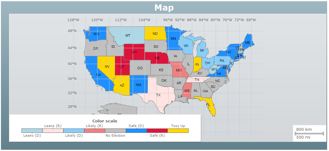
Let's add additional design elements to supplement the information being presented. We’ll adjust aspects of the map’s visual element. First, we’ll hide the Distance Scale, since it’s not necessary in this situation. Expand the DistanceScale property in the Properties pane and set the Hidden property to True. Next, we’ll hide the Color Scale. We will create our own report-level legend later on because we are using the same colors for multiple visualizations on the report. This will provide a better aesthetic to the report, and make it more evident that the legend applies to both the Map and the Doughnut chart. Expand the Viewport property and set the GridUnderContent property to True, so that the map is in front of the Latitude and Longitude guidelines. You can get rid of these entirely by setting the Hidden property of Meridians and Parallels to True. This helps declutter the map and makes it easier to see. Expand the Margins property and set all margins to 0. After this, adjust the location of the map layer to your preference. I used the navigation arrows to center the map.
The final modification to the map will be labeling the two special cases in our data. Since Minnesota and Mississippi both have both Senate seats up for election this year, we need to create two labels to make note. The placement of these labels requires some guess-and-check work, since the map at design-time does not mimic the map at run-time. Create the labels, place them accordingly, and preview the report. Now we have a complete, informative map without any elements hiding other aspects of the map. To the left of the map, we need to create our report-level legend. Create nine textboxes, one for each election prediction outcome and one for the legend header. Set the text value in each textbox accordingly, and the BackgroundColor property of the textboxes to the corresponding colors.
The final touches of this report require only a few simple steps involving some supplemental data visualizations. First, add a Chart control below the map, making it about 1/3 the width of the Map control. Select the chart, then click chart appearance underneath the Properties pane, highlighted in blue.
In the Gallery tab, click Advanced, then select Exploded Doughnut. From the Report Explorer, drag the ElectionType data field into the Chart’s ‘category fields’ section, and the StateName data field into the Chart’s ‘data fields’ section.
This pie chart will now display the number of states per election prediction. We can update the title as such by clicking chart appearance and navigating to the Title tab. While in this menu, click the Palette tab so that we can match the colors of the chart with the colors of the map. In the palette drop-down, select Custom. Add the following colors in this order to match the two controls’ colors: Gold, DodgerBlue, LightSkyBlue, LightCoral, LightBlue, Crimson, MistyRose. Your doughnut-style pie chart should now look like this at design-time:
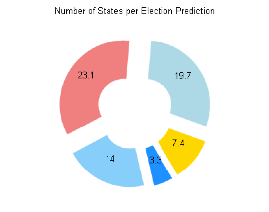
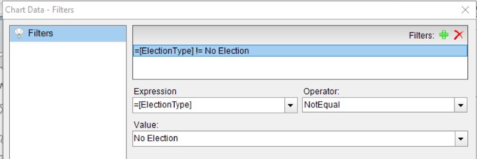
You may have noticed that we did not include Silver in this palette to represent states with no elections for a Senate seat. We are going to filter the chart to exclude states with no election, since this chart should only focus on the number of states with elections. Select the chart and find the Filters property in the Properties pane. Click the ellipsis and, once the Filters window appears, click the green plus sign to add a new filter. Set the first drop-down item as =[ElectionType], the second as NotEqual, and the third as No Election.
Now when we preview the report, the doughnut chart only displays the total states per election type excluding the ones with no election.
The last addition to the report will be a bar chart to round out the distribution of data visualizations. Add another chart control to the report design surface and select "Bar" as the chart type. Drag the ElectionType data field into the bar chart’s category fields section, and the NumSeats data field into the bar chart’s data fields section. Right-click the NumSeats data field that was just added and select ‘Edit’. Under Value, change the expression from =Count([NumSeats]) to =SUM([NumSeats]) so that the bars depict the sum number of seats per election prediction. If you wish, you can change the color of the bars in the chart, as well as the intervals of the grid lines and the Chart/Axes titles. Finally, filter the chart to exclude states without an election this year, following the same process as we took with the pie chart filter.
With the bar chart added, we now have a complete dashboard-style report representing data on the predicted outcomes of the upcoming elections in November. A .NET Page report with a map is great to have, but a .NET Page report with a map and supplemental data visualizations is even better! The map tells one story (the predicted outcome on a state-by-state basis), but the pie chart and bar chart help tell a completer and more overarching story (the total numbers of states and seats for each predicted outcome category) to assist with a more thorough analysis of the upcoming elections.
Visualizing the data in this way does not limit the report to only one story, but rather it transforms the data to allow for a better understanding of the predicted outcomes. Similar reports like this could be used for many things, such as Presidential elections, country-wide sales dashboards, global economics reports, and more. There are many controls and customization options to take advantage of when creating reports with ActiveReports, so this is just one of many ways to design such a report.
Download the report files to create this report

Ethan Conner