How to Show the RadioButton in a ComponentOne FlexGrid Tree
In ComponentOne Studio, C1FlexGrid is one of the controls that does not need any introduction. It is a powerful data management tool. As mentioned in its key features, the grid allows display of data in hierarchical form.
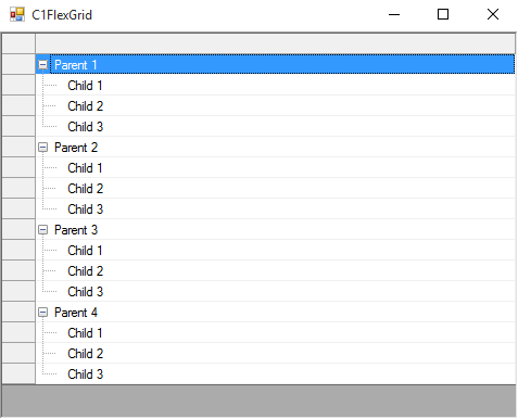
In hierarchical display, it can also show a CheckBox before any node row, using Node.Checked property. These checkboxes before parent nodes can, then, be used to add functionality such as enabling/disabling or selecting/deselecting all of its child nodes in the tree.
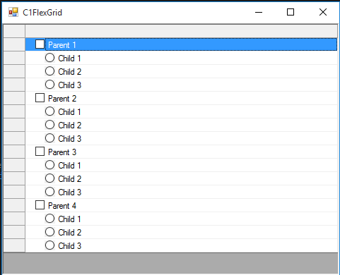
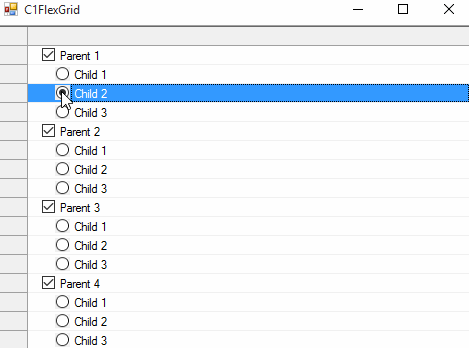
Recently, we came across a requirement where the user wanted to show RadioButton in place of these checkboxes, but for child nodes only. And, checking/unchecking a parent node should enable/disable its child nodes for selection.
Is it even possible to show RadioButton in Tree?
The answer is Yes. The trick is to display RadioButton images using Node.Image property of child nodes in the grid.
Node child = c1FlexGrid1.Rows.AddNode(1);
child.Image = Image.FromFile("../../Resources/Img_Unchecked.png");
We have just displayed these images. Now, we need to disable/enable child nodes when the parent node has been unchecked/checked. In order to meet this requirement, CellChecked event of the grid becomes a good choice. It gets fired when the user unchecks/checks a parent node.
private void C1FlexGrid1_CellChecked(object sender, RowColEventArgs e)
{
   //Get the checked/unchecked node row
   Node node = c1FlexGrid1.Rows[e.Row].Node;
   //If node row is itself a parent
   if (node.Parent == null)
   {
      //If checked
      if (node.Checked == CheckEnum.Checked)
      {
         //For each child row
         foreach(Node childNode in node.Nodes)
         {
            //Enabled
            childNode.Row.AllowEditing = true;
            childNode.Row.StyleNew.BackColor = Color.White;
         }
      }
      //If unchecked
      else if(node.Checked == CheckEnum.Unchecked)
      {
         //For each child row
         foreach (Node childNode in node.Nodes)
         {
            //Disabled
            childNode.Row.AllowEditing = false;
            childNode.Row.StyleNew.BackColor = Color.LightGray;
         }
      }
   }
}
Next, it comes to handle toggling of RadioButton of enabled child nodes through code in MouseDown event of the grid.
private void C1FlexGrid1_MouseDown(object sender, MouseEventArgs e)
{
   HitTestInfo hti = c1FlexGrid1.HitTest(e.Location);
   //Get node row corresponding to clicked row
   Node node = c1FlexGrid1.Rows[hti.Row].Node;
   Rectangle cellBounds = c1FlexGrid1.GetCellRect(hti.Row, hti.Column);
   //If it is a child row
   if(node.Parent != null)
   {
      //Only for RadioButton
      if (hti.Column == 1 && node.Level == 1 && (hti.X >= cellBounds.X + 33) && (hti.X <= cellBounds.X + 43))
      {
         //Check if enabled
         if(node.Row.AllowEditing)
         {
            //Currently unchecked
            if (Convert.ToInt32(node.Key) == 0)
            {
               //Checked state
               node.Image = Image.FromFile("../../Resources/Img_Checked.png");
               node.Key = 1;
            }
            //Currently checked
            else
            {
               //Unchecked state
               node.Image = Image.FromFile("../../Resources/Img_Unchecked.png");
               node.Key = 0;
            }
         }
      }
   }
}
In the above implementation, we store 0/1 in Node.Key property: 0 for Unchecked state and 1 for Checked state.
If there comes the need of displaying controls other than RadioButton, no problem! Since you know the approach now, you can use your custom icons as well.
Happy development using ComponentOne!
If you have any questions about this tutorial, please leave us a comment. Additionally, if you have a request for a specific demo, be sure to leave a comment below!

Meenakshi Singh