Using GrapeCity's FlexGrid with Web Components
Web Components are a set of features that support the creation of custom HTML elements. In practice, Web Components allow the browser to take over many responsibilities typically performed by JavaScript frameworks. The benefits are clear—more standardization and better performance.
Web Components are an emerging standard. They're already supported in all modern browsers, but there are still some limitations that hopefully will be removed soon. Wijmo supports Web Components with an interop module that is currently in Beta. You can learn more about Web Components and how see how Wijmo supports Web Components, or see a sample here.
In another post, we discuss what makes data grids so useful as UI elements and how to build a React datagrid in minutes. You can see the FlexGrid in action and learn more about it using our Learn Wijmo application. You can get your copy from NPM, from our CDN, or you can download it from our site.
Let's put FlexGrid to work, building a customizable data grid that implements Web Components.
This is the Web Component version of the "2019 Sedans" app:
https://stackblitz.com/edit/js-2z2sl8
We used stackblitz to create the sample so it's easy to maintain and share.
Create a Plain JavaScript App
To create your own copy of the app, follow these steps:
- Open stackblitz
- Click the "Javascript/Blank Project" button at the bottom of the screen
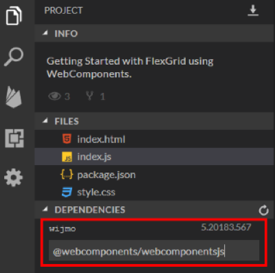
- Add Wijmo and the Web Component interop to the project by typing "wijmo" and "@webcomponents/webcomponents.js" into the dependencies list:
Import the Required Modules
Add this code to the index.js file to import the classes and styles the app needs:
// index.js

// to use WebComponents with ES5 code (Wijmo loaded from public npm)
import '@webcomponents/webcomponentsjs/custom-elements-es5-adapter';

// to support IE11/Edge
import '@webcomponents/webcomponentsjs/webcomponents-bundle';

// Import Wijmo components
window['wj-control-is-element'] = true;
import { CollectionView } from 'wijmo/wijmo';
import 'wijmo/wijmo.webcomponents.grid';
import 'wijmo/wijmo.webcomponents.grid.filter';

// Import stylesheets
import 'wijmo/styles/themes/wijmo.theme.material.css';
import './style.css';
The code imports the CollectionView, FlexGrid, and FlexGridFilter classes as well as Wijmo's material theme.
Add the Data Source
Add this code to the index.js file to load the data into a grouped CollectionView:
// index.js
var data = new CollectionView([], { // grouped CollectionView
  groupDescriptions: ['make']
});
fetch('https://api.myjson.com/bins/cqvk8')
  .then(result => result.json())
  .then(arr => {
    data.sourceCollection = arr;
    updateCounts();
  });

// update model and make counts
function updateCounts() {
  document.getElementById('models').textContent = data.items.length;
  document.getElementById('makes').textContent = data.groups.length;
}
The code creates a CollectionView grouped by "make" then uses the fetch API to load the data asynchronously from the JSON data source. When the data arrives, the code assigns it to the CollectionView's sourceCollection property and updates the model and make count elements on the page.
Create the HTML
The index.html file defines the application's UI:
<!-- index.html -->
<h1>
  2019 Sedans (WebComponents)
</h1>
<p>
  Sort by model and price …</p>
<p>
  Showing
  <b id="models">0</b> models from
  <b id="makes">0</b> makes.</p>

<wjc-flex-grid id="theGrid"
  allow-resizing="None"
  show-alternating-rows="false"
  is-read-only="true"
  selection-mode="ListBox"
  headers-visibility="Column"
  auto-generate-columns="false">

  <wjc-flex-grid-column binding="make" header="Make" width="*" visible="false">
  </wjc-flex-grid-column>
  <wjc-flex-grid-column binding="model" header="Model" width="*">
  </wjc-flex-grid-column>
  <wjc-flex-grid-column binding="price" header="Price" width=".5*" format="c0"
     aggregate="Avg">
  </wjc-flex-grid-column>

  <wjc-flex-grid-filter id="theFilter"></wjc-flex-grid-filter>
</wjc-flex-grid>
The "theGrid" element is a FlexGrid, now implemented as custom element. It contains column elements and a filter element that represent the grid columns and the column filter. The properties are set using regular HTML attributes.
Unfortunately, we cannot set the grid's itemsSource property or add a handler to the filter's filterApplied event using markup. This is a limitation imposed by the current state of the Web Component standard, and we hope it will be removed soon when a declarative binding standard emerges.
For now, we must work around these limitations by adding some code to the index.js file:
// index.js

// assign the data source to the grid (can't do this in markup yet...)
var theGrid = document.getElementById('theGrid');
theGrid.itemsSource = data;

// update counts after applying filter
var theFilter = document.getElementById('theFilter');
theFilter.addEventListener('filter-applied', () => {
  updateCounts();
});
Style the App
To style the app, edit the styles.css file as follows:
/* styles.css */
body {
  font-family: Lato, Arial, Helvetica;
}
wjc-flex-grid.wj-web-component {
  display: block;
}
.wj-flexgrid {
  max-height: 300px;
  max-width: 32em;
}
Run the Application
That's it! The Web Component version of the "2019 Sedans" app is ready:
https://stackblitz.com/edit/js-2z2sl8

Bernardo de Castilho