Posted 10 June 2021, 4:19 am EST
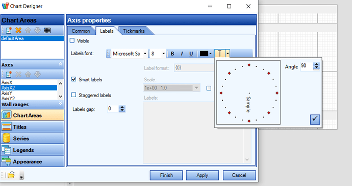
I have had troubles getting my category labels to work for my points values that contain dates. Note how the very first DateTime stamp shows on the left-most side, but not on right-hand side. It just cuts off the right-most value from the label. Can you advise on how I can show my right-most value in the X-Axis label?
var currentSeries = FindMySeriesByName(series, groupByVal);
            if (currentSeries != null)
            {
                currentSeries.AxisY = yAxis;
                currentSeries.AxisX = xAxis;
                currentSeries.AxisX.LabelFormat = "{0:d}\n{0:t}";
                currentSeries.AxisX.LabelsGap = 1;
                currentSeries.AxisX.SmartLabels = false;
                var lastSeriesVal = currentSeries.Points[currentSeries.Points.Count - 1];

//I've even tried adding a "dummy point" to move the label to show the last value
                if (DateTime.TryParse(lastSeriesVal.XValue.ToString(), out DateTime lastSeriesValue))
                    currentSeries.Points.Add(new DataPoint(lastSeriesValue.AddMonths(3), new DoubleArray( new double[] { 0.0 }), true));

                currentSeries.AxisX.Title = "Date Collected";
                var ySuffix = string.Empty;
                if (yAxis.Max > 1000.0)
                    ySuffix = $" (Thousands)";
                if (yAxis.Max > 1000000.0)
                    ySuffix = $" (Millions)";
                currentSeries.AxisY.Title = "RLU Reading "  + ySuffix;

                rluChartControl.Titles[0].Text = currentSeries.Name;
                rluChartControl.Series.Add(currentSeries);
```[img]https://gccontent.blob.core.windows.net/forum-uploads/file-3344d0d9-b2dc-4940-9ea7-d522e833fb93.png[/img][img]https://gccontent.blob.core.windows.net/forum-uploads/file-456ff60a-b4e0-4ba9-87ea-2d5a56cedb22.png[/img]

