Charts

Posted by: Luis.Alvarez on 21 January 2019, 6:13 am EST

    • Post Options:
    • Link

    Posted 21 January 2019, 6:13 am EST

    Hello,

    I’m trying to create a simple line chart that only shows the data points, a chart title, and the X/Y axis with ticks. I have been able to plot the data points and the chart title but I have not been able to prevent the application from showing the “Series 1” label and associated graphic and this makes my chart smaller and it is not necessary since I have only one data set. I have tried using some of the examples from the Help application but the “Series 1” label is still there. I’m also trying to get the chart to automatically detect that the values are negative and display the X-Axis on the top. And to show only specific ticks for example I have 27 data points and I want the X axis to show a tick every 3 data point.

    |-----|----|----|

    0 3 6 9

    Thanks,

    Luis
  • Posted 21 January 2019, 6:15 am EST

    The tick representation that I want should have the number under the tick. The alignment looked good until I posted my message.

    |

    x

  • Posted 22 January 2019, 1:22 am EST

    Hello,

    To customize the axis, I would suggest you to please go through the documentation given here:

    https://help.grapecity.com/spread/SpreadWPF/webframe.html#chartaxis.html

    Also to change the series label you can set the series name as follows:

    GrapeCity.Windows.SpreadSheet.Data.SpreadDataSeries aseries = new GrapeCity.Windows.SpreadSheet.Data.SpreadDataSeries();
    aseries.Name = "1234";
    

    to show the negative values you need to set:

    aseries.InvertIfNegative = true;
    

    To change the minor/major ticks on axis you can use the code as shown in th example below:

    chart.AxisX.Min = 2;
    chart.AxisX.Max = 5;
    chart.AxisX.AutoMin = true;
    chart.AxisX.AutoMax = true;
    chart.AxisX.MinorUnit = 2;
    chart.AxisX.MajorUnit = 3;
    

    Please visit:

    https://help.grapecity.com/spread/SpreadWPF/webframe.html#chartunder.html

    Thanks,

    Deepak Sharma

  • Posted 22 January 2019, 2:59 am EST

    Deepak,

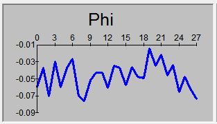
    Thanks for your prompt response but none of your suggestions answer my needs. I have already tried the example code that is shown in the web pages you list without success. Attached is a picture of what I’m trying to achieve.

    Here are the results of what I tried:

    aseries.Name = “1234”; - The series name changes but if I just use = “” I get “Series 1” if I use = " " I get a horizontal line with no text above it. I’m looking for both text and line not to be displayed, just the linear graph.

    aseries.InvertIfNegative = true; - No apparent change on the graph. The graph I’m getting shows both positive and negative ticks (2 to -10) and the negative data is plotted. What I’m looking for is for the X-Axis to be displayed on top and the Y-Axis to only display the negative values.

    The tick code lines. I have tried quite a few variations. For instance if I use chart.AxisX.MajorUnit = 3 for a linear graph with 5 data points what I’m looking for is for the x-Axis to show 5 tick marks and a “0” label below the origin, a “3” label below the third tick mark, and a '5" below the last tick mark. What I’m getting is

  • Posted 22 January 2019, 3:02 am EST - Updated 29 September 2022, 6:09 am EST

    Sorry, I posted an incomplete reply.

    What I’m getting is two tick marks on the X-axis. One “0” on the origin and a second one “1” where the third value is. The plotted data does not change.

    Thanks,

    Luis

  • Posted 23 January 2019, 1:43 am EST - Updated 29 September 2022, 6:09 am EST

    Hello,

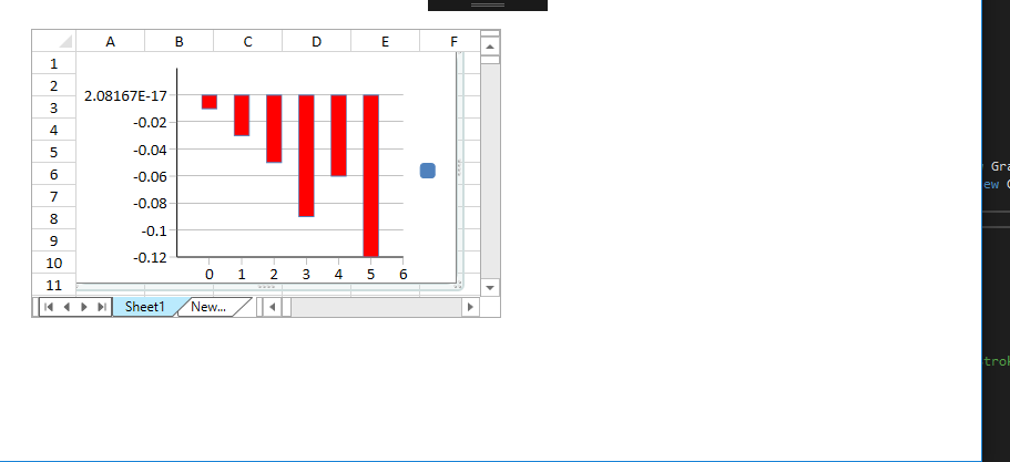
    I tested for negative values and it shows the 0000 in scientific format. Please refer to the attached image.

    Also setting the series.Name =" " makes the series name blank. Please refer to the screenshot attached.

    Please provide me your sample application where you are seeing the ‘0.01’ as the first value on negative axis so I can debug it further.

    Thanks,

    Deepak Sharma

  • Posted 23 January 2019, 5:12 am EST

    Deepak,

    The picture I attached (right above your response) represents the display that I would like to get using Spread. Basically, can Spread allow the user to omit the “series 1” label and associated graphic (blue square in your screen shot) so that the graph can use this additional space? I just want the X axis, the Y-Axis and the data to be shown. Can the tick labels be shown at specific intervals? Using your screen shot I would like the major tick lines the way they are shown but the number labels below the tick lines to only be shown every third tick so that my graph will show on the X axis the following labels 3 and 6. The example lines you listed do not provide the tick display that I’m looking for. When all the values are negative can I get the X-Axis to be on the top of the graph with the tick number labels shown right above the X axis and not below (I tried .crossAt and the X-Axis was displayed on the top but the tick number labels were displayed below the X-axis instead of above it.

    Thanks,

    Luis

  • Posted 23 January 2019, 9:04 pm EST

    Hi Luis,

    I was able to create the chart as shown in the image with two issues:

    1. The Legend with series name is still visible. There seems to be no property exposed to hide it directly.
    2. The interval can be set to 3 but the axis label shown as “1, 2, 3,” where they indicate the item at 3rd, 6th and 9th position.

    Please refer to the attached sample.

    I have asked the development team to look into this further. I will let you know as soon as I get an update on it. The tracking id for this issue is 269484.

    Thanks,

    Deepak Sharma

    SpreadWpfChart.zip[img]https://gccontent.blob.core.windows.net/forum-uploads/file-b21ce245-312d-4e30-861c-1caf43561cec.png[/img]

Need extra support?

Upgrade your support plan and get personal unlimited phone support with our customer engagement team

Learn More

Forum Channels