
Posted 7 March 2023, 5:11 am EST - Updated 7 March 2023, 5:16 am EST
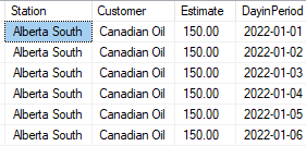
I have a dataset similar to the below
I want to create a line chart that will show the daily revenue by station but for the life of me I can’t get it to show properly. Suggestions please??


