An axis is used to display the scale for a single dimension of a plot area. An axis can have a title, a ruler line, major/minor tick marks, tick mark labels, major/minor grid lines, and stripes. The direction of the axis can be reversed. The minimum, maximum, major/minor tick, and label units can be automatically generated or manually assigned. The scale can be linear or logarithmic.
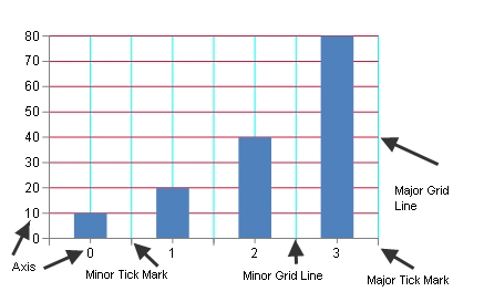
Tick marks and grids are used to mark individual values on the ruler. Tick marks are painted on the ruler while corresponding grids are painted on the wall(s). Stripes are used to highlight ranges of values. Stripes are painted on the wall(s).
The title, ruler, tick marks (major and minor), tick mark labels, and grids (major and minor) can be hidden.
A font can be set for the title and tick marks and the title can be customized. The title and tick mark labels can have fill effects.
The axis can have lines for the ruler, major, and minor grids as well as a minimum and maximum value. The minimum and maximum values can be automatically generated by the chart view.
Units can be assigned for major and minor tick marks and tick mark labels. The units can also be automatically generated for the chart view. Length (measured in model units), can also be set for major and minor tick marks. The units can be automatically generated.
An axis can be assigned a collection of stripes. A stripe represents a range of values on the axis and is used to highlight a range of values on a given axis. A stripe is associated with an axis, but is painted on a wall.
An index axis is used to display integer values such as a category or series index. Tick marks, tick mark labels, and grid lines can be displayed on the integer values or between the integer values. A value axis is used to display double values (data values). The value axis can have a linear or logarithmic scale (when using a logarithmic scale, the value axis can use a logarithmic base). For more information, see the following classes:
Markers represent a data point and can have many shapes. For more information, see the MarkerShape enumeration:
Use properties in the plot area classes to set axis options.
The following example sets a title for the axis.
| C# |
Copy Code
|
|---|---|
YPlotArea plotArea = new YPlotArea(); plotArea.Location = new PointF(0.2f, 0.2f); plotArea.Size = new SizeF(0.6f, 0.6f); plotArea.XAxis.Title = "Categories"; plotArea.YAxis[0].Title = "Values"; |
|
| VB |
Copy Code
|
|---|---|
Dim plotArea As New FarPoint.Web.Chart.YPlotArea() plotArea.Location = New PointF(0.2F, 0.2F) plotArea.Size = New SizeF(0.6F, 0.6F) plotArea.XAxis.Title = "Categories" plotArea.YAxis(0).Title = "Values" |
|