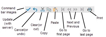
You can customize how (and if) the command buttons are shown in the command bar. The figure below shows the default display of the command buttons using the images (or icon) type of display.
The various settings of the command bar are handled using the CommandBarInfo class.

For more information, please refer to Working with the SaveExcel button on the CommandBar.

Which command buttons appear in the command bar change if you set the EnableClientScript property to false for the component. Fewer buttons are displayed, due to the limitations of not providing scripting on the client.
The type of buttons displayed in the command bar can be any of these types:
| Button Type | Enumeration Setting | Typical Default Display |
|---|---|---|
| Images (or icons) | ImageButton |
|
| Text links | LinkButton |
|
| Push-buttons | PushButton |
|
Refer to the ButtonType enumeration and the ButtonType property. Note that the buttons appear grayed out or inactive until they can be used. The figures shown above show all the buttons active. The link type command button option requires that the client-side scripting be disabled (FpSpread class, EnableClientScript property set to false). Client-side operations such as cut, copy, and paste are not available when scripting is disabled so buttons for those operations do not appear on the command bar.
The properties that affect the appearance of the buttons include these:
| CommandBarInfo Property | Appearance Description |
|---|---|
| ButtonFaceColor | the background color of the buttons |
| ButtonHighlightColor | the color of the top and left outline of the buttons |
| ButtonShadowColor | the color of the bottom and right outline of the buttons |
| Font | the color of text in the buttons |
Remember that to update the data on the server, changes must be saved from the client. Changes from the client can be saved either by using the SaveChanges method in code or by having the user click the Update button on the command bar.
For other ways to customize parts of the command bar, refer to Customizing the Command Bar on the Component.
Use the properties of the CommandBarInfo class to define the appearance of the buttons.
In this example, some of the button properties of the command bar are set. The result is shown in this figure.

| C# |
Copy Code
|
|---|---|
FpSpread1.CommandBar.Background = null; FpSpread1.CommandBar.BackColor = Color.Yellow; FpSpread1.CommandBar.ButtonFaceColor = Color.YellowGreen; FpSpread1.CommandBar.ButtonTextColor = Color.RoyalBlue; FpSpread1.CommandBar.ButtonType = FarPoint.Web.Spread.ButtonType.PushButton; FpSpread1.CommandBar.Font.Bold = true; FpSpread1.CommandBar.Font.Name = "Comic Sans MS"; FpSpread1.CommandBar.Visible = true; |
|
| VB |
Copy Code
|
|---|---|
FpSpread1.CommandBar.Background = Nothing FpSpread1.CommandBar.BackColor = Color.Yellow FpSpread1.CommandBar.ButtonFaceColor = Color.YellowGreen FpSpread1.CommandBar.ButtonTextColor = Color.RoyalBlue FpSpread1.CommandBar.ButtonType = FarPoint.Web.Spread.ButtonType.PushButton FpSpread1.CommandBar.Font.Bold = True FpSpread1.CommandBar.Font.Name = "Comic Sans MS" FpSpread1.CommandBar.Visible = True |
|