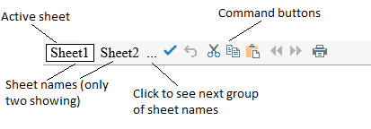
You can customize how and if to display the sheet names in the bar at the bottom of the component. Since a component may have more than one sheet, the tabs (or buttons) in the command bar contain the sheet names and provide a way to navigate to different sheets. These are called sheet name tabs. The default sheet names are Sheet0, Sheet1, etc. You can specify other names for the sheets and these appear in the sheet name tabs. By default, the component has only one sheet and so no sheet name tabs are displayed. When you add a sheet, as described in Adding a Sheet, the sheet name tabs are added to the command bar for display.
You can set how many sheet name tabs are displayed. If the number of tabs exceeds the value specified, an ellipses is displayed. Click the ellipses to display the next (or previous) set of sheet names. You can also set the increment for advancing the sheet names. Be sure not to set the increment bigger than the number displayed if you want to be able to see all the sheet name tabs. You can set which sheet number displays first. These are all properties of the TabInfo class.
Note: The sheet changes when you click a different sheet name tab or when you click on the ellipses. When you click on the ellipses, the lowest number sheet in the set of sheet names is displayed.
In this example, set the sheet name tabs to always appear below the sheet at the bottom of the component and show only two sheet names (two tabs) and set the background color of the active tab to green.
| C# |
Copy Code
|
|---|---|
FpSpread1.Sheets.Count = 3; FpSpread1.Tab.TabControlPolicy = FarPoint.Web.Spread.TabControlPolicy.Always; FpSpread1.Tab.VisibleCount = 2; FpSpread1.Tab.ScrollIncrement = 2; FpSpread1.Tab.FirstVisibleTab = 1; FpSpread1.Tab.TextColor = Color.Yellow; FpSpread1.Tab.ActiveTabBackColor = Color.Green; FpSpread1.Tab[0] = "First"; FpSpread1.Tab[1] = "Second"; FpSpread1.Tab[2] = "Third"; |
|
| VB |
Copy Code
|
|---|---|
FpSpread1.Tab.TabControlPolicy = FarPoint.Web.Spread.TabControlPolicy.Always FpSpread1.Sheets.Count = 3 FpSpread1.Tab.VisibleCount = 2 FpSpread1.Tab.ScrollIncrement = 2 FpSpread1.Tab.FirstVisibleTab = 1 FpSpread1.Tab.ActiveTabBackColor = Color.Green FpSpread1.Tab.TextColor = Color.Yellow FpSpread1.Tab(0) = "First" FpSpread1.Tab(1) = "Second" FpSpread1.Tab(2) = "Third" |
|