Spread Windows Forms 17
Spread Windows Forms 17.0 Product Documentation / Developer's Guide / Headers / Customizing the Appearance of Headers / Customizing the Header Grid Lines
In This Topic
    Customizing the Header Grid Lines
    In This Topic

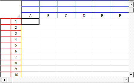
    You can specify the grid lines for a header in ways similar to setting the grid lines for a sheet. For more information on grid lines, refer to Displaying Grid Lines on a Sheet. In the following figure, the row header grid lines are three-dimensional with red hues and the column header grid lines are three-dimensional with blue hues.

    Example of Spread with Custom Header Grid Lines

    You can specify the horizontal grid lines separately from the vertical grid lines. You can specify the column header grid lines separately from the row header grid lines.

    In code, you can customize the grid lines in a header either in the row or column header classes or in the SheetView class. You can use any of the following:

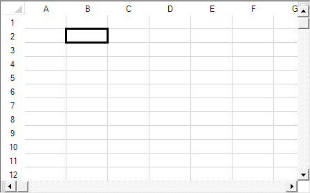
    You can also set the headers to not show any grid lines, as shown in the following figure, by setting the grid line type to None.

    Headers with no grid lines

    Using the Properties Window

    1. At design time, in the Properties window, select the particular sheet from the selection drop-down list.
    2. Another way to select the sheet is to select the Spread component, select the Sheets property, and click the button to display the SheetView Collection Editor, and in the Members list, select the sheet.
    3. To set the row header (or column header) horizontal grid line color or vertical grid line color,
      1. Select the RowHeader object (or ColumnHeader object) in the property list, and expand the list of properties under that object.
      2. Select the HorizontalGridLine property or the VerticalGridLine property, and expand the list of properties under that object.
      3. If you want to display three-dimensional grid lines, set the Type property to Lowered or Raised.
      4. If the grid lines are not three-dimensional, select the Color property, and then click the drop-down button to display the color picker. Select a color in the color picker. If the grid lines are three-dimensional, select the HighlightColor property, and then click the drop-down button to display the color picker. Select a color in the color picker. Do the same for the ShadowColor property.
    4. If you selected the sheet using the Sheets Editor, click OK to close the editor.

    Method to set

    1. Create a GridLine object, setting the color or colors and the style for the grid line in the constructor.
    2. Assign the GridLine object to the specified header by setting the RowHeader object (or ColumnHeader object) HorizontalGridLine or VerticalGridLine property to the GridLine object you created in step 1.
    3. You can alternatively assign the GridLine object to the RowHeaderHorizontalGridLine, RowHeaderVerticalGridLine, ColumnHeaderHorizontalGridLine, or ColumnHeaderVerticalGridLine properties in the SheetView object.

    Example

    This example code sets the row header grid lines to be three-dimensional with red hues and the column header grid lines to be three-dimensional with blue hues as shown in the preceding figure.

    C#
    Copy Code
    fpSpread1.Sheets[0].VisualStyles = FarPoint.Win.VisualStyles.Off;
    fpSpread1.ActiveSheet.ColumnHeader.DefaultStyle.Renderer = new FarPoint.Win.Spread.CellType.ColumnHeaderRenderer();
    fpSpread1.ActiveSheet.RowHeader.DefaultStyle.Renderer = new FarPoint.Win.Spread.CellType.RowHeaderRenderer();
    FarPoint.Win.Spread.GridLine rgdln = new FarPoint.Win.Spread.GridLine(FarPoint.Win.Spread.GridLineType.Raised, Color.Purple, Color.Red, Color.Orange);
    FarPoint.Win.Spread.GridLine cgdln = new FarPoint.Win.Spread.GridLine(FarPoint.Win.Spread.GridLineType.Raised, Color.Purple, Color.Blue, Color.LightBlue);
    fpSpread1.Sheets[0].ColumnHeader.RowCount = 3;
    fpSpread1.Sheets[0].RowHeader.ColumnCount = 2;
    fpSpread1.Sheets[0].ColumnHeader.HorizontalGridLine = cgdln;
    fpSpread1.Sheets[0].RowHeader.HorizontalGridLine = rgdln;
    fpSpread1.Sheets[0].ColumnHeader.VerticalGridLine = cgdln;
    fpSpread1.Sheets[0].RowHeader.VerticalGridLine = rgdln;
    
    VB
    Copy Code
    fpSpread1.Sheets(0).VisualStyles = FarPoint.Win.VisualStyles.Off
    fpSpread1.ActiveSheet.ColumnHeader.DefaultStyle.Renderer = New FarPoint.Win.Spread.CellType.ColumnHeaderRenderer
    fpSpread1.ActiveSheet.RowHeader.DefaultStyle.Renderer = New FarPoint.Win.Spread.CellType.RowHeaderRenderer
    Dim rgdln As New FarPoint.Win.Spread.GridLine(FarPoint.Win.Spread.GridLineType.Raised, Color.Purple, Color.Red, Color.Orange)
    Dim cgdln As New FarPoint.Win.Spread.GridLine(FarPoint.Win.Spread.GridLineType.Raised, Color.Purple, Color.Blue, Color.LightBlue)
    fpSpread1.Sheets(0).ColumnHeader.RowCount = 3
    fpSpread1.Sheets(0).RowHeader.ColumnCount = 2
    fpSpread1.Sheets(0).ColumnHeader.HorizontalGridLine = cgdln
    fpSpread1.Sheets(0).RowHeader.HorizontalGridLine = rgdln
    fpSpread1.Sheets(0).ColumnHeader.VerticalGridLine = cgdln
    fpSpread1.Sheets(0).RowHeader.VerticalGridLine = rgdln
    

    Using the Spread Designer

    1. Select the sheet tab for the sheet for which you want to set the grid line colors. You can select the sheet from the drop-down list or select the sheet corner or select the Spread component, then select the Sheets property and display the Sheets Editor.
    2. To set the row header (or column header) horizontal grid line color or vertical grid line color,
      1. In the Appearance category, select the RowHeaderHorizontalGridLine or RowHeaderVerticalGridLine object (or ColumnHeaderHorizontalGridLine or ColumHeaderVerticalGridLine object) in the property list, and expand the list of properties.
      2. If you want to display three-dimensional grid lines, set the Type property to Lowered or Raised.
      3. If the grid lines are not three-dimensional, select the Color property, and then click the drop-down button to display the color picker. Select a color in the color picker.
      4. If the grid lines are three-dimensional, select the HighlightColor property, and then click the drop-down button to display the color picker. Select a color in the color picker. Do the same for the ShadowColor property.
    3. From the File menu choose Apply and Exit to apply your changes to the component and exit Spread Designer.
    See Also