The Fastest, Most Flexible Angular Datagrid in the Industry
Improve your applications by leveraging the best Angular datagrid in the industry with Wijmo's FlexGrid. FlexGrid provides a familiar, Excel-like experience. FlexGrid provides customizable cells with cell templates and themes. With extensive API documentation, hundreds of demos, and first-class support, we've got the tools to help you create the grid your application needs.
DOWNLOAD SAMPLES WITH SOURCE CODE (v 5.20241.9) Need Help? Request a Demo


Overview
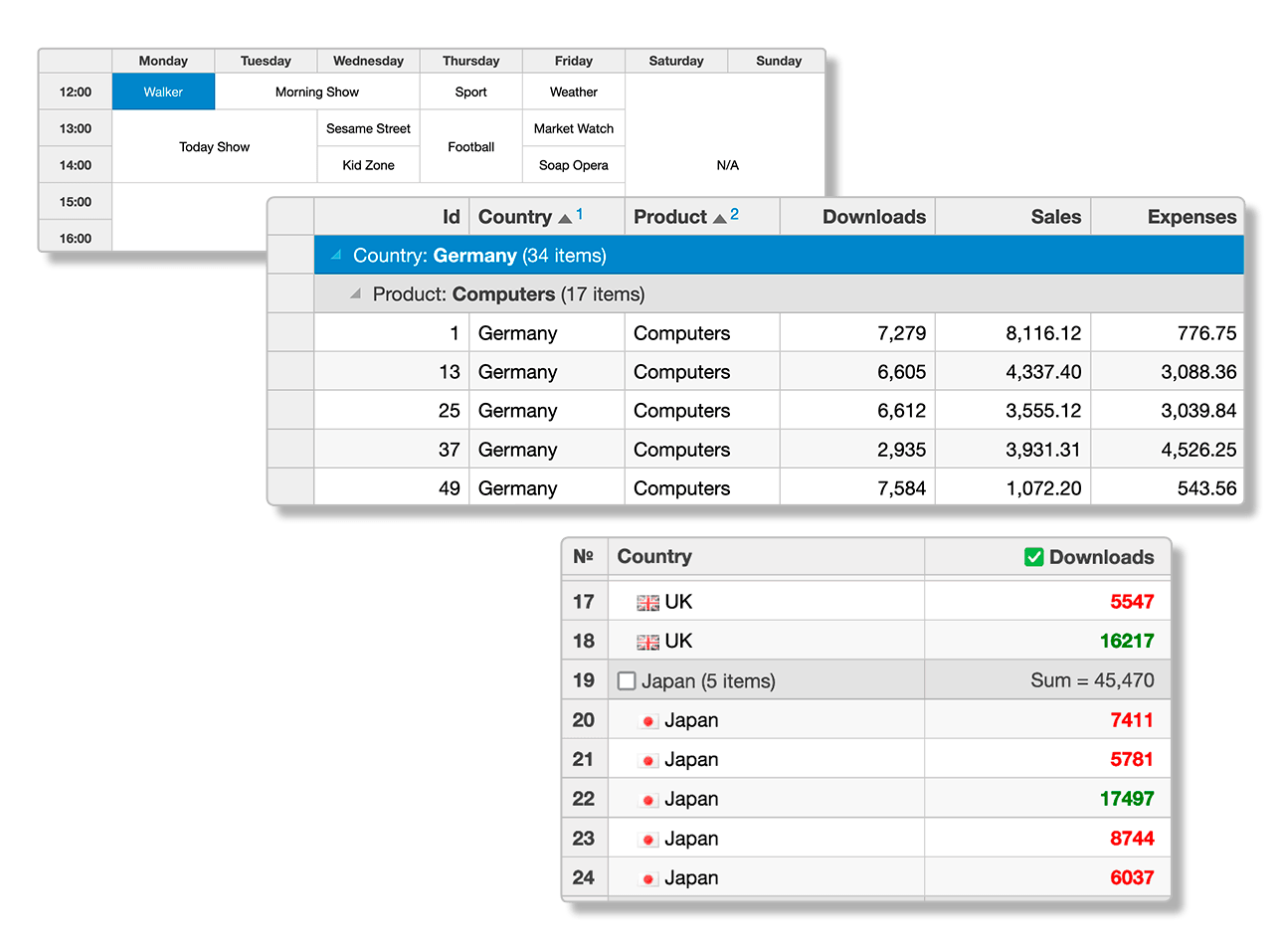
An Angular datagrid is a feature-rich control for displaying data in a tabular format. Its wide range of functionalities includes data binding, editing, Excel-like filtering, custom sorting, aggregating rows, selection, and support for Excel, CSV, and PDF formats.
Learn How to Use Our Angular Datagrid Component
Why Choose FlexGrid for Angular?
Familiar Functionality
Excel-like keyboard support, data aggregation, cell merging, star sizing, and cell freezing create a familiar experience.
Limitless CellTemplates
Cell Templates provide limitless templates with support for declarative markup and binding expressions for Angular, React, Vue and PureJS.
Written in TypeScript
With TypeScript, you'll get an object-oriented C# feel, design-time error checking, and complete IntelliSense in Visual Studio.
Improved Performance
Our FlexGrid module clocks at 113kb, it'll help keep your applications lean and fast with minimal load time.
Security Compliant
Wijmo is Content Security Policy (CSP) compliant, working seamlessly in JavaScript applications without compromising security.

Data Binding
FlexGrid supports client-side and server-side data binding. You can bind it to simple Angular arrays, observable CollectionViews, remote OData servers, or real-time WebSocket servers.
Custom Cells

Custom Cells
Wijmo's Angular datagrid, FlexGrid, allows you to heavily customize the look, feel, and functionality of every cell within the datagrid to match your style requirements. You're able to add both Wijmo and custom components to cells, conditionally style cells and their internal data, and dynamically update cells within the datagrid.

DataMaps
FlexGrid offers the DataMap feature as a simple way to provide the grid with automatic lookup capabilities, such as displaying a customer name instead of their ID. FlexGrid will add drop-downs to columns using DataMaps with valid items to use when editing cells. DataMaps also supports dynamic DataMaps and DataMap editors.

Paging
FlexGrid uses the CollectionView component and allows you to implement client-side paging by default. This allows you to generate datagrids that display a reasonable amount of data per page. You can also connect the CollectionView directly to your data source and allow for server-side paging.
Additional Features

Virtual Scrolling
FlexGrid allows you to virtualize your data when loading it into the datagrid. As you scroll through FlexGrid, it will load the data into the grid as needed, allowing for increased performance and infinite scrolling.

Selection
Like Excel, FlexGrid allows you to select a range of cells over multiple rows and columns. FlexGrid also allows you to modify the marquee of the selection, as well as set the selection through other components.

Accessibility
FlexGrid comes with an extensive list of features that support accessibility. ARIA technology helps users interact with and modify the FlexGrid and the Excel-like keyboard shortcuts enable users to easily traverse its contents.

Clipboard
Wijmo's Angular datagrid, FlexGrid, allows one to copy selected rows or cell data into the clipboard with built-in support. The clipboard gives you the ability to customize the clipboard actions using several of FlexGrid's clipboard events.
Data Customization

Editing
FlexGrid, has built-in support for Excel-like, in-cell editing. Customize the data stored inside of the FlexGrid, such as data validation, pop-up editors, and custom editors.

Sorting
FlexGrid supports data sorting through its CollectionView and can be customized to allow for features such as on-demand sorting and multi-column sorting.

Filtering
Flexgrid supports multiple filter options, from standard text and highlighting to Excel-like filtering. Use server-side filtering when loading data from an OData source.
Data Summaries

Grouping
FlexGrid allows you to group data via CollectionView. Set multiple groups in a single grid and implement an Outlook-style GroupPanel to allow users to drag-and-drop columns to create groups.

Aggregation
FlexGrid allows you to aggregate data to display summarized information for rows and columns in either the entire grid or individual sections. You're able to set where the aggregated data is displayed, as well as create custom aggregations and format options. Built-in aggregate functions include Sum, Count, CountAll, First, Last, Average, Min, Max, None, Rng, Std, StdPop, Var, and VarPop.

TreeGrid
FlexGrid allows you to bind child items to the datagrid, creating a TreeGrid to display your data. TreeGrid supports both bound and an unbound mode, lazy loading of data to increase performance, and importing XML data to display.
Master-Detail
Wijmo's Angular datagrid, FlexGrid, allows you to view hierarchical data through both a master-detail model and through the use of RowDetail. Use the master-detail model to select an item inside of a FlexGrid and view its details, or use RowDetail to allow nesting data within FlexGrid's rows.

Exporting

Import/Export Excel
If your business relies on Excel for data management, you can use FlexGrid to both import XLSX files, as well as export your FlexGrid data into an XLSX file to view in Excel. FlexGrid also supports both synchronous and asynchronous data exportation and has the ability to retain formatting and styles set by FlexGrid and Excel.

Export PDF
FlexGrid supports content exporting and formatting to PDFs. This allows you to not only view data in a browser, but also add FlexGrid to newly-created PDFs. Modify PDFs and reports to include FlexGrid.

Printing
FlexGrid supports using printers as export options, allowing you to convert the datagrid into a format that supports printing. With FlexGrid's PrintDocument class, you can convert a grid into a table element, which can then be rendered onto a page and printed out.
Globalization and Localization

Globalization
FlexGrid has a Globalization class that allows you to format the display of its content. You'll not only be able to select the language that FlexGrid uses to display its data but also format how it displays dates and numbers.

Right-to-Left
Some languages render content from the right-hand side to the left-hand side of a page. HTML accommodates this by using the dir attribute so, when setting dir to rtl on an element, that element's content will flow from the right to the left. If you place FlexGrid within an element that is set to display content from the right to the left, FlexGrid will display its content in the same way.

Freezing & Pinning
FlexGrid offers Excel-like row and column freezing and pinning. This allows you to keep rows and columns in view as users navigate the content of the grid.
Sticky Headers
FlexGrid supports the implementation of sticky headers. Sticky headers remain visible when users scroll through the grid while maintaining all of the functionality of a static header row.


Searching
Wijmo's Angular datagrid, FlexGrid, allows you to perform full-text searches–filtering your data to show all matching instances found in the grid. You can then highlight all matching occurrences of the scanned text.
Add New Rows
FlexGrid allows you to implement a new row feature without writing code for additional rows. Adding a blank row to the grid allows users to add even more rows of data. You can automatically include the blank row at either the top or bottom of the grid when you set the grid's allowAddNew property.

Layout

Cell Merging
FlexGrid supports content-driven cell merging. This allows users to merge data cells by matching content through the allowMerging property. Merge header cells, create custom cell merging rules, and set restrictions on how FlexGrid merges cells.

Reordering
FlexGrid allows users to modify columns by dragging and dropping their headers. FlexGrid also allows you to disable reordering in the entire grid or in individual columns. Enable reordering by setting the allowReordering property as true and dragging and dropping the column header from one index to another within the grid.

Column Sizing
FlexGrid allows you to specify column sizing in code, as well as allow users to resize columns after rendering the grid. Like Excel, users may drag the column header's right edge to expand or decrease sizing, or double-click the edge to auto-size the column to fit its content.
All of Wijmo's Angular UI Components
Frameworks & Integrations
- Angular
- React
- Vue
- Web Components
- TypeScript
- ES6
Common
Data Management
Printing & Docs
Navigation & Layout
Input & Editors
Viewers
Designers
Featured Blogs, Videos, and Other Resources


Wijmo's Customer Feedback & Awards

"Good value for money and high quality components"
RICHARD HERBERT
"Great tools, not cheap, but worth the money for us."
TRUSTED CUSTOMER
"I've been using Wijmo controls for about a year and a half. Fantastic product. Fantastic support!"
TRUSTED CUSTOMER
 |
 |

"I don’t give kudos lightly, and without merit, but the Wijmo team has been awesome to work with. Just amazingly responsive! I am so glad I recommended Wijmo to my partners."
GABOR FARI, PARTNER TECHNOLOGY STRATEGIST - MICROSOFT CORP
"With Wijmo's extensibility model, the Microsoft Dynamics team was able to quickly customize and incorporate Wijmo 5 components into our new release."
PARAM KAHLON, GENERAL MANAGER, MICROSOFT DYNAMICS CRM ENGINEERING

"We rely on functionality of Wijmo Core's FlexGrid in our massive next-generation platform products. Wijmo's modern, full-featured FlexGrid with sophisticated grid manipulations is what you will find at the heart of our workflow."
AARON MENDEZ, MANAGER OF THE USER EXPERIENCE, THOMSON REUTERS
Trusted by the World's Leading Companies
