
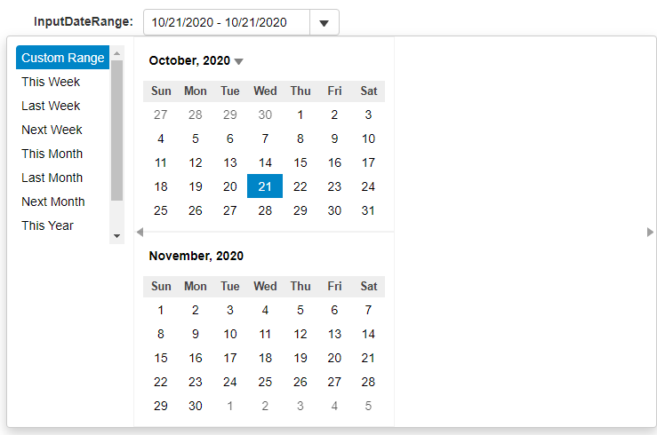
InputDateRange Overview
The InputDateRange control extends the InputDate control, combining multiple and allowing users to use it to select ranges of dates. Users can either type out the complete date/time values in any format suppported by the Globalize class, or by selecting a date range from the drop-down calendars.
By default, the InputDateRange control has its selectionMode property set to DateSelectionMode.Range by default, to allow for users to select a range of dates.
The InputDateRange control extends the InputDate control, so all properties and events are available as usual. However, there are a couple of properties that we will be focusing on to allow us to get the most out of the control:
predefinedRanges: Gets or sets an object that defines predefined ranges, such as week-long/month-long/year-long.
rangeEnd: Gets or sets the last selected date in a range selection.
weeksBefore/weeksAfter: Gets or sets the number of weeks to show on the calendar before/after the current month.
monthCount: Gets or sets the number of months to display in the drop-down calendar.
Creating the InputDateRange Control
The first thing that we'll need to do is create the InputDateRange control, using the properties that we outlined above:
HTML
<input id="theInputDateRange"></div>JavaScript
import { DateTime, format } from '@mescius/wijmo';
import { InputDateRange, InputNumber } from '@mescius/wijmo.input';

function init() {
    const inputDateRange = new InputDateRange('#theInputDateRange', {
        alwaysShowCalendar: true,
        predefinedRanges: getPredefinedRanges(),
        value: new Date(),
        valueChanged: s => showDateRange(s),
        rangeEnd: DateTime.addDays(new Date(), 2),
        rangeEndChanged: s => showDateRanges(s),
        closeOnSelection: true,
        monthCount: 2,
        weeksBefore: 0,
        weeksAfter: 0,
    });

    function getPredefinedRanges() {
        let dt = DateTime, now = new Date();
        return {
            'Custom Range': null,
            'This Week': [dt.weekFirst(now), dt.weekLast(now)],
            'Last Week': [dt.weekFirst(dt.addDays(now, -7)), dt.weekLast(dt.addDays(now, -7))],
            'Next Week': [dt.weekFirst(dt.addDays(now, +7)), dt.weekLast(dt.addDays(now, +7))],
            'This Month': [dt.monthFirst(now), dt.monthLast(now)],
            'Last Month': [dt.monthFirst(dt.addMonths(now, -1)), dt.monthLast(dt.addMonths(now, -1))],
            'Next Month': [dt.monthFirst(dt.addMonths(now, +1)), dt.monthLast(dt.addMonths(now, +1))],
            'This Year': [dt.yearFirst(now), dt.yearLast(now)],
            'Last Year': [dt.addYears(dt.yearFirst(now), -1), dt.addYears(dt.yearLast(now), -1)],
            'Next Year': [dt.addYears(dt.yearFirst(now), +1), dt.addYears(dt.yearLast(now), +1)],
        };
    }
}
This will both create our InputDateRange control, as well as populate the control's predefined range options that the user can pick from. We're also setting the current selected range of the control, from the current date through the following 2 days.
We're also setting the weeksBefore and weeksAfter properties to 0, and monthCount to 2. This means that we will not show any weeks before or after the month being displaying in our calendars inside of InputDateRange, as well as telling the control that we want to display 2 months at a time. The number of months displayed can be increased, and for each increment will render another calendar inside of the InputDateRange control.