FlexChart provides various options to customize the appearance of chart and chart elements individually, so that you can generate charts as per your requirement and look and feel of the application you are creating. this topic discusses all the appearance related options available with the FlexChart.
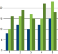
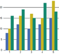
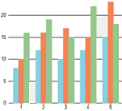
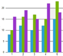
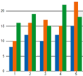
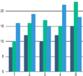
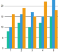
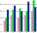
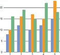
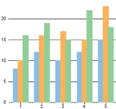
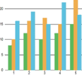
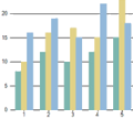
FlexChart provides 16 pre-defined color palettes, so that you can generate the charts with desired appearance with a single line of code. You can apply these palettes to FlexChart using the Palette property which accepts the values from Palette enumeration of C1.Chart namespace. By default, this property is set to Standard. You can also create a custom palette using the existing color palettes.
|
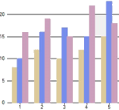
Cerulan |
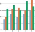
Cocoa |
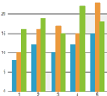
Coral |
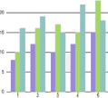
Cyborg |
|
|
|
|
|
|
Dark |
Darkly |
Flatly |
HighContrast |
|
|
|
|
|
|
Light |
Midnight |
Modern |
Organic |
|
|
|
|
|
|
Slate |
Standard |
Superhero |
Zen |
|
|
|
|
|
Apart from the color palettes, FlexChart also lets you style the chart titles, axis titles, axis, data labels, legend and plot area. For styling of specific elements, see the styling section of corresponding topics.
| Style chart titles | Style axis titles | Style a series | Style an axis |
| Style data labels | Style legend | Style plot area | Style an annotation |
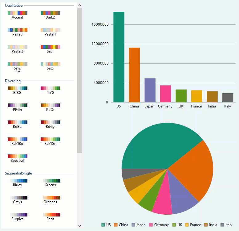
FlexChart now provides more palette options. These palettes were inspired by ColorBrewer 2 and are grouped in the following categories:
The Extended Palettes feature is provided by the C1.Win.Chart.Palettes namespace. You can apply these palettes to FlexChart using the CustomPalette property. Each category of palettes also exposes the brushes dictionary, which the user can enumerate or use as a data source.
| C# |
Copy Code
|
|---|---|
chart.Palette = Palette.Custom;
|
|
The different categories of these extended palettes are useful in varying scenarios as listed below:
| Palette Type | UseCase |
|
Qualitative Palette (Represented by the Qualitative class) |
To show nominal or categorical data. |
|
Multi (Represented by the Diverging class) |
To give equal emphasis to mid-range critical values and extremes at both ends–light colors for mid-range and dark colors for extreme low and high values. |
|
Sequential Single/SequentialMulti (Represented by the SequentialSingle or SequentialMulti class) |
To show ordered data that progress from low to highlight colors for low-data values to dark colors for high-data values. |