Column Charts
In This Topic
You can create a page report with a chart using the ActiveReports Chart data region. This walkthrough illustrates how to create a simple report with a Column chart.
The walkthrough is split into the following activities:
- Creating an ActiveReports project in Visual Studio
- Connecting the report to a data source
- Adding a dataset
- Adding a chart data region with data and grouping to the report
- Configuring the appearance of the chart
- Viewing the report
Note:
- This walkthrough uses the StoreSummary table from the Reels database. The Reels.mdb file can be downloaded from GitHub: ..\Samples14\Data\Reels.mdb.
- Although this walkthrough uses Page reports, you can also implement this using RDL reports.
When you complete this walkthrough you get a layout that looks similar to the following at design time and at run time.
Design-Time Layout
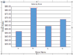
Column chart at design time
Run-Time Layout
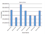
Column chart at run time
To create an ActiveReports project in Visual Studio
- Create a new Visual Studio project.
- In the New Project dialog that appears, select ActiveReports 14 Page Report Application and in the Name field, rename the file as rptSalesByStore.
- Click OK to create a new ActiveReports 14 Page Report Application. By default a Page report is added to the project.
See Quick Start for information on adding different report layouts.
To connect the report to a data source
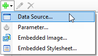
- In the Report Explorer, right-click the Data Sources node and select the Add Data Source option or select Data Source from the Add button.
- In the Report Data Source Dialog that appears, select the General page and in the Name field, enter a name like ChartData.
- On this page, create a connection to the Reels database. See Connect to a Data Source for information on connecting to a data source.
To add a dataset
- In the Report Explorer, right-click the ChartData data source node and select the Add Data Set option or select Data Set from the Add button.
- In the DataSet Dialog that appears, select the General page and enter the name of the dataset as StoreSummaryData. This name appears as a child node to the data source icon in the Report Explorer.
- On the Query page of this dialog, in the Query field enter the following SQL query.
SQL Query Copy CodeSELECT * from StoreSummary - Click the Validate DataSet
 icon at the top right hand corner above the Query box to validate the query.
 - Click OK to close the dialog. Your data set and queried fields appear as child nodes to the data source in the Report Explorer.
To add chart data region with data and grouping to the report
- From the toolbox, drag the Chart data region onto the design surface of the report .
- In the Select a Chart Type wizard that appears, select the chart type Column.
- Go to the Properties Window, click ellipses button next to Plots property to open the PlotDesigner Collection Editor. You see that Plot1 is already added.
- Select Plot1 and click ellipses next to go to Encodings>Values property to open the DataFields Collection Editor.
- Add a field and set its value to expression
=Fields!GrossSales.Value. - Click OK to save and return to PlotDesigner Collection Editor.
- Go to Encodings>Category>Values property and click ellipses next to Values property.
- Add a field and set its value to expression
=Fields!StoreName.Value. - Click OK to save and exit expression editor and then again to close the collection editor.
You see that 'Store Name' is added to Category Fields and 'Gross Sales' is added to Data Fields.
To configure the appearance of the chart
- Select Chart and set Pallet to Office.
- Select 'Chart title' on the chart and set Title to 'Sales by Store'.
- Select the chart plot and set following properties.
Property Name Property Value LineStyle>LineColor Red LineStyle>LineStyle Dotted - Select X-axis and set Labels>LabelsAngle to -45 degrees.
- Select X-axis and set Title>TitleStyle>Padding>Top to 8pt.
- Select Y-axis and set Title>TitleStyle>Padding>Right to 4pt.
Note: You may need to adjust:
- Size of the chart so that all labels are displayed correctly. Select Chart and set Size property to a larger value.
- Page size of the report so that the chart is fully rendered. Select Report and set PageSize property to a larger value.
To view the report
- Click the Preview tab to view the report at design time.
OR
- Open the report in the Viewer. See Windows Forms Viewer for further information.
See Also