In section reports, you can use the CrossSectionLine and CrossSectionBox report controls to display a frame, borders, and vertical lines that run from a header section through its related footer section, spanning all details that come between. You can specify line appearance using properties on the report controls, and even round the corners of the CrossSectionBox.
You can only place the cross section controls in header sections in the designer. They automatically span intervening sections to end in the related footer section. (You can also place them in footer sections, but they automatically associate themselves with the related header section in the Report Explorer.)
CrossSectionLine
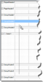
CrossSectionLine control
The CrossSectionLine control draws a vertical line from a header section to the corresponding footer section. At run time, this vertical line stretches through any intervening sections. You can change the appearance of CrossSectionLine by changing the following properties.
| Property | Description |
|---|---|
| LineColor | Allows you to get or set color of the line. |
| LineStyle | Allows you to select the line style from solid, dash, dotted, or double. |
| LineWeight | Allows you to specify the thickness of the line. |
CrossSectionBox
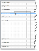
CrossSectionBox control
The CrossSectionBox control draws a rectangle from a header section to its corresponding footer section. To change the appearance of the rectangle, you can use the following properties in addition to the ones mentioned above.
| Property | Description |
|---|---|
| Radius | Sets the radius of each corner for the RoundRect shape type. You can select Default, TopLeft, TopRight, BottomLeft or BottomRight. Selecting Default sets the radius of all the corners of the CrossSectionBox control to a specified percentage. Default value = 0 (point). |
| BackColor | Sets the back color. |
Caution:
- The CrossSectionBox and CrossSectionLine controls do not render properly in multi-column reports, that is, those in which a GroupHeader section has the ColumnLayout property set to True.
- The CrossSection control (CrossSectionBox and CrossSectionLine) is drawn across multiple sections. Therefore, it is not possible to change its appearance etc. in the event of a section. The appearance of the CrossSection control can be dynamically changed only in the ReportStart event.
CrossSectionLine Dialog
With the control selected on the report, in the Commands section at the bottom of the Properties window, you can click the Property dialog command to open the dialog.
General
Name: Enter a name for the control that is unique within the report. This name is displayed in the Document Outline and in XML exports. You can only use underscore (_) as a special character in the Name field. Other special characters such as period (.), space ( ), forward slash (/), back slash (\), exclamation (!), and hyphen (-) are not supported.
Tag: Enter a string that you want to persist with the control. If you access this property in code, it is an object, but in the Properties window or Property dialog, it is a string.
Visible: Clear this check box to hide the control.
Appearance
Line style: Select a line style to use for the control. You can set it to Transparent, Solid, Dash, Dot, DashDot, DashDotDot, or Double.
Line weight: Enter the width for the line.
Line color: Select a color to use for the line.
CrossSectionBox Dialog
With the control selected on the report, in the Commands section at the bottom of the Properties window, you can click the Property dialog command to open the dialog.
General
Name: Enter a name for the control that is unique within the report. This name is displayed in the Document Outline and in XML exports. You can only use underscore (_) as a special character in the Name field. Other special characters such as period (.), space ( ), forward slash (/), back slash (\), exclamation (!), and hyphen (-) are not supported.
Tag: Enter a string that you want to persist with the control. If you access this property in code, it is an object, but in the Properties window or Property dialog, it is a string.
Visible: Clear this check box to hide the control.
Appearance
Line style: Select a line style to use for the border line. You can set it to Transparent, Solid, Dash, Dot, DashDot, DashDotDot, or Double.
Line weight: Enter the width for the border line.
Line color: Select a color to use for the border line.
Background color: Select a color to use for the background of the picture control.
CloseBorder: Select the checkbox to close the borders.
Rounded Rectangle: Specify the radius for each corner of the CrossSectionBox individually. Drag the handlers  available at each corner of the CrossSectionBox to set the value of the radius at each corner.
-
Use the same radius on specified corners: Select this option to apply the same radius to all selected corners of the CrossSectionBox.
-
Use different radius on specified corners: Select this option to apply a different radius to each selected corner of the CrossSectionBox.