The Shape report control is used to display one of the available shape types on a report. You can add a shape report control to a report by dragging it from the toolbox and dropping it onto the report design surface.
In the ShapeStyle property of the Shape report control, you can select Rectangle, RoundRect or Ellipse, or you can use an expression to assign fields, datasets, parameters, constants, operations or common values to it.
You can highlight different sections or parts of a report using a shape report control. For example, you can use a Rectangle as border around different report controls or the entire page or you can use an Ellipse to highlight a note on your report.
By clicking on the Shape control, you can set its properties in the Properties window.
| Property | Description |
|---|---|
| AccessibleDescription | Enter the alternative description of the control for use by accessibility client application. The property on exporting the report adds the ‘alternative text’ in PDF and ‘alt’ attribute in HTML. |
| BackgroundColor | Choose a color for the background from the Color Picker. |
| BackgroundImage | Add a background image from External, Embedded, or Database as Source. You can also select the MIME type of the image. |
| BorderColor | Choose a color for the border from the Color Picker. |
| BorderStyle | Select a style for the border. |
| BorderWidth | Enter a value to set the width of the border. |
| RoundingRadius | Enter a value in points to round the corner of the outer border edge of the RoundRect shape style. |
| ShapeStyle | Choose a shape style from Rectangle, RoundRect, or Ellipse. |
| Size | Enter the Width and Height of the shape. |
You can set the Shape properties in the Shape dialog. To open it, with the Shape selected on the report, under the Properties window, click the Property dialog link.
Name: Enter a name for the image that is unique within the report. This name can be called in code. You can only use underscore (_) as a special character in the Name field. Other special characters such as period (.), space ( ), forward slash (/), backslash (\), exclamation (!), and hyphen (-) are not supported.
Shape Style: Choose Rectangle, RoundRect or Ellipse from the dropdown list, or select the <Expression...> option to open the Expression Editor.
| Rectangle | RoundRect | Ellipse |
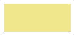 |
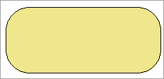 |
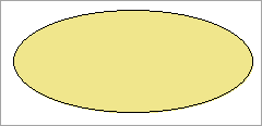 |
Rounded Rectangle: When the Shape type is set to RoundRect, you can specify the radius for each corner of the shape independently. Drag the handlers  available at each corner of the shape to set the value of the radius at each corner.
Background
Color: Select a color to use for the background of the Shape, or select the <Expression...> option to open the Expression Editor.
Image: Specify the background image of shape using Expression or Data Visualizer, or directly open the image file on your system.
MIME Type: Select the MIME type of the image.
Background repeat: Specify how the background image fills the space of the shape.
Border
Style: Select a style for the border.
Width: Enter a value in points to set the width of the border or select the <Expression...> option to open the Expression Editor.
Color: Select a color to use for the border, or select the <Expression...> option to open the Expression Editor and create an expression that evaluates to a .NET color.
Initial visibility
Visibility can be toggled by another report item: Select this check box to display a toggle shape next to another report item. This enables the drop-down box where you can specify the TextBox control which, if clicked, toggles the visibility of the shape.
Document map label: Enter an expression to use as a label to represent this item in the table of contents (document map).
Bookmark ID: Enter an expression to use as a locator for this shape. You will then be able to provide a bookmark link to this item from another report control using a Jump to bookmark action.
Element Name: Enter a name to be used in the XML output for this shape report control.
Output: Choose Auto, Yes, No, or Contents only to decide whether to include this Shape in the XML output. Choosing Auto exports the contents of the Shape report control.