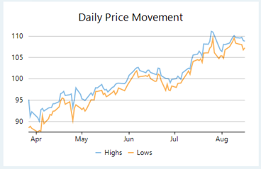
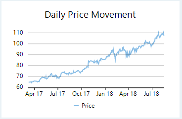
Line charts are the most basic charts that are created by connecting the data points with straight lines. These charts are used to visualize a trend in data as they compare values against periodic intervals such as time, temperature etc. Closing prices of a stock in a given time frame, monthly average sale of a product are some good example that can be well demonstrated through a line chart.
Line symbol chart is a slight variation of line chart and is displayed with markers on the data points. These charts are used when it is required to know the exact data points which have been used to plot the chart.
|
Line Chart |
Line Symbol Chart |
|---|---|
 |
 |
Spline charts are a variation of line charts as they connect the data points using smooth curves instead of straight lines. Apart from the aesthetic aspect, these charts are preferred for displaying a gradual change in trend. Just like line chart, closing prices of a stock or life cycle of a product can be well demonstrated through a spline chart.
Spline symbol chart is a version of spline chart that is displayed with markers on the data points. These charts are used when it is required to know the exact data points which have been used to plot the chart.
|
Spline Chart |
Spline Symbol Chart |
|---|---|
 |
 |
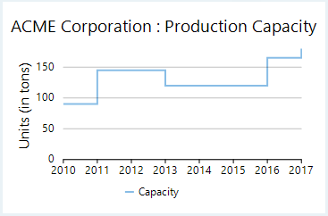
Step charts use vertical and horizontal lines to connect the data points to form a step-like progression. These charts are generally used to demonstrate the sudden change in data that might occur on irregular intervals and remains constant till the next change. These charts can be used to plot the change in commodity prices, change in tax rate against income etc.
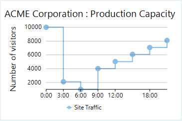
Step symbol chart is a slight variation of step chart and is displayed with markers on the data points. These charts are used when it is required to know the exact data points which have been used to plot the chart.
|
Step Chart |
Step Symbol Chart |
|---|---|
 |
 |
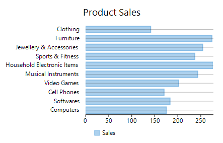
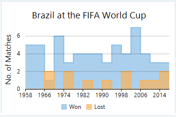
Bar charts compare categorical data through the horizontal bars, where length of each bar represents the value of the corresponding category. Y-axis in these charts is a category axis. For example, sales of various product categories can be well presented through a bar chart.
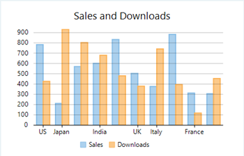
Column charts are simply vertical version of bar charts and they use X- axis as a category axis. Though bar charts and column charts can be used interchangeably, column charts are preferred where number of values is too large to be accommodated on an X-axis while bar charts are preferred in the case of long category titles which are difficult to fit on an X-axis or in the case of large number of categories.
|
Bar Chart |
Column Chart |
|---|---|
 |
 |
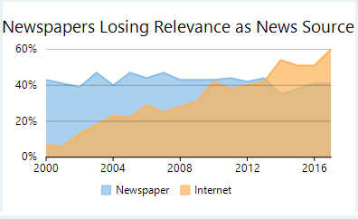
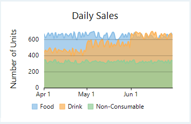
Area charts are line charts with area between the line chart and axis filled with a color or shading. However, while line charts simply present the data values to demonstrate the trend, filled portion of the area chart helps in communicating the magnitude of the trend as well. These charts are also used to analyze a simple comparison between the trend of each category.
Spline area charts and step area charts are other modifications of area charts where area between spline chart or step chart and axis is filled with a color or shading to indicate the magnitude of change.
|
Area Chart |
Spline Area Chart |
Step Area Chart |
|---|---|---|
 |
 |
 |
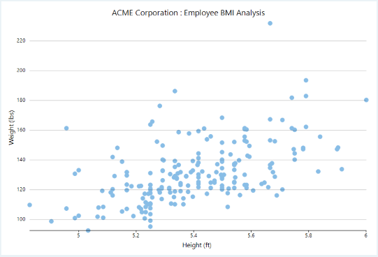
Scatter charts are very powerful type of charts which plot pairs of numerical data in order to identify a relationship between the two variables. Scatter charts show how much one variable is affected by another. They are best for comparing large number of data points.
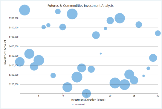
Bubble charts are similar to scatter charts and are used when you have a third dimension to plot. This third dimension is depicted through the size of the bubbles. These charts are generally used to plot financial data, for example, below chart presents a relationship between investment duration, amount of investment and return on investment.
|
Scatter Chart |
Bubble Chart |
|---|---|
 |
 |
With FlexChart, you can create these Basic charts by setting the ChartType property of FlexChart class. This property accepts the values from ChartType enumeration of C1.Chart namespace.
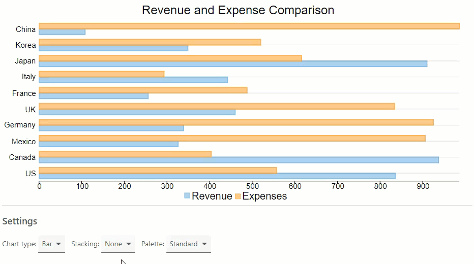
You can set the Stacking property of FlexChart class to Stacked or Stacked100pc for stacked or stacked100% line charts respectively. This property accepts the values from Stacking enumeration of C1.Chart namespace. FlexChart also provides option to choose a colour palette as shown in the GIF below.
You need to set up the data source through the ItemsSource property which accepts the collection of items for the FlexChart control and configure the X and Y axes by setting the BindingX and Binding property.
| Razor |
Copy Code
|
|---|---|
@page "/FlexChart/Index" @using Localization @using C1.Chart; @using C1.Blazor.Chart; @using C1.Blazor.Input; <FlexChart Class="chart" ChartType="chartType ?? ChartType.Column" Stacking="stacking ?? Stacking.None" Palette="palette ?? Palette.Standard" HeaderContent="Revenue and Expense Comparison" HeaderStyle="font-size:24px" LegendPosition="Position.Bottom" LegendStyle="font-size:20px" BindingX="Country" ItemsSource="Data"> <SeriesCollection> <Series Name="Revenue" Binding="Sales" /> <Series Name="Expenses" Binding="Expenses" /> </SeriesCollection> </FlexChart> |
|
Add a DataSource class that binds data to the chart. The below code allows you to select the chart type, series stacking, and palette for appearance.
| Razor |
Copy Code
|
|---|---|
@code {
    ChartType[] chartTypes = new ChartType[] { ChartType.Column, ChartType.Bar, ChartType.Line, ChartType.LineSymbols, ChartType.Scatter, ChartType.Area };
    ChartType? chartType = ChartType.Column;

    Stacking[] stackings = new Stacking[] { Stacking.None, Stacking.Stacked, Stacking.Stacked100pc };
    Stacking? stacking = Stacking.None;

    IEnumerable<Palette> palettes = Enum.GetValues(typeof(Palette)).Cast<Palette>().Where((p, x) => p!=Palette.Custom);
    Palette? palette = Palette.Standard;

    List<DataSource.CountryData> Data { get; set; }

    protected override void OnInitialized()
    {
        Data = DataSource.GetData();
    }

    public class DataSource
    {
        private static Random rnd = new Random();

        public class CountryData
        {
            public string Country { get; set; }
            public double Sales { get; set; }
            public double Expenses { get; set; }
        }

        public static List<CountryData> GetData(int rangeMin = 100, int rangeMax = 1000)
        {
            var countries = "US,Canada,Mexico,Germany,UK,France,Italy,Japan,Korea,China".Split(',');
            var data = new List<CountryData>();
            for (int i = 0; i < countries.Length; i++)
            {
                var country = new CountryData
                {
                    Country = countries[i],
                    Sales = rnd.Next(rangeMin, rangeMax),
                    Expenses = rnd.Next(rangeMin, rangeMax)
                };
                data.Add(country);
            }
            return data;
        }
    }
|
|