In this step, you will add content to the C1Splitter using both the Designer and markup. You can easily drop controls from the Visual Studio Toolbox into the panels, or you can achieve the same result by switching to Source view and adding the elements in markup code.
Complete the following steps:
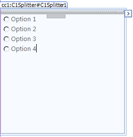
<ContentTemplate>
  <asp:RadioButton ID="RadioButton1" runat="server" Text="Option 1" />
  <br />
  <asp:RadioButton ID="RadioButton2" runat="server" Text="Option 2" />
  <br />
  <asp:RadioButton ID="RadioButton3" runat="server" Text="Option 3" />
  <br />
  <asp:RadioButton ID="RadioButton4" runat="server" Text="Option 4" />
</ContentTemplate>
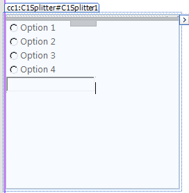
In the next step, you'll run the program and walk through some of the behavioral features of the C1Splitter control.