You can display check boxes next to each C1TreeViewNode when ShowCheckBoxes is set to true. When the check boxes are enabled for the C1TreeView you can use the NodeCheckChanged to create an action whenever the status of a check box changes between posts. If you want to respond immediately to changes in the check boxes on the client without postback you can use the OnClientNodeCheckChanged server-side event property.
Tri-State Checkboxes
When the ShowCheckBoxes and AllowTriState properties are set to true you can use three types of checkbox states that appear next to the C1TreeViewNode.
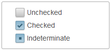
The following table describes the three check box states and how it visually affects each checkbox next to the C1TreeViewNodes.
The property Checked specifies the check state of C1TreeViewNode.
|
Checkbox State |
Description |
|---|---|
|
Indeterminate |
A dark shaded gray box appears in the parent node when only a few of the child nodes are selected. |
|
Checked |
A checkmark appears in the parent node when all of its child nodes are selected. |
|
Unchecked |
An empty checkbox appears in the parent node when none of the parent node or child nodes are selected. |
The following image displays each check box state for the C1TreeView control: indeterminate, checked, and unchecked.
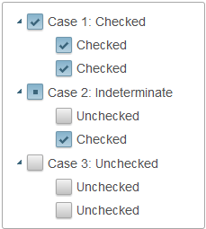
Tri-State's Effect on Child Nodes
If AllowTriState is set to True and a node of C1TreeView has child nodes, its CheckState is determined by the CheckState of its children. There are three cases which are as follows:
All of the Checked properties of child nodes are set to True, in which case the parent node's Checked property would be True and the CheckState is set to Checked automatically.
Some of the child nodes' Checked properties are set to True, in which case the parent node's Checked property will be True, but the CheckState property will be Indeterminate.
All child nodes' Checked properties are set to False, in which case the parent node's Checked property will be False, and the CheckState property will be UnChecked.