A Bar chart draws each series as a bar in a cluster. You can display each series on a single row with 2D Bar charts, or display each series in multiple rows with 3D Bar charts. The 3D Bar chart provides an interesting alternative view; you can view the front side of the 3D Bar or Column charts rather than the typical side view. The sizing and spacing of the clusters for Bar and Stacking Bar charts can be customized. Additionally, you can change the Bar chart's appearance to any of the following shapes: cylinder, cone, or pyramid.
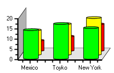
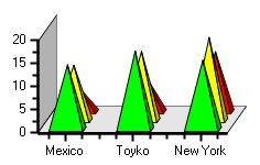
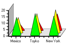
While Bar charts are commonly represented as rectangular bars (default), you can alternatively represent the chart with cylinders, cones, or pyramids for a different effect. To change the bar's shape from its default setting to cylinder, cone, or pyramid, use the Appearance property.
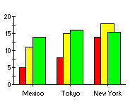
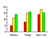
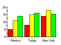
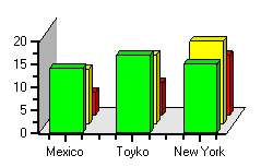
The following figures illustrate the values of the Appearance property:
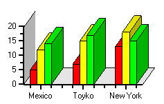
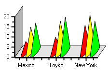
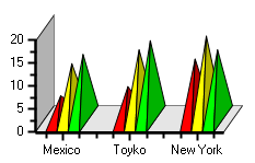
| Appearance = Default | Appearance = Cylinder |
|---|---|
 |
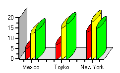 |
| Appearance = Cone | Appearance = Pyramid |
 |
 |
Use the ClusterOverlap property to set the amount that bars overlap each other in a cluster. The value represents the percentage of bar overlap, with valid values between 0 and 100. The following figure illustrates a bar chart with a ClusterOverlap of 50 percent:
Use the ClusterWidth property to set the space used by each bar cluster. The value represents the percentage of available space, with valid values between 0 and 100.
| ClusterWidth = 50% | ClusterWidth = 90% |
|---|---|
 |
 |
The Bar class properties, ClusterWidth and ClusterOverlap, can be accessed at design time under the Bar node in the ChartGroupsCollection Editor.
When the Use3D property is set to True to enable 3D Charts you can use the MultiRow property to display a new row for each bar or column in the cluster.
The following figures illustrate the effect of the MultiRow property for each Bar chart type:
| MultiRow = True | MultiRow = True |
|---|---|
 |
 |
| MultiRow = True | MultiRow = True |
 |
 |
Set the BarLines property to True when you want to show the lines between the data series rectangles from point to point in stacked 2D bar and column charts. When you set the BarLines property to True you can use the BarLineColor and BarLineThickness properties to specify the line color and line thickness for the bar lines as depicted in the following figure:
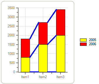
Using bar lines in Stacked 2D Bar or Column charts makes it easier to see the quantitative information by using the bar lines to compare the values across the X-axis (Column charts) or the Y-axis (Bar charts).