Annotations are the user defined objects such as text, images or shapes that can be added to the charts to make them more informative along with enhancing it aesthetically. The extra information in annotations is generally added with the aim to provide better understanding of the chart to the reader.
FlexChart provides following eight types of annotations through C1.Win.Chart.Annotation namespace to make your charts more appealing and informative. The namespace provides a class corresponding to each annotation which provide properties to set its dimensions etc. You can also position or style the annotations using the properties provided by these annotation classes. Moreover, additional information can be added to these annotations in the form of a tooltip by using the TooltipText property of the class.
| Annotation Type | Description |
|---|---|
| Line | Refers to a straight line whose endpoint can be specified using the Start and End properties. It also provides the Content property that renders the text above the line annotation. |
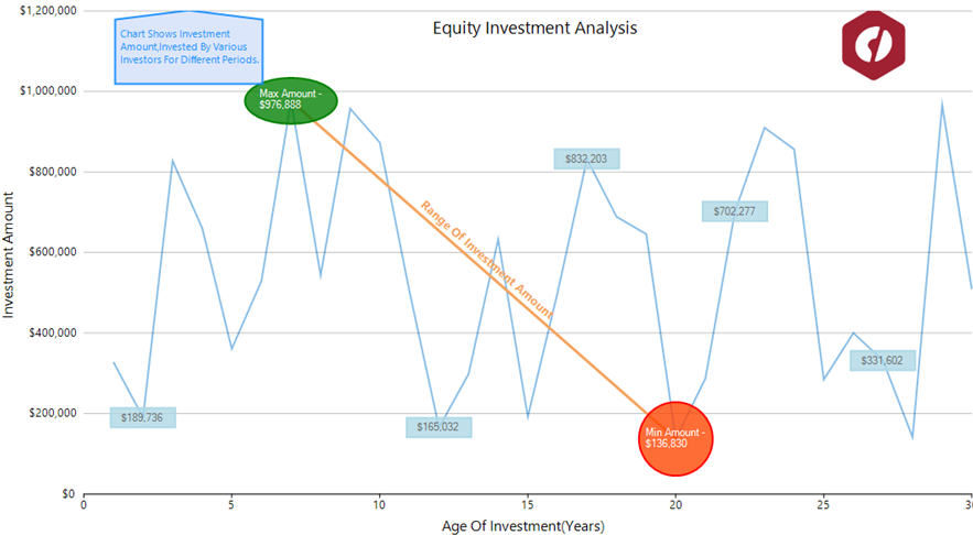
| Circle | Renders a circular shape in the plot area with its radius specified through the Radius property. Content property provided by the class lets you draw the text inside this annotation. |
| Ellipse | Adds an ellipse to the chart with its dimensions defined through the Height and Width property. Similar to other closed shapes, Content property lets you render the text inside this annotation. |
| Rectangle | Creates a rectangular shape in the chart plot area with specified Height and Width. Also, Content property lets you add the text inside this annotation. |
| Square | Draws a square on the plot area with its side length defined by the Length property. Similar to other closed shapes, Content property lets you render the text inside this annotation. |
| Polygon | Adds a polygon whose vertices can be added through the Points property which gets the collection of the vertex points. This class also provides a ContentCenter property which specifies the center of the text that is added using the Content property. |
| Image | Renders an image on the plot area for unmatched visual impact. The source of image can be specified through the SourceImage property while image size can be adjusted using the Height and Width property. An image annotation can be made more informative with the help of a tooltip. |
| Text | Draws the additional information in the form of text that is specified through the Content property. |
There are two aspects that determine the position of an annotation on the chart, one is the position of annotation with respect to the data points and other is how an annotation is attached to the chart, that is, its position with respect to the chart. You can display an annotation in the left, right, top or bottom of the data point by setting the Position property which accepts the values from AnnotationPosition enumeration.
To position annotations relative to a chart, FlexChart provides the Attachment property. This property accepts following values from AnnotationAttachment enumeration.
| Value of Attachment property | Description |
|---|---|
| Absolute | The annotation remains fixed irrespective of the resizing of application. In this case, position of annotation is specified in pixels. |
| DataCoordinate | The annotation is attached to a specific data point. In this case, position of annotation is defined by specifying the data coordinates in Location property. |
| DataIndex | The annotation is attached to the series as per the value of SeriesIndex property and to the point as per the value specified by the PointIndex property. |
| Relative | The annotation retains its location and dimensions relative to the chart. In this case, position of annotation can be defined using the Location property. Here, (0,0) coordinates represent the top left corner while (1,1) is for the bottom right corner of the chart. |
FlexChart provides various properties that let you customize the annotations so that they stand out against the chart background. Apart from properties related to dimensions that are provided by the corresponding annotation classes, these class also provide Style and ContentStyle properties to customize the annotation and its content respectively.