C1ToolBars layout is very flexible. They can be horizontal or vertical as well as docked to specific areas of the form. The toolbar's Movable property is enabled by default. This allows the user to move the toolbar anywhere on the form. The default layout for a toolbar is horizontal. You can change the toolbar layout to vertical by setting the Horizontal to False.
In addition to toolbar orientation, C1ToolBar also provides button alignment for vertical toolbars. You can align the image or text near, center, or far from the button through the ButtonAlign property.
The following table shows the values for the ButtonAlign property:
| Property Setting | Image |
|---|---|
| ButtonAlign.Near | 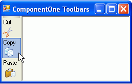 |
| ButtonAlign.Center | 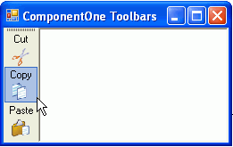 |
| ButtonAlign.Far | 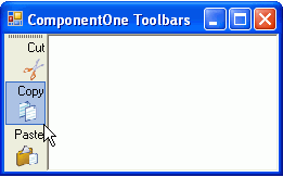 |
You can determine the relative position of text and images for toolbar buttons in horizontal and vertical toolbars using the ButtonLayoutHorz and ButtonLayoutVert properties. The ButtonLayoutHorz property gets the layout of the buttons when the toolbar is horizontal. This is the default orientation of the toolbar. The ButtonLayoutVert property gets the layout of the buttons when the toolbar is vertical. Setting the Horizontal property to False gets the vertical orientation for the toolbar.
C1ToolBar provides several options for customizing the toolbar buttons for vertical and horizontal toolbars.
| Property Setting | Image |
|---|---|
| ButtonLayoutHorz.TextOnRight (default) | 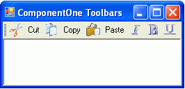 |
| ButtonLayoutHorz.TextOnLeft | 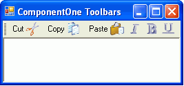 |
| ButtonLayoutHorz.TextAbove | 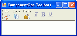 |
| ButtonLayoutHorz.TextBelow | 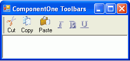 |
In addition to controlling the relative position of text and images for toolbar buttons you can also set the ButtonLookHorz property to display text, images, or both for the horizontal toolbar and the ButtonLookVert property to display text, images, or both for the vertical toolbar.
The following table shows the values for the ButtonLayoutVert property:
| Property Setting | Image |
|---|---|
| ButtonLayoutVert.TextOnRight | 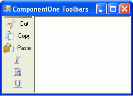 |
| ButtonLayoutVert.TextOnLeft | 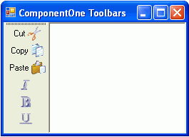 |
| ButtonLayoutVert.TextAbove | 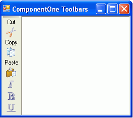 |
| ButtonLayoutVert.TextBelow (default) | 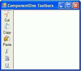 |