Expander provides various options to style the UI of the Expander control. The C1Expander class provides several properties such as HeaderStyle and ExpandIconStyle, which offers different ways of styling all the elements of the Expander control, such as header, expand icon, and content area.
The following code demonstrates the use of the available styling properties in the C1Expander class to change the appearance of the Expander control:
| XAML |
Copy Code
|
|---|---|
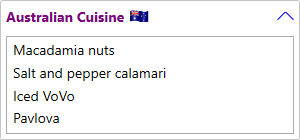
<c1:C1Expander x:Name="ExpanderControl" Height="140" Width="300" Margin="40"> <!--Header Template--> <c1:C1Expander.HeaderTemplate> <DataTemplate> <StackPanel Orientation="Horizontal"> <TextBlock VerticalAlignment="Center" FontWeight="Bold">Australian Cuisine</TextBlock> <Image Margin="5, 0" Source="Images/australia.png" Height="20" Width="20"></Image> </StackPanel> </DataTemplate> </c1:C1Expander.HeaderTemplate> <!--Header style--> <c1:C1Expander.HeaderStyle> <Style TargetType="ContentControl"> <Setter Property="Foreground" Value="Purple"></Setter> <Setter Property="FontWeight" Value="Bold"></Setter> <Setter Property="FontFamily" Value="segoe ui"></Setter> </Style> </c1:C1Expander.HeaderStyle> <!--Expander icon style--> <c1:C1Expander.ExpandIconStyle> <Style TargetType="ContentControl"> <Setter Property="Height" Value="17"></Setter> <Setter Property="Width" Value="17"></Setter> <Setter Property="Foreground" Value="Blue"></Setter> </Style> </c1:C1Expander.ExpandIconStyle> <ListBox> <ListBoxItem Content="Macadamia nuts"></ListBoxItem> <ListBoxItem Content="Salt and pepper calamari"></ListBoxItem> <ListBoxItem Content="Iced VoVo"></ListBoxItem> <ListBoxItem Content="Pavlova"></ListBoxItem> </ListBox> </c1:C1Expander> |
|