Like other data visualization controls, FlexGrid supports unbound mode and can be populated with data from various data sources. The below section discusses unbound FlexGrid in .NET and .NET Framework editions.
The FlexGrid control is designed to work with various data sources and collections such as ObservableCollection and DataCollection to leverage its full capabilities. However, the control is not restricted to data sources and can be used in unbound mode.
The image given below shows an unbound grid populated with cell index notation.
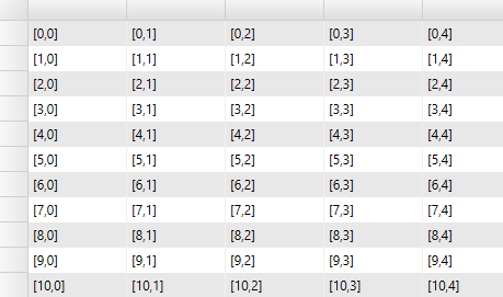
To create an unbound grid, add rows and columns to the grid using the Add method. The following code illustrates adding rows and columns in a grid and populating it with an indexing notation that specifies a cell by corresponding row and column index.
| C# |
Copy Code
|
|---|---|
for (int i = 0; i < 20; i++) { grid.Columns.Add(new Column()); } for (int i = 0; i < 500; i++) { grid.Rows.Add(new Row()); } // populate the unbound grid with some index for (int r = 0; r < grid.Rows.Count; r++) { for (int c = 0; c < grid.Columns.Count; c++) { grid[r, c] = string.Format("[{0},{1}]", r, c); } } |
|
The indexing notation displayed in the grid specifies a cell by row and column index. The cells can also be specified by row index and column name, or by row index and column name. The indexing notation works in bound and unbound modes. In bound mode, the data is retrieved or applied to the items in the data source. In unbound mode, the data is stored internally by the grid.
The new indexing notation displayed in the grid contains no items in the 0th row. This notation makes indexing easier as the indices match the index of data items and the column count matches the number of displayed properties. The only drawback of this notation is that a new method is required to access the content of fixed cells. The new method consists of additional properties called RowHeaders and ColumnHeaders that return an object of type GridPanel, which can be seen as a sub-grid having its own set of rows and columns. For example, use the following code to customize row headers.
| C# |
Copy Code
|
|---|---|
// get grid's row headers GridPanel rowHeader = grid.RowHeaders; // add a new fixed column to the grid rowHeader.Columns.Add(new Column()); // set the width and content of the row headers for (int c = 0; c < rowHeader.Columns.Count; c++) { for (int r = 0; r < rowHeader.Rows.Count; r++) { // set content for this cell rowHeader[r, c] = string.Format("hdr {0},{1}", r, c); } } |
|
The GridPanel class exposes Rows and Columns collections just as the main grid does, and supports the same indexing notation. The row and column headers can be customized and populated using the same object model and techniques you use while working with the content area of the grid (the scrollable part).
The FlexGrid control is designed to work with various data sources and collections such as ObservableCollection and DataCollection to leverage its full capabilities. However, the control is not restricted to data sources and can be used in unbound mode.
The image given below shows an unbound grid populated with cell index notation.
To create an unbound grid, add rows and columns to the grid using the Add method. The following code illustrates adding rows and columns in a grid and populating it with an indexing notation that specifies a cell by corresponding row and column index.
| C# |
Copy Code
|
|---|---|
for (int i = 0; i < 20; i++) { grid.Columns.Add(new GridColumn()); } for (int i = 0; i < 500; i++) { grid.Rows.Add(new GridRow()); } // populate the unbound grid with some index for (int r = 0; r < grid.Rows.Count; r++) { for (int c = 0; c < grid.Columns.Count; c++) { grid[r, c] = string.Format("[{0},{1}]", r, c); } |
|
The indexing notation displayed in the grid specifies a cell by row and column index. The cells can also be specified by row index and column name, or by row index and column name. The indexing notation works in bound and unbound modes. In bound mode, the data is retrieved or applied to the items in the data source. In unbound mode, the data is stored internally by the grid.
The new indexing notation displayed in the grid contains no items in the 0th row. This notation makes indexing easier as the indices match the index of data items and the column count matches the number of displayed properties. The only drawback of this notation is that a new method is required to access the content of fixed cells. The new method consists of additional properties called RowHeaders and ColumnHeaders that return an object of type GridPanel, which can be seen as a sub-grid having its own set of rows and columns. For example, use the following code to customize row headers.
| C# |
Copy Code
|
|---|---|
// Customize Headers // get grid's row headers GridPanel rowHeader = grid.RowHeaders; // add a new fixed column to the grid rowHeader.Columns.Add(new GridColumn()); // set the width and content of the row headers for (int c = 0; c < rowHeader.Columns.Count; c++) { for (int r = 0; r < rowHeader.Rows.Count; r++) { // set content for this cell rowHeader[r, c] = string.Format("hdr {0},{1}", r, c); } |
|
The GridPanel class exposes Rows and Columns collections just as the main grid does, and supports the same indexing notation. The row and column headers can be customized and populated using the same object model and techniques you use while working with the content area of the grid (the scrollable part).