By default, the C1LinearGauge control displays only a plain horizontal linear gauge. In most applications, you'll also want to display a scale composed of labels and tick marks that allow users to see what the current value is and where it lies within the gauge's range. This is done by adding C1GaugeMark, C1GaugeLabel, and C1GaugeRange elements to the gauge's C1Gauge.Decorators collection:
The decorators are displayed at specific positions on the scale, determined by the value of the C1GaugeDecorator.From, C1GaugeDecorator.To, and C1GaugeMark.Interval properties.
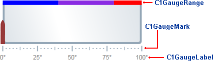
In the image above, you'll see three C1GaugeMark elements and one C1GaugeLabel element:
| XAML |
Copy Code
|
|---|---|
<!—Add tick marks --> <c1:C1GaugeMark From="0" To="100" Interval="25" Location="1.1" /> <c1:C1GaugeMark From="0" To="100" Interval="12.5" Location="1.1" /> <c1:C1GaugeMark From="0" To="100" Interval="2.5" Location="1.1" /> <!—Add label marks --> <c1:C1GaugeLabel Location="1.3" Interval="25" Foreground="Gray" Alignment="Center" Format="0°" /> |
|
The C1GaugeLabel element shows labels every 25 units for the values 0 to 100 along the scale. The C1GaugeMark element shows tick marks spaced 25, 12.5, and 2.5 units apart.
In addition to showing the scale, you may want to highlight parts of the scale range. For example, you may want to add a red marker to indicate that values in that range are too low (sales) or too high (expenses). This can be done easily by adding one or more C1GaugeRange elements to the gauge's C1Gauge.Decorators collection.
In the image above, you'll see three C1GaugeRange elements:
| XAML |
Copy Code
|
|---|---|
<!-- Add three colored ranges --> <c1:C1GaugeRange Fill="Blue" To="40" Width=".1" /> <c1:C1GaugeRange Fill="BlueViolet" From="40" To="80" Width=".1" /> <c1:C1GaugeRange Fill="Red" From="80" To="100" Width=".1" /> |
|
The C1GaugeRange elements show blue, blue violet, and red range areas. Each C1GaugeRange element displays a curved swath along the scale. The color of the swath is determined by the C1GaugeRange.Fill property, and the position is determined by the C1GaugeDecorator.From and C1GaugeDecorator.To properties. You can control the thickness of the ranges using the C1GaugeRange.Width property.