In This Topic
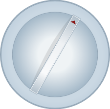
The C1Knob control extends a C1RadialGauge control to let the user select a numerical value by rotating the pointer. For example, C1Knob is perfect if you want to simulate the volume knob of a music player. By default, the C1Knob control appears similar to the following image:
Creating and using a C1Knob control is similar to creating a C1RadialGauge control and typically involves the similar steps:
- Creating the C1Knob control and setting its main properties: Minimum, Maximum, C1RadialGauge.StartAngle, and C1RadialGauge.SweepAngle.
- Setting how users interact with the knob, by setting the C1Knob.InteractionMode property.
- Adding C1GaugeMark and C1GaugeLabel decorators to show the scale. Each element may show a set of labels, tick marks, or both.
- Optionally customizing gauge elements with XAML templates.
- Setting the C1Gauge.Value property to display the value you want to initially show.
See Also