Menu for WPF | ComponentOne
Menu Overview / Radial Menu / RadialMenu Appearance
In This Topic
    RadialMenu Appearance
    In This Topic

    You can customize the RadialMenu's appearance by changing it's style or adding an icon to a RadialMenuItem. Customizing your menu control, either by changing the appearance or by adding an icon, can be done quickly and easily as illustrated in the following sections.

    Customizing Appearance

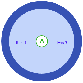
    Customizing the RadialMenu's appearance uses just a few properties.

    Complete the following steps:

    1. Add the following properties to the <c1: C1RadialMenu>tag:
      • AccentBrush="#FF28B01A"
      • Background="#FFC3D5FB"
      • BorderBrush="#FF3652B4"
      • Foreground="#FF4210EE"
    2. Run your application.

      When you run your application, it should resemble the following image:

    Adding an Icon to a C1RadialMenuItem

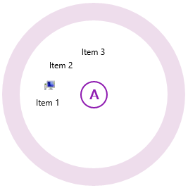
    Adding an icon to a RadialMenuItem can be completed in just a few steps.

    Complete the following steps:

    1. Add an icon image to your project. A 12x12 pixel image is best.
    2. Add the following XAML markup between the <c1:C1RadialMenuItem> and </c1:C1RadialMenuItem> tags, replacing the value of the Source property with your image's name:
      XAML
      Copy Code
      <c1:C1RadialMenuItem.Icon>
           <Image Source="YourImage.png" Height="12" Width="12" Margin="5,0,0,0"/>
      </c1:C1RadialMenuItem.Icon>
      
    3. Run the project. The following image depicts a RadialMenuItem with a 12x12 pixel icon.