Xamarin controls match the native controls on all three platforms by default and are designed to work with both: light and dark themes available on all platforms. However, developers can choose to customize the appearance of the FlexPie control by setting some of the properties at design time. You can change the background color of the FlexPie, the plot area, the color and width of borders and the thickness of margins by simply setting the desired values in the following properties:
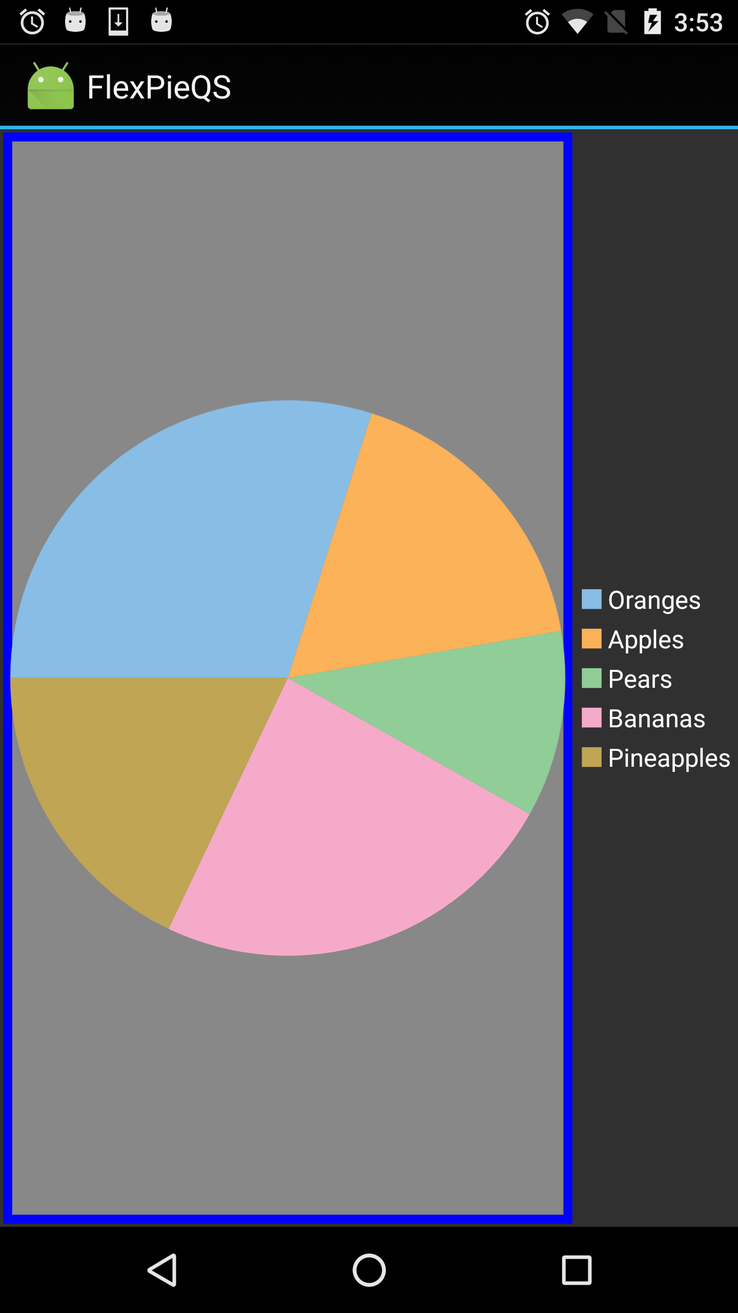
BackgroundColor: Changes the background color.
Stroke: Changes the color of the stroke.
StrokeThickness: Changes the thickness of the stroke. The image below shows the how the FlexPie appears after these properties have been set.
The following code examples demonstrate how to set these properties in C#. This example uses the sample created in the Quick Start section.
| C# |
Copy Code |
|---|---|
//Customizing Appearance fpie.BackgroundColor = Color.AliceBlue; ChartStyle s = new ChartStyle(); s.Fill = Color.Gray; s.StrokeThickness = 5; s.Stroke = Color.Blue; fpie.PlotStyle = s; | |