In This Topic
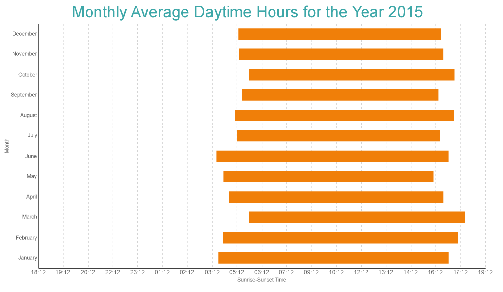
This walkthrough shows creating a Range Bar chart. The final chart appears like this:
Create a Report and Bind Report to Data
In the ActiveReports Designer, create a new RDLX report and follow the
New Report wizard to bind the report to data. You can also perform
data binding later using the
Report Data Source dialog accessed from the
Report Explorer.
Connect to a Data Source
- In the Report Data Source dialog, select the General page and enter the name of the data source.
- Under Type, select 'Csv Provider'.
For more information, see the CSV topic.
- Go to the Connection String tab and click Build
- In the Path field, navigate to the CSV file with content: weatherdata.csv
- Click Get from preview and edit the Data Type column for the following fields as shown.
| Name |
Data Type |
| DATE |
DateTime |
| CITY |
String |
| AVG MIN TEMP |
Float |
| AVG MAX TEMP |
Float |
| RAINFALL Min |
Float |
| RAINFALL Max |
Float |
| SUNRISE |
DateTime |
| SUNSET |
DateTime |
- Click OK to view the generated connection string, which will be similar to the following:
| Connection String |
Copy Code
|
Path=C:\\Data\\weatherdata.csv;Locale=en-US;TextQualifier=";ColumnsSeparator=,;RowsSeparator=\r\n;Columns=DATE(DateTime),CITY,AVG MIN TEMP,AVG MAX TEMP,RAINFALL Min,RAINFALL Max,SUNRISE,SUNSET;HasHeaders=True
|
- Click OK to complete connecting to data.
Add Report Parameters
CityParameter
- In the Report Explorer, right-click Parameters and select Add Parameters.
- In the Report - Parameters dialog's General tab, add a name for the parameter, 'CityParameter'.
- Ensure that the Data type matches that of the field (here, String).
- In the Available Values tab, select Non-queried and enter:
- Label: Melbourne Airport
- Value: MelbourneAirport
- Order By > Condition: Value
- Order By > Direction: Ascending
- In the Default Values tab, select Non-queried and add 'MelbourneAirport' (same as the Value in Available Value tab).
YearParameter
- Add another parameter and in the General tab, add a name for the parameter, 'YearParameter'.
- Ensure that the Data type matches that of the field (here, Integer).
- In the Available Values tab, select Non-queried and enter:
- Label: 2015
- Value: 2015
- Order By > Condition: Value
- Order By > Direction: Ascending
- In the Default Values tab, select Non-queried and add '2015' (same as the Value in Available Value tab).
Add Filter to Dataset
- Right-click the 'weatherdata' dataset and select Edit.
- Go to Filters page and add following two filters:
| S.no. |
Expression |
Operator |
Value |
| 1. |
=Fields!CITY.Value |
Equal |
=Parameters!CityParameter.Value |
| 2. |
=Year(Fields!DATE.Value) |
Equal |
=Parameters!YearParameter.Value |
- Now that the filters are added in the dataset, click OK.
Create a Chart
We will use the Chart Wizard dialog to configure chart data values and customization. The wizard appears by default if you have a dataset added to your report. See the topic on Chart Wizard for more information.
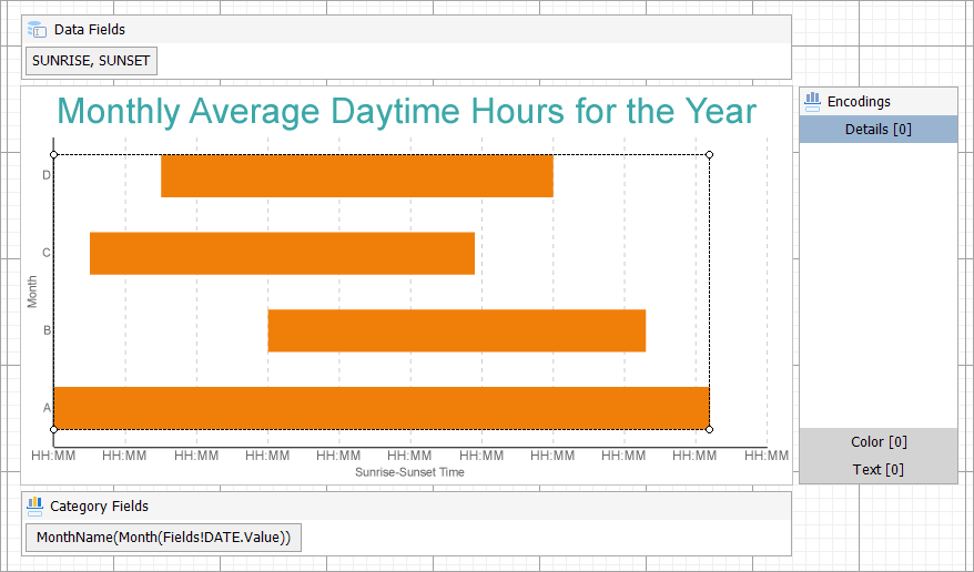
- Drag-drop Chart data region The Chart Wizard dialog appears with an option to select the data and the chart type.
- Select the Dataset name as 'weatherdata' and the Chart Type as 'Range Bar'.
- Click Next to proceed. Here, you need to specify the settings for the Range Bar chart.
- In Choose Data Values section, we will define the start and end fields.
| Start Field |
End Field |
| =Fields!SUNRISE.Value |
=Fields!SUNSET.Value |
- In Choose Data Categories, enter the field as =MonthName(Month([DATE])). We will add more customizations to the category in later steps.
- Click Next to preview your chart.
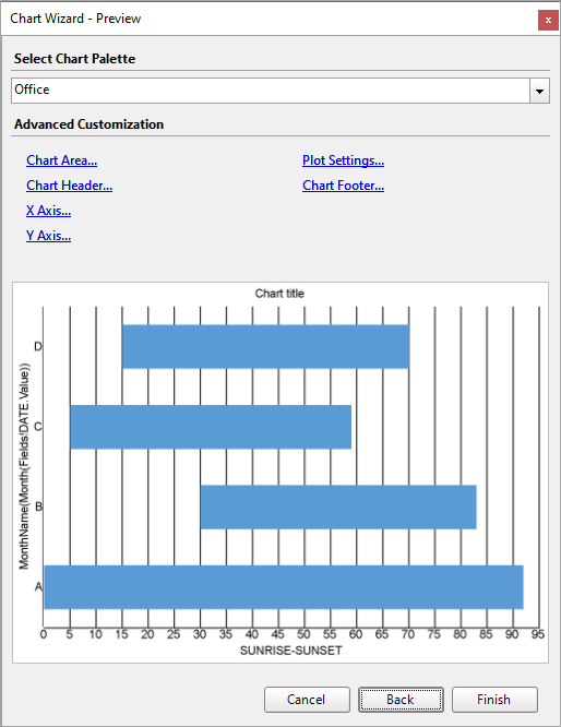
You can also modify the chart palette and do other customizations as the last step in the process of chart creation. Or, you can exit the wizard and access these smart panels as explained below.
Set Advanced Customization
Now that the chart is configured with data values, let us do some customizations on the chart elements using the smart panels.
Plot Settings
- To open the smart panel for advanced plot settings, right-click 'Plot-Plot1' on the Report Explorer and choose Property Dialog.
- Go to the Categories page and in the Sorting > Sorting field, select =Fields!DATE.Value field and set the Sort direction to 'Ascending'.
- Click OK to complete setting up the plot.
Y-Axis
- To open the smart panel for advanced Y-axis settings, right-click 'Y-axis' on the Report Explorer and choose Property Dialog.
- Go to the Title page. Enter the text in the Title field as 'Sunrise-Sunset Time' and set Color to 'DimGray'.
- Go to the Labels page > General tab and set Format to 'HH:MM'.
- Go to the Labels page > Appearance tab and set the following properties.
- Font > Size: 9pt
- Font > Color: DimGray
- Go to the Major Gridline page and set the following properties.
- Show grid: Check-on
- Grid appearance > Color: #cccccc
- Grid appearance > Width: 0.25pt
- Grid appearance > Style: Dashed
- Click OK to complete setting up the Y-axis.
X-Axis
- To open the smart panel for advanced Y-axis settings, right-click 'X-axis' on the Report Explorer and choose Property Dialog.
- Go to the Title page and edit the text in the Title field to 'Month' and set Color to 'DimGray'.
- Go to the Labels page > Appearance tab and set Font > Color to DimGray.
Chart Palette
- To open the smart panel for advanced chart settings, right-click 'Chart' on the Report Explorer and choose Property Dialog.
- Go to the Palette page and select 'Aspect'
- Click OK to complete setting up the chart palette.
Chart Header
- To open the smart panel for the chart header, right-click 'Header' on the Report Explorer and choose Property Dialog.
- Go to the General page and set the Title to the following expression:
|
Copy Code
|
="Monthly Average Daytime Hours for the Year " & Parameters!YearParameter.Value
|
- Go to the Font page and set the properties as below.
- Size: 24pt
- Color: #3da7a8
- Click OK to complete setting up the chart header.
You may want to resize the chart.
Note: We use stub data at design time and not real data. So to view the actual final chart, you need to view the chart on the preview.
- Once you are done with configuring and customizing the chart, press F5 to preview the report.