ActiveReports 18 .NET Edition
Report Authors: Designer Components / Report Controls / Page/RDLX Report / TextBox
In This Topic
    TextBox
    In This Topic

    The Textbox report control is the most commonly used report control that displays textual data in any report.  

    In Page and RDLX reports, the TextBox by default appears in each cell of a Table or Tablix data region. Also, a TextBox is what is created when you drag a field from the data set onto the report. In the Value property of the TextBox, you can enter static text or an expression. To enter a text directly into the TextBox, just double-click inside the control on the design surface of the report. An expression in TextBox can display fields from a database, calculate a value, or visually display data.

    In the Properties window, there are a number of properties that you can use to control the appearance and behavior of the TextBox. For example, you can set the Action property to have the viewer jump to a bookmark within the report, another report, or a URL when a user clicks the TextBox at run time. The Data Element properties allow you to control how and whether the TextBox displays in XML exports.

    By default, in RDLX reports, the TextBox can grow vertically to accommodate the data it displays, and it cannot shrink smaller than it appears at design time. To change this behavior, set the CanShrink and CanGrow properties in the Properties grid.

    Edit Mode

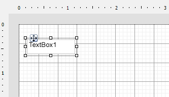
    You can double-click in the TextBox control to enter edit mode and enter text directly in the control, or you can enter text in the Properties window or code through the Value property.

    Textbox in Edit Mode

    You can format text in the TextBox control in edit mode using the ActiveReports toolbar, or you can modify properties in the Properties window. Formats apply to all of the text in the control. Text formatting changes in the Properties window immediately appear in the control, and changes made in the toolbar are immediately reflected in the Properties window.

    Important Properties

    Clicking the TextBox control reveals its properties in the Properties window.

    Property Description

    RDLX report

    CanGrow Determines whether ActiveReports should increase the height of the control based on its content.
    CanShrink  Determines whether ActiveReports should decrease the height of the control based on its value.
    CharacterSpacing Gets or sets a character spacing in points.
    LineSpacing Gets or sets a line spacing in points.
    MinCondenseRate Specifies the minimal rate of the text horizontal scaling in percentages. Should be between 10 and 100.
    ShrinkToFit Determines whether ActiveReports decreases the font size when text values exceed available space.
    TextJustify Specifies text justification with TextAlign set to Justify.
    Value A field, constant, or expression, which value is displayed in the textbox.
    VerticalAlignment Gets or sets the position of the textbox's text vertically within the bounds of the control.
    WrapMode Indicates whether a multi-line textbox control automatically wraps words or characters to the beginning of the next line when necessary.

    Page report

    CharacterSpacing Gets or sets a character spacing in points.
    LineSpacing Gets or sets a line spacing in points.
    MinCondenseRate Specifies the minimal rate of the text horizontal scaling in percentages. Should be between 10 and 100.
    ShrinkToFit Determines whether ActiveReports decreases the font size when text values exceed available space.
    TextJustify Specifies text justification with TextAlign set to Justify.
    Value A field, constant, or expression, which value is displayed in the textbox.
    VerticalAlignment Gets or sets the position of the textbox's text vertically within the bounds of the control.
    WrapMode Indicates whether a multi-line textbox control automatically wraps words or characters to the beginning of the next line when necessary.

    TextBox Dialog Properties

    You can set the TextBox properties in the TextBox dialog. To open it, with the TextBox selected on the report, under the Properties window, click the Property dialog link.

    Name: Enter a name for the textbox that is unique within the report. This name is displayed in the Document Outline and in XML exports. You can only use underscore (_) as a special character in the Name field. Other special characters such as period (.), space ( ), forward slash (/), backslash (\), exclamation (!), and hyphen (-) are not supported.

    Tooltip: A textual label for the report item used to include TITLE or ALT attributes in HTML reports.

    Value: A field, constant, or expression, which value is displayed in the textbox.

    Note: When the group or dataset breaks to a new page, the first instance of the repeated value is printed.

    Initial visibility allows you to select from the following options:

    • Visible: The textbox is visible when the report runs.
    • Hidden: The textbox is hidden when the report runs.
    • Expression: Use an expression with a Boolean result to decide whether the textbox is visible. For example, on a "Free Shipping" textbox, you could use the expression to see whether the ShippingCountry is international. A value of True hides the textbox, False shows it.

    Visibility can be toggled by another report item: If you select this check box, it enables the drop-down box where you can specify the TextBox control that users can click to toggle the visibility of the textbox.

    Initial appearance of the toggle image: allows you to select from the following options:

    • Expanded: The toggle image shows as a minus sign, and all instances of this textbox are visible.
    • Collapsed: The toggle image shows as a plus sign, and all instances of this textbox are hidden.
    • Expression: Use an expression with a Boolean result to decide whether the toggle image is expanded. A value of True expands the toggle image, False collapses it.
     Select one of the following actions to perform when a user clicks on the textbox.

    None: The default behavior is to do nothing when a user clicks the textbox at run time.

    Jump to report: For drill-through reporting, select this option and provide the name of a local report, the relative path of a report in another folder, or the full path of a report on another server. You can also use expressions to create drill-through links.

    Parameters: Supply parameters to the targeted report by entering the Name of each parameter, the Value to send to the targeted report, or whether to Omit the parameter. Note that parameter names you supply must exactly match parameters in the target report. You can remove or change the order of parameters using the X and arrow buttons.

    Jump to bookmark: Select this option and provide a valid Bookmark ID to allow the user to jump to the report control with that Bookmark ID.

    Jump to URL: Select this option and provide a valid URL to create a hyperlink to a Web page.

    Apply Parameters: Select the Name, the Type, and the Value of the parameter to set a parameter value through user action. See Actionable Parameters for more information.

    Document map label: Enter an expression to use as a label to represent this item in the table of contents (document map).

    Bookmark ID: Enter an expression to use as a locator for this textbox. You will then be able to provide a bookmark link to this item from another report control using a Jump to bookmark action.

    Border

    Style: Select a style for the border.

    Width: Enter a value in points to set the width of the border.

    Color: Select a color to use for the border, or select the <Expression...> option to open the Expression Editor and create an expression that evaluates to a .NET color.

    Background

    Color: Select a color to use for the background of the textbox.

    Image: Enter an image to use for the background of the textbox.

    Image Source: Select whether the image comes from a source that is External, Embedded, or Database, or select the <Expression...> option to open the Expression Editor.

    MIME Type: Select the MIME type of the chosen image.

    Background repeat: Select from the options Repeat, NoRepeat, RepeatX, RepeatY, or select the <Expression...> option to open the Expression Editor.

    Note: The Background Color and Background Image properties allow you to choose the <Data Visualizer...> option as well to launch the dialog that let you build a data visualization expression.

    Family: Select a font family name or a theme font.

    Size: Choose the size in points for the font or use a theme.

    Style: Choose Normal or Italic or select a theme.

    Weight: Choose from Lighter, Thin, ExtraLight, Light, Normal, Medium, SemiBold, Bold, ExtraBold, Heavy, or Bolder.

    Color: Choose a color to use for the text.

    Decoration: Choose from None, Underline, Overline, or LineThrough.

    Format code: Select one of the common numeric formats provided or use a custom .NET formatting code to format dates or numbers. For more information, see MSDN's Formatting Types topic.

    Line Spacing: This property sets the space between lines of text.

    Character Spacing: This property sets the space between characters.


    Textbox height

    Can increase to accommodate contents (RDLX report): Select this check box to set CanGrow to True.

    Can decrease to accommodate contents (RDLX report): Select this check box to set CanShrink to True.

    Can shrink text to fit fixed size control: Select this check box to set ShrinkToFit to True.


    Text direction and writing mode

    Direction: Choose LTR for left to right, or RTL for right to left.

    Mode: Choose lr-tb for left right top bottom (normal horizontal text) or tb-rl for top bottom right left (vertical text on its side).

    Upright: Indicates whether the text is written horizontally in the vertical text. Choose from None, Digits, DigitsAndLatinLetters, or the <Expression...> option.

    Angle: Enter the number of degrees to rotate the text in a counter-clockwise direction. Enter a negative number to rotate the text in a clockwise direction.

    Minimal rate of text horizontal shrinking (in %): Specify the percentage to which the text should be shrunk horizontally.

    Vertical alignment: Choose Top, Middle, Bottom, or the <Expression...> option.

    Horizontal alignment: Choose General, Left, Center, Right, Justify, or the <Expression...> option.

    Justify method: Set Horizontal alignment to Justify to enable this property. Choose Auto, Distribute, DistributeAllLines, or the <Expression...> option.

    Wrap mode

    • NoWrap: No text wrap.
    • WordWrap: Wrap words from one line to another.
    • CharWrap: Per-character wrapping mode.

    Padding

    • Top: Set the top padding in points.
    • Left: Set the left padding in points.
    • Right: Set the right padding in points.
    • Bottom: Set the bottom padding in points.

    Select the checkbox next to Add an interactive sort action to this textbox to enable the following controls which allow end users to sort the report data in the viewer.

    Sort expression: Enter an expression to use for determining the data to sort.

    Data region or group to sort: Select the grouping level or data region within the report to sort. The default value is Current scope, but you may also elect to choose an alternate data region or grouping.

    Evaluate sort expression in this scope: Select the grouping level within the report on which to evaluate an aggregate sorting expression. The default value is Current scope, but you may also elect to choose an alternate data region or grouping.

    Element Name: Enter a name to be used in the XML output for this textbox.

    Output: Choose Auto, Yes, or No to decide whether to include this textbox in the XML output. Auto exports the contents of the textbox only when the value is not a constant.

    Render as: Choose Auto, Element, or Attribute to decide whether to render text boxes as Attributes or Elements in the exported XML file. Auto uses the report's setting for this property.

    Attribute example: <table1 textbox3="Report created on: 7/26/2021 1:13:00 PM">

    Element example: <table1> <textbox3>Report created on: 7/26/2021 1:13:28 PM</textbox3>

    Data Fields

    When you drag a field from a dataset and drop it onto the report surface, a TextBox report control with an expression is automatically created. The type of expression that is created depends upon the context where you drop the field. The following table describes the various contexts and expressions created if you drag a field named SalesAmount onto the report.

    Expressions created for fields in different contexts

    Note: The expression created is different for a field with a string or unknown data type. In these cases, the First aggregate is used in place of the Sum aggregate in the expressions below. At run time, the first value found within the scope is displayed instead of a summary.
    Context Expression Run-Time Behavior
    Directly on the report surface =Sum(Fields!SalesAmount.Value) Displays a summary of the sales amount for the entire dataset.
    List data region =Fields!SalesAmount.Value Displays a value for each row of data, in a list running down the page.
    BandedList data region, header, or footer band =Sum(Fields!SalesAmount.Value) Displays a summary of the sales amount for the dataset associated with the BandedList.
    BandedList data region, detail band =Fields!SalesAmount.Value Displays a value for each row of data, in a list running down the page.
    BandedList data region, group header, or footer band =Sum(Fields!SalesAmount.Value) Displays a summary of the sales amount for the grouping.
    Table data region, header, or footer row =Sum(Fields!SalesAmount.Value) Displays a summary of the sales amount for the dataset associated with the Table.
    Table data region, detail row =Fields!SalesAmount.Value Displays a value for each row of data, in a list running down the page.
    Table data region, group header or footer row =Sum(Fields!SalesAmount.Value) Displays a summary of the sales amount for the grouping.
    Tablix data region, corner cell none Displays a blank cell. You can add a label or even use this area to embed other report control.
    Tablix data region, column group cell =Fields!SalesAmount.Value Displays the value at the top of a new column for each row of data running to the right.
    Tablix data region, row group cell =Fields!SalesAmount.Value Displays the value to the left of a new row for each row of data running down the page.
    Tablix data region, body cell =Sum(Fields!SalesAmount.Value) Displays a summary of the sales amount for the intersection of the column and row.

    TextBox Features

    Text Justification

    The TextJustify property of a Textbox control provides you justification options for aligning your text within a control. It is important to note that the TextAlign property must be set to Justify for TextJustify property to affect the text layout.

    You can choose from the following values of the TextJustify property:

    Auto

    Results in Standard MSWord like justification where space at the end of a line is spread across other words in that line. This is the default value.

    Distribute

    Spaces individual characters within a word, except for the last line.

    DistributeAllLines

    Spaces individual characters within words and also sets the justification on the last line according to the length of other lines.

    To set text justification,

    1. Select the TextBox control to view its properties in the  Properties window.
    2. In the Properties window, set the TextAlign property
    3. Go to the TextJustify property and from the drop down list select any one option.

    Text justification is supported when you preview a report in the Viewer, print a report, export a report in PDF, and TIFF formats, or render a report in Word, HTML, PDF and Image formats using rendering extensions.  

    Shrink Text to Fit in a Control

    When working with the Textbox control in a Page report and RDLX report, you can use the ShrinkToFit property to reduce the size of the text so that it fits within the bounds of the control. The text shrinks at run time, so you can see the reduced font size when you preview, print or export the report.

    The following image illustrates the result when the ShrinkToFit property is set to True on 'Title' field.

    TextBox with ShrinkToFit set to True

    You can use other text formatting properties in combination with the ShrinkToFit property.

    Caution:

    • When both CanGrow and ShrinkToFit are set to True, CanGrow setting is ignored and only ShrinkToFit is applied.
    • When  ShrinkToFit is set to True and Angle is set to a value other than 0, the ShrinkToFit property is ignored.
    • ShrinkToFit property does not work when the WritingMode property is set for a control.
    • Common value with Page number (in data region or report header/footer) appears clipped in exported files (HTML, MHT, Word, and Excel) even when ShrinkToFit property for the TextBox is set to True.

    On exporting a report, various file formats handle ShrinkToFit differently. ShrinkToFit gets exported in all formats except Text. While rendering a Page report or RDLX report using rendering extensions, ShrinkToFit is not supported in XML. However, all other rendering extensions allow ShrinkToFit to display as it is.

    Multi-line in TextBox

    You can display multi-line text in TextBox and some other controls such as CheckBox for Page/RDLX reports.

    In a Page/RDLX report, with your control in edit mode, insert line breaks at the desired location using the Enter key or Ctrl + Enter key to create multi-line text. You can also insert line breaks in the Expression Editor through the Value property of the control.

    Note: In edit mode, scrollbars appear automatically to fit multi-line content within a control. However, these are not displayed at preview, so you may need to adjust the Size property of the control to display all of the text.

    Line Spacing and Character Spacing

    In edit mode, scrollbars appear automatically to fit multi-line content within a control. However, these are not displayed at preview, so you may need to adjust the Size property of the control to display all of the text.

    Line and Character Spacing in TextBox

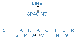
    To set Line or Character spacing,

    1. On the design surface, click the TextBox control to display it in the Properties window.
    2. In the Properties window, click the Property dialog command at the bottom to open the control dialog.
    3. In the TextBox dialog, go to the Format page and set the Line Spacing or Character Spacing values in points.

    Line and character spacing are supported when you preview a report, print a report, or export a report. It is also supported while rendering a report through rendering extensions in WordHTMLPDF and Image formats.

    Keyboard Shortcuts

    In the edit mode, you can use the following keyboard shortcuts.

    Key Combination Action
    Enter New line.
    Alt + Enter Saves modifications and exits edit mode.
    Esc Cancels modifications and exits edit mode.

    In Visual Studio Integrated Designer, you can disable this feature in the EditModeEntering Event and EditModeExit Event.

    See Also