The basic charts are used to provide visual representation of simple data and thus helps you to analyze the data in effective manner. The thumbnails below let you have a glance of how a particular chart type looks like.
| Chart Type | Chart Snapshot | Description |
|---|---|---|
| Line Chart |
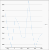
|
Line charts are the most basic charts that are created by connecting the data points with straight lines. These charts are used to visualize a trend in data as they compare values against periodic intervals such as time, temperature etc. Closing prices of a stock in a given time frame, monthly average sale of a product are some good example that can be well demonstrated through a line chart. |
| LineSymbols Chart |
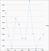
|
Line symbol chart is a slight variation of line chart and is displayed with markers on the data points. These charts are used when it is required to know the exact data points which have been used to plot the chart. |
| Spline Chart |
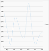
|
Spline charts are a variation of line charts as they connect the data points using smooth curves instead of straight lines. Apart from the aesthetic aspect, these charts are preferred for displaying a gradual change in trend. Just like line chart, closing prices of a stock or life cycle of a product can be well demonstrated through a spline chart. |
| Spline Symbol Chart |
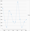
|
Spline symbol chart is a version of spline chart that is displayed with markers on the data points. These charts are used when it is required to know the exact data points which have been used to plot the chart. |
| Bar Chart |
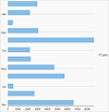
|
Bar charts compare categorical data through the horizontal bars, where length of each bar represents the value of the corresponding category. Y-axis in these charts is a category axis. For example, sales of various product categories can be well presented through a bar chart. |
| Column Chart |
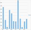
|
Column charts are simply vertical version of bar charts and they use X- axis as a category axis. Though bar charts and column charts can be used interchangeably, column charts are preferred where number of values is too large to be accommodated on an X-axis while bar charts are preferred in the case of long category titles which are difficult to fit on an X-axis or in the case of large number of categories. For example, population share of different countries across the globe is good example that can be demonstrated using a column chart. |
| Scatter Chart |
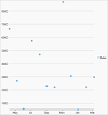
|
Scatter charts are very powerful type of charts which plot pairs of numerical data in order to identify a relationship between the two variables. Scatter charts show how much one variable is affected by another. They are best for comparing large number of data points. For instance, following chart displays the relationship between weight and height of the employees working in a company. |
| Area Chart |
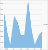
|
Area charts are line charts with area between the line chart and axis filled with a color or shading. However, while line charts simply present the data values to demonstrate the trend, filled portion of the area chart helps in communicating the magnitude of the trend as well. These charts are also used to analyze a simple comparison between the trend of each category. For instance, an area chart can easily depict how internet is gradually taking over the newspaper as a source of getting news. |
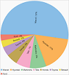
| Pie Chart |
|
Pie charts are used to demonstrate the relative contribution of various categories. |
With FlexChart, you can create basic charts by setting the ChartType property of FlexChart class. This property accepts one of the following values from ChartType enumeration.
| Chart Type | Value of ChartType property |
|---|---|
| Line Symbol | LineSymbols |
| SpLine Symbol | SpLineSymbols |
| Column | Column |
| Bar | Bar |
| Scatter | Scatter |
| Area | Area |
| Histogram | Histogram |
| Funnel | Funnel |
To create a LineSymbol chart through code, the first step is to configure the X and Y axes by setting the BindingX and Binding properties, respectively. Then, you can set up the chart by setting the ChartType property along with the other required properties.
Following XAML code creates the LineSymbol chart by setting the ChartType property. This sample code uses the same datasource as we used in the Quick Start topic:
Similarly, you can create any basic chart types listed in the above table just by setting the ChartType property.