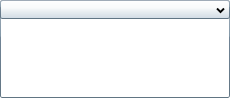
The C1Expander control is a header content control that provides an expandable and collapsible pane for storing text, images, and controls. When you add the C1Expander control to a project, it exists as a header with a blank content area. By default, the control's interface looks similar to the following image:
After the C1Expander control is added to your project, you can add a header and content to the control. You can also modify behaviors, such as the expandability and the direction, of the control. The following topics provide an overview of the C1Expander control's elements and features.