In This Topic
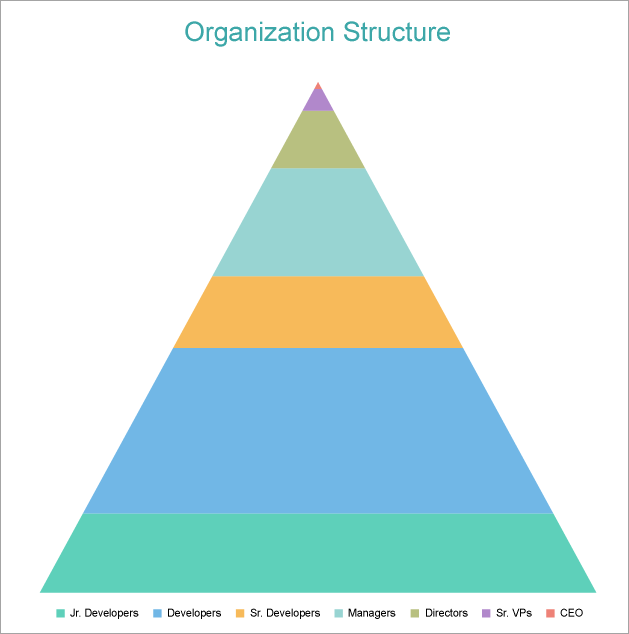
This walkthrough creates a Clustered Pyramid Chart. The chart shows the hierarchical structure of employees in an organization, which is depicted in the form of discrete vertical pyramids. The final chart appears like this:
Create a Report and Bind Report to Data
In the ActiveReports Designer, create a new RDLX report and follow the
New Report wizard to bind the report to data. You can also perform
data binding later using the
Report Data Source dialog accessed from the
Report Explorer.
Connect to a Data Source
- In the Report Data Source dialog, select the General page and enter the name of the data source.
- Under Type, select 'Json Provider'.
- Go to the Content tab under Connection and set the type of JSON data to 'Embedded'.
- In the Select or type the file name or URL or enter the data to be embedded field, enter the following data:
JSON Data
|
Copy Code
|
{
   "data":{
      "Counts":[
         {
            "Title":"Managers",
            "Layer":4,
            "Count":15
         },
         {
            "Title":"Sr. VPs",
            "Layer":2,
            "Count":3
         },
         {
            "Title":"Directors",
            "Layer":3,
            "Count":8
         },
         {
            "Title":"Developers",
            "Layer":6,
            "Count":23
         },
         {
            "Title":"CEO",
            "Layer":1,
            "Count":1
         },
         {
            "Title":"Sr. Developers",
            "Layer":5,
            "Count":10
         },
         {
            "Title":"Jr. Developers",
            "Layer":7,
            "Count":11
         }
      ]
   }
}
|
For more information, see the JSON Provider topic.
- Go to the Connection String tab and verify the generated connection string by clicking the Validate DataSource
 icon.
icon.
- Click OK to save the changes and open the DataSet dialog.
Add a Dataset
- In the Dataset dialog, select the General page and enter the name of the dataset, 'OrgDS'.
- Go to the Query page and enter the following query to fetch the required fields:
| Query |
Copy Code
|
| $.data.Counts[*] |
- Click OK to complete adding the dataset.
Create a Chart
We will use the Chart Wizard dialog to configure chart data values and customization. The wizard appears by default if you have a dataset added to your report. See the topic on Chart Wizard for more information.
- Drag-drop Chart data region onto the design area. The Chart Wizard dialog appears with an option to select the data and the chart type.
- Select the Dataset Name as 'OrgDS' and the Chart Type as 'Pyramid'.
- Click Next to proceed. Here, we will define a data value.
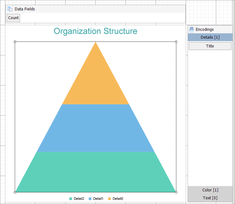
- Under Choose Data Values, add a new data value, and set and set the Field to =[Count].
- In Choose Data Category, set the Field to =[Title] and the Break-down method to 'Stack'.
- Click Next to preview your chart.
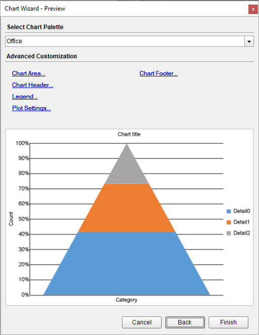
- Click Finish to complete configuring the chart.
You can also modify the chart palette and do other customizations as the last step in the process of chart creation. Or, you can exit the wizard and access these smart panels as explained below.
Set Advanced Customization
Now that the chart is configured with data values, let us do some customizations on the chart elements using the smart panels.
Plot Settings
- To open the smart panel for advanced plot settings, right-click 'Plot-Plot1' on the Report Explorer and choose Property Dialog.
- Go to the Encodings page > Detail tab, ensure that Expression is set to [Title], and set following properties as below.
- Sorting field:[Layer]
- Sorting direction: Descending
- Go to the Appearance page and set Opacity to 70%.
- Click OK to close the dialog.
Y-Axis
- To open the smart panel for advanced Y-axis settings, right-click 'Y-axis' from the Report Explorer and choose Property Dialog.
- Go to the Title page and remove the text from the Title field to hide the Y-axis title in the chart.
- Go to the Labels page > General tab and uncheck the Show Labels option to hide the data labels.
- Go to the Line page and uncheck the Show Line option.
- Go to the Major Gridline page and uncheck the Show Grid option to hide the gridlines.
- Click OK to complete setting up the Y-axis.
X-Axis
- To open the smart panel for advanced X-axis settings, right-click 'X-axis' on the Report Explorer and choose Property Dialog.
- Go to the Title page and remove the text from the Title field to hide the X-axis title in the chart.
- Go to the Labels page and uncheck the Show Labels option to hide the data labels.
- Go to the Line page and uncheck the Show Line option.
- Click OK to complete setting up the X-axis.
Chart Palette
- To open the smart panel for advanced chart settings, right-click 'Chart' on the Report Explorer and choose Property Dialog.
- Go to the Palette page and select the 'Flatly' palette.
- Click OK to complete setting up the chart palette.
Legend - Color
- To open the smart panel for the legend, right-click 'Legend - Color' on the Report Explorer, and choose Property Dialog.
- Go to the Layout page and set the Orientation to Horizontal and Position to Bottom.
- Click OK to save the settings.
Chart Header
- To open the smart panel for the chart header, right-click 'Header' on the Report Explorer and choose Property Dialog.
- Go to the General page and set Title to 'Organization Structure'.
- Go to the Font page and set the properties as below.
- Size: 20pt
- Color: DimGray
- Click OK to complete setting up the chart header.
You may want to resize the chart.
Note: We use stub data at design time and not real data. So to view the actual final chart, you need to view the chart on preview.
- Once you are done with configuring and customizing the chart, press F5 to preview the report.