WYSWYG (What You See is What You Get) Designer
InputPanel provides InputPanel Item Collection Editor which enables you to add, move, remove, and format the items, all in single editor. In addition to this editor, the control provides other some editors such as ToolTip Text Editor to make your programming task easier.
Universal .NET Data Binding
InputPanel for WinForms supports binding to most of the .NET data sources and that too with little or no code at all. This allows you to create a fully-navigational database browser in seconds. For more information, see DataBinding.
Easy Setup
While working with designer, you just need to drop the InputPanel component on your form, connect to a data source and select the data set you want to load. The InputPanel control automatically creates an input component and a label for each field. All fields and corresponding labels are consistently aligned giving you a ready-to-use layout. In addition, a data navigation control, InputDataNavigator, is also added to the form for end-users to navigate the records at runtime.
Automatic Tab order
The InputPanel control automatically assigns the tab order to the field according to their position on the form. This allows you to make changes to your data form, add components and move them around on the form without throwing off the form’s structure. Also, end-users can tab jump from field to field for fast and friendly editing experience at run time.
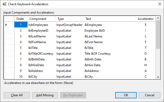
Accelerator Keys
The InputPanel control automatically generates accelerator keys, when the form is populated with fields from a data source at design time. It also provides a Check Keyboard Accelerators dialog to manage any newly added accelerators and to fix any duplicates. While working with code, you can easily assign the accelerator keys by appending ampersand(&) before any character in value of the Text property.
Validation and Error Handling
When the end-user enters invalid input, a customizable visual alert appears in the form of red frame around the input component. You can also add custom alerts in the form of error text. For example, you can allow your end-users to only enter alpha characters, and show an error indicator when any other character is entered. The InputPanel components provide ErrorText Editor so that you can display rich error text messages on an invalid input from the user.
Easy Layout Settings
While working with a bound InputPanel at design time, the control automatically sets up a uniform layout. In other scenarios as well, you can adjust the layout with minimal efforts. By default, the fields are set one in each row. You can break the flow by setting the Break property to either Column or Group.
Spatially Arrange Components on the Form
To spatially arrange your components on the form, you can either set the components padding or simply set the width of all the labels to display field components at equal distance every time. The control also provides the ChildSpacing property which is universal for all the components on the panel giving you a consistent layout. You can also use the HorizontalAlign or VerticalAlign properties for this purpose. For more information about layout and spacing, see InputPanel Layout.
Easy to Customize the Appearance
InputPanel supports visual styles that mimic the Office 2007 and Office 2010 styling including Blue, Silver, and Black. In addition, you can also use ThemeController to apply other themes or even create your own custom theme. For more information on customizing appearance, see Appearance and Style.
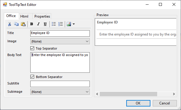
Create Rich ToolTips
Each component of the InputPanel control provides the ToolTipText property along with an editor so that you can easily set the tooltip text and customize it as per your requirement.
Import and Export Panel Layout
The InputPanel control lets you load the layout from an XML file. It also lets you save the layout in the form of an XML file. For more information, see Export and Import InputPanel Layout.
Interactive Components with Graphical Effects
The appearance of each field at runtime is customized when you move the mouse over the component, press it, or disable it. No extra steps are required for these graphical effects.
Scrollbars Automatically Added if Needed
InputPanel automatically adds horizontal and vertical scroll bars, if needed on resizing the form. This feature is available at design time as well as runtime.