Grouping
In DataViewsJS, you can use grouping to organize data in a grid. You can implement nested or row grouping.
Grouping Rows
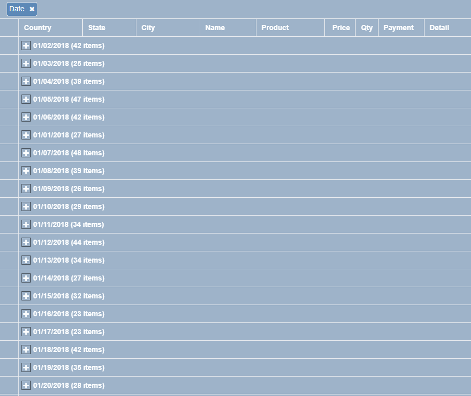
DataViewsJS allows you to group rows using the drop panel. The group can be set programmatically or manually at run time by dragging the column header in the group drop.
Implementation of group by drop down panel along with column hide and show is as follows:
Sample Code
These steps assume that you have already initialized the grid and defined the columns. See Creating a Basic Grid and Defining Columns for additional information.
The default Grid Layout provides an option for setting the allowingGrouping property to true. This property displays the grouping panel where you can drag a column header to group by that column.
var dataView = new GC.DataViews.DataView(
  document.getElementById('grid1'),
  data,
  columns,
  new GC.DataViews.GridLayout({
    allowGrouping: true,
  })
);

dataView.grouping.addHandler(function (sender, args) {
  var grid = sender;
  var columns = grid.columns;
  var action = args.action;
  if (action === 'insert') {
    var column = getColumnById(columns, args.newGroupDescriptor.field);
    if (column) {
      column.visible = false;
    }
  } else if (action === 'remove') {
    var column = getColumnById(columns, grid.data.groupDescriptors[args.oldIndex].field);
    if (column) {
      column.visible = true;
    }
  }
});
Customized Group Headers
You can customize the group settings using the groupHeader or groupFooter property in the grid's group properties.
Implementation of customization of group settings is as follows:
Sample Code
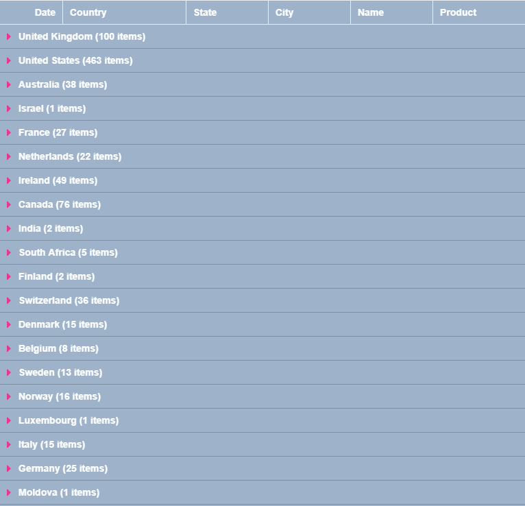
The following sample code demonstrates customization of group settings. The first group level, country, hides the group footer and shows aggregates for Quantity and Sales.
- Add the gc-grouping-toggle CSS class in the header template to customize the toggle. Note: Definition for both the expand (gc-grouping-toggle.expand) and collapse (gc-grouping-toggle.collapsed) icons are defined in the custom toggle "gc-grouping-toggle" class. If they are not defined, default behaviour is inherited from gc-grouping-toggle.
.header-cell {
  height: 100%;
  position: absolute;
  font-weight: 700;
  border-right: 1px solid rgba(0, 0, 0, 0.2);
  border-bottom: 1px solid rgba(0, 0, 0, 0.2);
  padding: 3px;
}

.gc-grouping-toggle {
  font-family: 'dataview';
  font-size: 16px;
  margin-right: 6px;
  border: 0;
  height: 100%;
}

.gc-grouping-toggle.expand:before {
  content: '\e800';
  color: #440381;
}

.gc-grouping-toggle.collapsed:before {
  content: '\e803';
  color: #ec368d;
}

.gc-group-header-row {
  background-color: white;
}
- Add a column definition.
var columns = [
  {
    id: 'id',
    caption: 'Order Id',
    dataField: 'Transaction_Id',
    dataType: 'number',
    visible: false,
  },
  {
    id: 'date',
    caption: 'Date',
    dataField: 'Transaction_Date',
    dataType: 'date',
    format: 'mm/dd/yyyy',
  },
  {
    id: 'country',
    caption: 'Country',
    dataField: 'Country',
    width: 180,
  },
  {
    id: 'state',
    caption: 'State',
    dataField: 'State',
    width: 120,
  },
  {
    id: 'city',
    caption: 'City',
    dataField: 'City',
    width: 120,
  },
  {
    id: 'name',
    caption: 'Name',
    dataField: 'Name',
    width: 120,
  },
  {
    id: 'product',
    caption: 'Product',
    dataField: 'Product',
    width: 280,
  },
  {
    id: 'price',
    caption: 'Item Price',
    dataField: 'Price',
    dataType: 'number',
  },
  {
    id: 'quantity',
    caption: 'Quantity',
    dataField: 'Quantity',
    dataType: 'number',
    width: 120,
  },
  {
    id: 'sales',
    caption: 'Sales',
    dataField: '=[price]*[quantity]',
    dataType: 'number',
    format: '$#,##',
    width: 120,
  },
];
- Initialize the code by calling the grid ID from the DIV tag.
var groupHeaderTemplate =
  '<div class="header-cell" style="width:calc(100% - 240px);">' +
  '<span class="gc-grouping-toggle \{{=it.groupStatus}}" style="margin-left:\{{=it.margin+4}}px;"></span>' +
  '<span level="\{{=it.level}}">\{{=it.name}} (\{{=it.count}} items)</span>' +
  '</div>' +
  '<div class="header-cell align-right" style="right:120px;width:120px;">\{{=it.eval("=sum([quantity])")}}</div>' +
  '<div class="header-cell  align-right" style="right:0px;width:120px;">\{{=it.eval("=sum([sales])", "$#,##")}}</div>';
var dataView = new GC.DataViews.DataView(
  document.getElementById('grid1'),
  data,
  columns,
  new GC.DataViews.GridLayout({
    showRowHeader: false,
    allowGrouping: false,
    allowColumnReorder: false,
    allowColumnResize: false,
    grouping: [
      {
        field: 'country',
        header: {
          template: groupHeaderTemplate,
        },
        footer: {
          visible: false,
        },
        collapsed: true,
      },
    ],
  })
);
See also
Feedback
Submit and view feedback for