A common requirement for most financial related applications is the need to create reports. This can be anything from Profit/Loss (P&L) Statements, Income Statements, Budgeting, Forecasting and Projections, and many more. The common factor for all these is data, and the need for spreadsheets to crunch the numbers.
In this article, we'll show you how to use SpreadJS, our enterprise JavaScript spreadsheet, to create a typical Aged Receivables Report that focuses specifically on how the end-user can easily filter that data.
This report will show all outstanding payments along with the customer's information. We'll then filter out the data and show the age of the past due payments along with that customer's details. The user of this type of reports can be a manager, an accountant, or director.
Creating the Financial Report
There are four different ways we can create this report using SpreadJS's built-in and custom features. These options include:
- Using Slicers
- Using Custom Filters
- Using Array Formulas
- Using Table Filters
Note: to create these reports, we have used static JSON data and use the same data for different sections.
We've divided each part into separate article, so we'll have a series of four articles to demonstrate all options.
Here, we'll discuss creating the aging report with Slicers.
We will be creating this report with ReactJS. Learn more about how to use SpreadJS with ReactJS
For this application, we've a created a custom component in our react application using Spread.Sheets to demonstrate the slicers in SpreadJS.
Slicers are used to filter the data quickly in a very visual intuitive way. They work differently from a traditional filter where you need to select from the dropdown. With slicers you see the result of the filter as soon as you click on the slicer item (a condition that you want to filter with). You can further customize the slicers by setting the style and data.
Here we have created a custom react component with Spread.Sheets where we will be using Table Slicers to generate the report.
- Set the style for Spread.Sheet rows in constructor:
constructor(props) {
    super(props);
    this.COLS = 12;
    this.hostStyle = props.hostStyle;

    this.customerRowStyle = new GC.Spread.Sheets.Style();
    this.customerRowStyle.backColor = "lightblue";
    this.customerRowStyle.font = "bold normal 15px normal";
  }
- Fetch data in component's state in a variable named 'records.'
state = {
    records: this.props.data,
    organizaionName: this.props.organizationName,
    title: this.props.title,
    dateGeneratedOn: new Date(),
    asOfDate: new Date(),
    dateFormat: "dd/MM/yyyy",
    spread: null
 };
- We will need three sheets to have the customer data, lookup formula data, and to show the slicer report.
  initSpread = workBook => {
    workBook.suspendPaint();
    this.initDataTableSheet(workBook.getSheetFromName("Aging Report
Table"));
    this.initLookupTable(workBook.getSheetFromName("LookupTable"));
    this.initSlicerSheet(workBook.getSheetFromName("Report with
Slicer"));
    workBook.resumePaint();
    this.setState({
      spread: workBook
    });
    this.props.onWorkBookInitialized(workBook);
  };
- Now we will write the body of these methods to initialize each sheet. We are going to use the pre-existing JSON data as data source for SpreadJS sheets. This shows the financial data of customers.
initDataTableSheet = sheet => {
    sheet.setDataSource(this.state.records);
    sheet.setColumnWidth(0, 120);
    sheet.setColumnWidth(1, 120);
    sheet.setColumnWidth(2, 120);
    sheet.setColumnWidth(3, 120);
    sheet.setColumnWidth(4, 120);
  };
The output appears as follows: 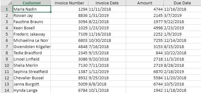
- We'll create another sheet with some pre-defined values. These will be used to create slicers to give a better user experience. We have used vLoopUp formula to group values for slicers:
initLookupTable = sheet => {
    let lookUpRowIndex = -1,
      lookUpColIndex = 0;
    let row = lookUpRowIndex;
    sheet.getCell(++row, lookUpColIndex).text("Lookup");
    sheet.getCell(row, lookUpColIndex + 1).text("Category");
    sheet.getCell(++row, lookUpColIndex).formula("-90");
    sheet.getCell(row, lookUpColIndex + 1).text("Current");
    sheet.getCell(++row, lookUpColIndex).text("1");
    sheet.getCell(row, lookUpColIndex + 1).text("[1-30]");
    sheet.getCell(++row, lookUpColIndex).text("31");
    sheet.getCell(row, lookUpColIndex + 1).text("[31-60]");
    sheet.getCell(++row, lookUpColIndex).text("61");
    sheet.getCell(row, lookUpColIndex + 1).text("[61-90]");
    sheet.getCell(++row, lookUpColIndex).text("91");
    sheet.getCell(row, lookUpColIndex + 1).text("91+");
  };
The sheet looks as follows: 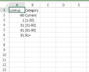
- Once we have the data in a workbook let's create the slicer sheet with a table to filter the data as per the user selection.
initSlicerSheet = sheet => {
    this.addReportHeader(sheet);

    sheet.setRowCount(this.state.records.length + 20);
    sheet.setColumnCount(20);

    let tableRowIndex = 4;
    let table = sheet.tables.addFromDataSource(
      "records",
      tableRowIndex,
      0,
      this.state.records
    );
    sheet.setColumnWidth(0, 180);
    sheet.setColumnWidth(1, 120);
    sheet.setColumnWidth(2, 120);
    sheet.setColumnWidth(3, 120);
    sheet.setColumnWidth(4, 150);
    sheet.setColumnWidth(5, 80);
    sheet.setColumnWidth(6, 120);


    sheet.tables.resize(
      table.name(),
      new GC.Spread.Sheets.Range(tableRowIndex, 0,
this.state.records.length, 7)
    );

    //#region  Add Tables
    let spreadNS = GC.Spread.Sheets;

    let customerCol = new spreadNS.Tables.TableColumn();
    customerCol.name("Customer");
    customerCol.dataField("Customer");

    let invoiceIDCol = new spreadNS.Tables.TableColumn();
    invoiceIDCol.name("Invoice #");
    invoiceIDCol.dataField("Invoice Number");

    let invoiceDtCol = new spreadNS.Tables.TableColumn();
    invoiceDtCol.name("Invoice Date");
    invoiceDtCol.dataField("Invoice Date");

    let balanceCol = new spreadNS.Tables.TableColumn();
    balanceCol.name("Balance");
    balanceCol.dataField("Amount");
    let dueDateCol = new spreadNS.Tables.TableColumn();
    dueDateCol.name("Due Date");
    dueDateCol.dataField("Due Date");

    let daysLateCol = new spreadNS.Tables.TableColumn();
    daysLateCol.name("DaysLate");

    let cateogoryCol = new spreadNS.Tables.TableColumn();
    cateogoryCol.name("Category");

    table.bindColumns([
      customerCol,
      invoiceIDCol,
      invoiceDtCol,
      dueDateCol,
      balanceCol,
      daysLateCol,
      cateogoryCol
    ]);

    table.setColumnDataFormula(5, "=Today() - [Due Date] ");
    table.highlightLastColumn(false);

    table.setColumnDataFormula(
      6,
      `=VLOOKUP([@DaysLate],LookupTable!$A$1:$B$6,2)`
    );

    let categorySlicer = sheet.slicers.add(
      "categorySlicer",
      table.name(),
      "Category"
   );
    categorySlicer.position(new GC.Spread.Sheets.Point(850, 100));
categorySlicer.style(GC.Spread.Sheets.Slicers.SlicerStyles.dark1());

    let customerSlicer = sheet.slicers.add(
      "customerSlicer",
      table.name(),
      "Customer"
    );
    customerSlicer.position(new GC.Spread.Sheets.Point(850, 400));
    customerSlicer.style(GC.Spread.Sheets.Slicers.SlicerStyles.dark1());

    sheet.setColumnVisible(6, false);
    sheet.getRange(-1, 5, -1, 1).formatter(new
NegativeValueFormatter());
    sheet.getRange(-1, 4, -1, 1).formatter("$#,#");
    sheet.getRange(-1, 2, -1, 6,
GC.Spread.Sheets.SheetArea.viewport).hAlign(GC.Spread.Sheets.Horizontal
Align.right);
    sheet.getRange(-1, 0, -1, 1,
GC.Spread.Sheets.SheetArea.viewport).hAlign(GC.Spread.Sheets.Horizontal
Align.left);
    sheet.getRange(1, 2, 1, 2,
GC.Spread.Sheets.SheetArea.viewport).vAlign(GC.Spread.Sheets.Horizontal
Align.center);
    sheet.getRange(4, 1, 1, 5,
GC.Spread.Sheets.SheetArea.viewport).hAlign(GC.Spread.Sheets.Horizontal
Align.center);
- We have created a few rules to color the number of days red, green, and orange based on the value.
    var cfs = sheet.conditionalFormats;
    var style = new GC.Spread.Sheets.Style();
    style.foreColor = "green";
    cfs.addCellValueRule(
GC.Spread.Sheets.ConditionalFormatting.ComparisonOperators.lessThan,
      30,
      0,
      style,
      [new GC.Spread.Sheets.Range(-1, 5, -1, 1)]
    );
    style = new GC.Spread.Sheets.Style();
    style.foreColor = "red";

cfs.addCellValueRule(GC.Spread.Sheets.ConditionalFormatting.ComparisonO
perators.greaterThan,
      90,
      0,
      style,
      [new GC.Spread.Sheets.Range(-1, 5, -1, 1)]
    );

    var lessThanstyle = new GC.Spread.Sheets.Style();
    lessThanstyle.foreColor = "orange";
    cfs.addCellValueRule(

GC.Spread.Sheets.ConditionalFormatting.ComparisonOperators.between,
      31,
      90,
      lessThanstyle,
      [new GC.Spread.Sheets.Range(-1, 5, -1, 1)]
    );

    cfs.addRule(dataBarRule);

  };
- In the sheet above, the code to add the slicers based on a hidden column (i.e. Column5) is as follows:
let categorySlicer = sheet.slicers.add(
      "categorySlicer",
      table.name(),
      "Category"
    );
    categorySlicer.position(new GC.Spread.Sheets.Point(850, 100));

categorySlicer.style(GC.Spread.Sheets.Slicers.SlicerStyles.dark1());

    let customerSlicer = sheet.slicers.add(
      "customerSlicer",
      table.name(),
      "Customer"
    );
    customerSlicer.position(new GC.Spread.Sheets.Point(850, 400));

customerSlicer.style(GC.Spread.Sheets.Slicers.SlicerStyles.dark1());
To set the style and formatting for the overall slicer worksheet:
addReportHeader = sheet => {
    sheet.setColumnCount(this.COLS);
    sheet.setRowCount(10000);

    sheet
      .getCell(1, 0)
      .text(this.state.title)
      .font("bold normal 20px normal")
      .vAlign(GC.Spread.Sheets.VerticalAlign.center);
    sheet.addSpan(0, 0, 1, 2);
    sheet
      .getCell(0, 0)
      .text(this.state.organizaionName)
      .font("bold normal 20px normal")
      .vAlign(GC.Spread.Sheets.VerticalAlign.center);
    sheet.addSpan(1, 0, 1, 2);
    sheet
      .getCell(1, 2)
      .text("As of:")
      .font("bold normal 15px normal");
    sheet
      .getCell(1, 3)
      .text(this.state.dateGeneratedOn)
      .formatter(this.state.dateFormat)
      .font("bold normal 15px normal");

    sheet.setRowHeight(0, 40);
    sheet.setRowHeight(1, 28);
    sheet.setColumnWidth(0, 150);
    sheet.setColumnWidth(1, 120);
    sheet.setColumnWidth(2, 120);
    sheet.setColumnWidth(3, 120);
    sheet.setColumnWidth(4, 80);
    sheet.setColumnWidth(5, 80);
    sheet.setColumnWidth(6, 80);
    sheet.setColumnWidth(7, 80);
    sheet.setColumnWidth(8, 80);
    sheet.setColumnWidth(9, 80);
    sheet.setColumnWidth(10, 80);
    sheet.setColumnWidth(11, 80);

    let defaultStyle = new GC.Spread.Sheets.Style();
defaultStyle.foreColor = "Black";
    defaultStyle.hAlign = GC.Spread.Sheets.HorizontalAlign.center;
    sheet.setDefaultStyle(defaultStyle);
    };
- We have applied the data bar rule to the 'Balance' column. This column shows databar for amount in the cell.
    var dataBarRule = new
GC.Spread.Sheets.ConditionalFormatting.DataBarRule(GC.Spread.Sheets.Con
ditionalFormatting.ScaleValueType.Number, 500,
GC.Spread.Sheets.ConditionalFormatting.ScaleValueType.Number, 12000,
"#6891c8", [new GC.Spread.Sheets.Range(-1,4,-1,1)]);
    dataBarRule.showBorder(true);
    dataBarRule.borderColor("#6891c8");

dataBarRule.dataBarDirection(GC.Spread.Sheets.ConditionalFormatting.Bar
Direction.LeftToRight);

dataBarRule.axisPosition(GC.Spread.Sheets.ConditionalFormatting.DataBar
AxisPosition.Automatic);
    cfs.addRule(dataBarRule);
- The code for rendering the component generated with the above code is as follows:
render() {
    return (
      <div>
        <SpreadSheets
          hostStyle={this.hostStyle}
          workbookInitialized={this.initSpread.bind(this)}
        >
          <Worksheet name="Report with Slicer" />
          <Worksheet name="LookupTable" />
          <Worksheet name="Aging Report Table" />
        </SpreadSheets>
      </div>
    );
  }
}

export default SlicerComponent;
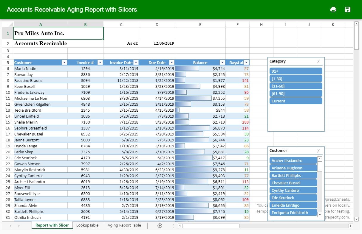
The outcome of the report renders as below:
As demonstrated in the image, the Spread.Sheets shows two slicers: one for 'category' and another for 'customer.' The user can click on the slicer category or customer, and the table displays the filtered records from the financial data from the data sheet.
The 'DaysLate' column shows data in different colors: red, green, and orange. The red color is for invoices older than 90 days, the orange color is for invoices that are less than 90 days old and more than 30, whereas the green color is for invoices less than 30 days old.
There are also Print and Save buttons in the toolbar at top. You can use these buttons to print the report and export the report to Excel format.
Please continue reading about the other options available with Spread.Sheets while working with financial data.
Happy coding, be sure to leave any thoughts or comments below.

Deepak Sharma